


.svg)
 Healthcare
 Finance
 Retail
 SaaS & Digital
 eCommerce
 Education

 Salesforce
  HubSpot
 Pipedrive
 Mailchimp
 Zendesk
  Freshdesk
 HelpScout
  Front
Front Slack
Slack  Zoom
Zoom Google Sheets
  Zapier
  Integrately
 Webhooks
  Blogs
Blogs Webinar
 Product Updates


TL;DR
- A website survey collects feedback from visitors directly on your site — using popups, slide-ups, feedback buttons, embedded forms, or bottom bars. No contact information required.
- There are five distinct widget types, and each serves a different moment: exit-intent popups catch abandonment reasons; feedback buttons stay permanently visible; embedded surveys collect inline content ratings.
- Response rates depend less on the questions you ask and more on when and where you ask them. Contextually triggered surveys consistently outperform page-load triggers.
- The targeting decisions (which pages, which visitor segments, what trigger, how often) matter as much as the question itself. Most teams get the questions right and the targeting wrong.
- Running independent survey programs on the same domain is possible without widget conflicts — provided each program runs in its own workspace with its own code snippet.
You have Google Analytics. You know visitors land on your pricing page and leave. You know your checkout flow has a drop-off somewhere around step two. You know your homepage bounce rate is higher than it should be.
What you don't know is why.
That's the gap website surveys close. A website survey is a short feedback prompt shown to visitors while they're still on your site. It asks one or two questions at the exact moment something meaningful is happening: a visitor is about to leave, a buyer just completed a purchase, a reader just finished an article.
The definition is simple. The useful part starts after it.
Because the question that actually determines whether a website survey program works isn't "what is a website survey?" It's: which type, on which page, triggered by what, asking exactly what. Get those four things right, and you'll collect feedback your analytics tools can't surface. Get them wrong, and you'll irritate visitors with a popup nobody asked for.
This guide covers all of it. Types, questions, deployment mechanics, use cases, best practices, and real examples of what works.
What Is a Website Survey?
A website survey is a feedback prompt displayed on web pages that collects input from visitors in real time, about their experience, their intent, their satisfaction, or what's stopping them from taking an action.
Unlike email surveys, website surveys don't require contact information. A visitor you've never heard of can tell you exactly why they didn't convert, if you catch them at the right moment. That's the core distinction worth holding onto.
Email surveys reach your known audience. Website surveys reach everyone, including the first-time visitor who found you through a blog post, compared three competitors, and left without signing up. Those visitors carry exactly the kind of friction signal that improves conversion rates. Website surveys are how you hear from them.
They're also distinct from in-app feedback, which is collected inside a product from logged-in users. Website surveys operate on the public-facing side: marketing pages, blog content, pricing, checkout flows. The audience is often anonymous. The intent is often unmeasured. That's precisely what makes the feedback valuable.
What they measure: navigation clarity, conversion friction, content quality, visitor intent, and satisfaction at specific moments in the session. Not averages across time. Signals from right now.
Website Surveys vs. Other Feedback Channels
Website surveys aren't the only way to collect feedback. But they serve a distinct moment that other channels can't reach. Here's how they compare:
| Channel | Who You Reach | Requires Contact Info? | When Feedback is Collected | Best For |
| Website survey | Anyone on your site, including anonymous visitors | No | During the visit, in real time | Conversion friction, visitor intent, content quality |
| Email survey | Known contacts only | Yes — you need their address | Hours or days after the experience | Relationship NPS, post-onboarding, renewal feedback |
| In-app survey | Logged-in product users | Yes — they have an account | Inside the product, during a session | Feature feedback, churn risk, product NPS |
| Customer interview | Willing customers who opt in | Yes — scheduled in advance | Separate from the experience entirely | Deep qualitative insight, persona research |
The practical implication: if you want to understand why anonymous visitors leave your pricing page, only a website survey can reach them. If you want to know how a long-tenured customer feels about your product overall, email works better. These channels aren't in competition. They capture different audiences at different moments.
Types of Website Surveys
Not all website surveys work the same way. Choosing the wrong type for a given moment is one of the fastest ways to kill your response rate before you've asked a single question.
There are five main widget types. Each has a different trigger model, a different relationship with the visitor, and a different best-fit use case. Understanding the differences isn't just academic: it changes which visitors respond, when they respond, and why.
Popup Surveys
A popup appears in the center of the screen, triggered by a condition you define: time on page, scroll depth, exit intent, or a custom event. The visitor doesn't choose to see it. It arrives.
That's both the strength and the risk. Popups interrupt. When they're timed well (exit intent on a checkout page, a satisfaction check after 60 seconds on pricing), interruption is fine because the timing signals relevance. When they fire the moment someone lands on a page, they're just noise that trains visitors to click the X before reading.
The single-question format works best here. A popup asking five things will get closed. A popup asking one clear question, at the right moment, gets answered more often than you'd expect.
Best for: exit intent, post-milestone moments (after form submission, after reaching a key page), satisfaction checks at high-intent touchpoints.
Not suited for: always-on general feedback programs, multi-question surveys, pages where the visitor has just arrived.
.svg)
Slide-Up Surveys
A slide-up enters from the bottom of the screen. Less intrusive than a centered popup because it doesn't block content. The same trigger logic applies: time, scroll, exit intent. What changes is the visual signal it sends to the visitor.
The format implies lower stakes. Visitors are more likely to glance at a slide-up than dismiss it immediately, which makes it the right format for feedback that isn't urgent but is worth capturing: article quality, page helpfulness, satisfaction at a moment that isn't a critical conversion point.
Best for: content feedback, post-action satisfaction, NPS on non-conversion pages, situations where you want to ask without interrupting.
Not suited for: situations where you need the visitor's full attention for more than one question, or where the ask feels significant enough to warrant a centered overlay.
-1.svg)
Exit intent surveys often use the slide-up format, catching the departing visitor without the full-screen pressure of a popup.
Side Tab / Feedback Button
The side tab lives on the edge of every page. Left side or right, always visible, never moving. It only opens when a visitor clicks it.
This is the only visitor-initiated format in the list. The visitor chooses to engage. That selectivity means raw response numbers look lower, but the quality of the feedback tends to be higher. Someone who clicked "Give Feedback" wanted to say something specific. You're more likely to get a real signal than a quick dismissal.
It's also the format that captures what you didn't think to ask. Bug reports. Content gaps. Broken links. Confusing navigation. Visitors who click the feedback button are usually motivated by something concrete, and that specificity is exactly what makes the response useful.
Best for: permanent feedback door, bug reporting, feature requests, ongoing programs that run alongside other survey types, any page where you want feedback available but not imposed.
.svg)
The side tab is the right format when feedback needs to be available at all times without interrupting the visitor. For full deployment detail, placement guidance, and real examples, see the website feedback button guide, or visit the feedback button product page to see how Zonka implements it.
Popover Surveys
A popover is triggered by a click on a specific element you've placed on the page, a button, a link, an icon. It opens next to whatever the visitor just clicked. System-positioned, but visitor-initiated.
That makes it the most contextual format. If you want feedback on a specific feature, a specific section of a page, or a specific content block, you place the clickable element there and the popover follows. Visitors who aren't engaged with that element never see it. Visitors who are engaged get an immediate, in-context feedback prompt.
Best for: feature-specific feedback, rating a specific section, in-content feedback on documentation or help articles, any scenario where the feedback question is only relevant to a subset of visitors.
Not suited for: broad satisfaction measurement, capturing signals from visitors who haven't engaged with the specific element you're targeting.
.svg)
Embedded and Bottom-Bar Surveys
An embedded survey lives inside the page itself, inline with content, visible without any trigger. A bottom-bar survey is similar: a fixed strip at the very base of the page. Website feedback forms take this concept further: full-form layouts embedded directly into a page rather than overlaying it.
These are the quietest format. No animation, no overlay, no interruption. A visitor finishes reading an article and encounters a one-question rating at the end. Easy to skip. Easy to answer. That combination tends to produce higher completion rates on content pages precisely because it doesn't feel like a survey being launched at them.
Best for: article feedback, documentation quality rating, post-content helpfulness checks, any page where the content is the primary experience and feedback should feel like a natural continuation of it.
For implementation detail and embed code options, see embedded website surveys.
.svg)
Here's a quick reference for the five types:
| Widget Type | Who Initiates | Trigger | Best Signal Type |
| Popup | System | Event-based (time, scroll, exit) | Exit intent, milestone moments |
| Slide-up | System | Event-based | Content satisfaction, post-action |
| Side tab / Feedback button | Visitor | On-click | Open-ended, bugs, feature requests |
| Popover | Visitor | On-click (specific element) | Feature-specific or section-specific |
| Embedded / Bottom-bar | Neither | Always visible | Content quality, article helpfulness |
The format isn't a style preference. It changes who responds, when, and why.
Choosing between them isn't complicated if you start from the right question: does this feedback moment need to be initiated by you, or by the visitor? System-triggered formats (popup, slide-up) are right when you know the moment matters: a visitor is about to leave, a buyer just converted. You don't want to rely on them choosing to give feedback. Visitor-initiated formats (side tab, popover) are right when the feedback is ongoing and open-ended, when you want to hear from whoever has something to say rather than whoever you've decided to ask.
Most mature website survey programs run both at once. A side tab runs permanently across every page, collecting open-ended signals. A popup or slide-up runs on specific pages at specific moments, collecting targeted responses. They don't compete if they're deployed in separate workspaces. They give you two different types of signal from the same visitors.
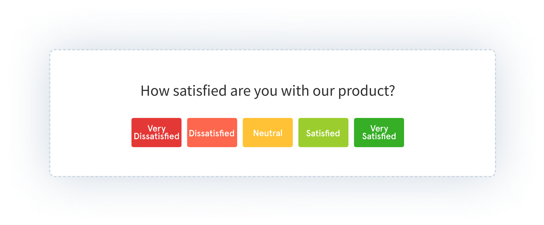
Website Survey Questions That Actually Work
Most question banks are organized by question type: multiple choice, rating scale, open-ended. That's the wrong organizing principle for most teams.
What you need to decide first isn't the format. It's the moment. The same question asked at two different points in the visitor journey produces completely different signals. So the more useful structure is: what is the visitor doing right now, and what do you need to know about it?
Here's how to think about questions by deployment scenario.
Navigation and UX Questions
These run on pages where visitors are trying to find something: category pages, navigation menus, help centers, site search results. The goal isn't satisfaction measurement. It's obstacle detection. What stopped a visitor from getting where they intended to go?
Questions that work: - "Did you find what you were looking for today?" (Yes / No / Still looking) - "What were you looking for that you couldn't find?" - "Was anything on this page unclear?" - "How easy was it to find the information you needed?" (1-5 scale) - "Is there anything you expected to see here that was missing?"
One note on question framing worth internalizing: ask about past behavior, not hypothetical future behavior. "Did you find what you were looking for?" captures what actually happened. "Would you be able to find what you're looking for?" captures what the visitor imagines, which is reliably more optimistic than what they'd actually do. Rob Fitzpatrick documents this distinction well: people give honest answers about what they did; they give optimistic answers about what they'd do.
The framing matters because it changes what you do with the answers. Behavioral questions point to specific friction. Hypothetical questions produce aspirational feedback that often doesn't map to real problems.
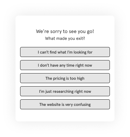
Exit Intent Questions
Exit intent surveys fire when a visitor moves their cursor toward closing the tab or navigating away. The window is short. One question is almost always better than three.
Questions that work: - "What stopped you from completing your purchase today?" - "Is there anything we can add or change that would have made you stay?" - "What were you hoping to find that you didn't?" - "How would you rate your experience on this page?" (with optional open comment)
Start with the exit intent survey template if you're building one from scratch. If you're using the popup format to deliver those surveys, popup surveys covers placement and timing in depth.
The instinct to ask follow-up questions here is understandable. A visitor is about to leave and you want to capture everything. But an exit intent survey that asks five questions will get abandoned before the second one. One well-framed question beats a form. Every time.
Here's why that matters practically: an exit intent popup is already asking something of a visitor who's already made the decision to leave. Every additional question increases the perceived cost of responding. One question feels like a quick favor. Five questions feel like homework. The behavioral reality is that you'll get five times as many responses to one question as you'll get completed responses to a five-question form shown in the same moment, to the same visitors.
If you find yourself needing multiple dimensions of exit feedback, run separate surveys on separate pages rather than stacking questions on one trigger. A visitor who abandons the checkout page has different motivations than a visitor who bounces from pricing. Ask them separately.
Post-Purchase and Post-Conversion Questions
Post-conversion surveys run on thank-you pages, order confirmation screens, or immediately after a signup completes. The visitor just took the action you wanted. That's the moment to understand what drove them there, not three days later in a follow-up email.
Questions that work: - "What almost stopped you from completing this purchase?" - "How did you hear about us?" (channel attribution) - "What was the main reason you decided to sign up today?" - "Was there anything about the checkout process that felt unclear or unexpected?" - "How confident are you in your decision?" (with open-text follow-up for low scores)
The attribution question deserves special attention. "How did you hear about us?" catches channel data that UTM parameters miss: word of mouth, podcast mentions, conference conversations, friend recommendations. UTM parameters tell you about the click. This question tells you about the entire chain of influence that preceded it.
G2 runs a version of this on their pricing page specifically to understand what drove high-intent visitors to evaluate their platform. Their website survey program runs three different surveys across different pages, each targeting a different visitor intent. One workspace, page-specific targeting rules, over 33,700 responses collected.
Use the website feedback survey template as your starting framework.
A note on timing for post-conversion surveys: the confirmation page is the right placement, not a follow-up email three days later. Memory degrades. The friction the visitor felt during checkout is fresh on the confirmation page. By day three, they've either forgotten what frustrated them or they've already resolved it. The immediacy of the on-site survey is what makes it more accurate than delayed outreach.
Content and Blog Feedback Questions
Embedded or bottom-bar surveys on content pages capture one of the most underappreciated signals in a website feedback program: whether your content actually answered the question the visitor had when they arrived. Website feedback forms offer a more structured version of this: longer-form layouts embedded directly into a page for deeper content feedback.
That sounds obvious. In practice, most content teams have no idea whether their articles are answering questions or just appearing in search results before visitors bounce.
Questions that work: - "Did this article answer your question?" (Yes / Partially / No) - "What were you hoping to find that wasn't here?" - "How would you rate the helpfulness of this content?" (1-5) - "Was there a topic we didn't cover that you needed?" - "What would have made this article more useful?"
The "partially" option on the first question is worth including. A binary yes/no misses the large group of visitors who found the article useful but incomplete. That "partially" response, followed by an open-text field, tends to surface the most specific improvement suggestions: the section that was missing, the question that wasn't answered, the follow-up resource the visitor expected to find but couldn't.
Over time, content feedback surveys build a prioritized backlog of specific improvements that analytics tools would never surface. A page with a 60% bounce rate tells you that visitors left. A content feedback survey with 40% "partially" responses tells you they left because the comparison table they were looking for wasn't there.
Question Patterns That Consistently Fail
Before moving to deployment mechanics, a few question types worth avoiding regardless of scenario:
Leading questions. "How much did you enjoy your experience today?" doesn't give visitors room to say they didn't enjoy it. "How would you rate your experience today?" does.
Double-barreled questions. "Was the checkout process clear and easy?" asks two things in one. A visitor who found it clear but not easy can't answer accurately. Split these into separate questions or choose the dimension that matters most.
Hypothetical questions. "Would you recommend us to a friend?" predicts future behavior. "Have you recommended us to a friend?" measures actual behavior. The latter correlates much more strongly with real outcomes. When you can ask about what a visitor did instead of what they'd do, ask about what they did.
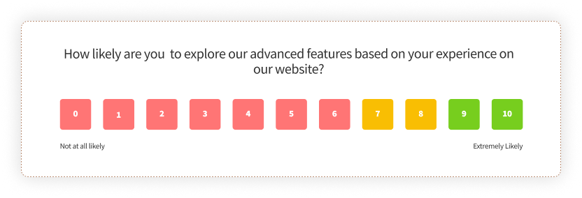
Vague rating scales without context. "Rate your experience from 1 to 10" without specifying what a 1 or a 10 means produces data that's hard to interpret consistently across visitors. Anchor your scales: "How likely are you to recommend us to a colleague? (0 = not at all likely, 10 = extremely likely)" is NPS. It's specific because decades of benchmarking made it standardized. For custom scales, provide the anchor text.
Usability and Redesign Questions
When you change something on your website, a new checkout flow, a redesigned landing page, a restructured navigation, usability surveys tell you whether the change worked for visitors. Run them on the pages that changed, not site-wide.
Site-wide usability surveys produce aggregate data that's hard to act on. Page-specific surveys produce data tied to a specific change, making it much clearer what needs attention.
Questions that work: - "How easy was it to complete what you came to do?" (1-5 scale) - "How would you rate your experience finding information on this page?" - "Was there anything about this page that felt confusing or unclear?" - "What would make this page easier to use?" - "Compared to your last visit, has the experience improved, stayed the same, or gotten worse?"
For more structured usability measurement, the website usability survey guide covers SUS (System Usability Scale) methodology and when to use it.
One framing note: usability surveys work best when they're running against a specific change, not as a continuous background measurement. If you're running a usability survey on a page that hasn't changed in six months, you're collecting static data. If you run it immediately after a redesign, you're measuring the impact of that change. The before-and-after comparison is where the signal lives.

When and Where to Deploy Website Surveys
Here's what most guides on website surveys won't tell you: the question is the last decision you should make.
The first decisions are when, where, and to whom. A well-written question shown at the wrong moment gets dismissed. A mediocre question shown to the right visitor at the right time gets answered. The targeting and triggering mechanics are doing more work than the copy. Most teams learn this by running their first survey program and getting a 3% completion rate on a popup that fires the moment anyone lands on any page.
Trigger Timing
Page-load triggers fire the moment a visitor arrives. They're the most common choice. They're also the lowest-signal trigger available, because they catch visitors before they've formed a single opinion about anything on the page.
Better options:
Time delay (15-30 seconds after page load). By then, a visitor has started reading. They have something to react to. A satisfaction question after 20 seconds on a pricing page is asking someone who engaged. A satisfaction question at zero seconds is asking someone who just blinked.
Scroll depth (50-70% of the page). A visitor who scrolled halfway through your pricing page is engaged. One who reached the bottom of a 2,000-word article read it. Triggering on scroll depth means the survey fires for visitors who've actually experienced the content, not just loaded it.
Exit intent. Cursor moves toward closing the tab or the address bar. Highest urgency, most forgiving for single-question surveys. Works especially well on checkout pages, pricing pages, and high-intent content where you genuinely want to understand abandonment. For the full guide to exit-intent mechanics and question examples, see exit intent surveys.
Post-action. After a form submit, a purchase, a content download, a video completion. The visitor just did something meaningful. That's the best moment to ask about it, because the experience is fresh and the context is specific.
Page-Level Targeting
Site-wide deployment is almost always the wrong choice.
A satisfaction survey running on every page of your domain collects thousands of responses that tell you nothing useful about anything specific. You end up with an average that obscures every problem under it.
The more useful approach is page-specific targeting. Ask yourself: which page is creating the problem I'm trying to understand? Deploy there, not everywhere.
Concrete examples: - Checkout drop-off concern: exit intent survey on the checkout page only - Navigation confusion on search results: UX survey targeting the search and category pages - Content quality gaps: embedded survey on high-traffic blog posts - Pricing page friction: one-question popover after 20 seconds on the pricing page
You can be as specific as a single URL or as broad as a URL pattern. Most survey platforms let you define page targeting by exact URL, URL contains, or URL starts with. That means you can target an entire section of your site without listing every individual page.
Visitor Segment Targeting
Beyond pages and devices, you can target by visitor attributes, provided you're passing user data through the JS client code. In logged-in mode, you can show surveys only to users on specific subscription tiers, users who've been active for more than 30 days, users in specific geographic regions, or users who've triggered a specific event.
This matters most for two scenarios. First, when the survey question only makes sense for a subset of visitors. A question about a Pro-tier feature shown to free-tier users produces noise. Filtering by plan tier produces signal. Second, when you're trying to understand a specific cohort. If you want to know why long-tenured users are churning, you can target the exit survey to users who've been active for 90+ days specifically, rather than blending their responses with new users who barely engaged.
Anonymous mode (for public-facing pages) doesn't support attribute-based targeting. But device, page URL, and percentage-based targeting still apply. You don't need logged-in user data to run a well-targeted website survey. You just have fewer dimensions to filter on.
Device Targeting
Over half of web traffic is mobile. Popups sized for a 1200px desktop viewport don't work on a 375px phone screen. Full-width overlays become unreadable. Multi-question forms become impossible to complete without zooming in.
If you're not segmenting by device, you're optimizing your survey for desktop visitors and serving a broken experience to the majority of your audience. Either design for the smallest screen first, or set separate targeting rules for mobile and desktop with formats appropriate for each.
Frequency Controls and Throttling
Showing the same survey to the same visitor every session is one of the fastest ways to train visitors to dismiss your surveys on sight.
Most platforms offer several options: - Show once per visitor, regardless of whether they responded - Show until the visitor submits a response - Show once per session, resetting each browser session - Show to a percentage of visitors (20%, 50%) rather than all of them
Use these controls. The right setting depends on your traffic volume and survey type, but the general rule is: if a visitor would feel surveyed rather than heard, the frequency is too high. A survey program that runs at the right frequency for months beats one that runs aggressively for two weeks and gets turned off because completion rates collapsed.
The One-Popup-Per-Workspace Constraint
This is a practical deployment reality that most website survey guides skip entirely.
In Zonka, each workspace supports one active popup, one active popover, and one active sidebar at a time. If you have both a marketing exit-intent popup and a product feedback popup trying to run on the same domain in the same workspace, one of them won't show. Whichever was most recently updated takes priority.
The solution is workspace separation. Your marketing team runs their surveys in one workspace with one JS snippet. Your product team runs theirs in a separate workspace with a different snippet. Both can be installed on the same domain. Neither competes with the other.
That sounds like extra setup. It prevents a lot of silent conflicts that show up as mysteriously low response rates and surveys that seem to stop working for no obvious reason. See how feedback widgets work alongside this architecture for the technical picture.
The Anonymous Visitor Advantage
Website surveys are the only feedback channel where you routinely hear from visitors you've never met.
Email surveys require a contact. In-app surveys require a login. Website surveys require nothing. That's not a limitation of the channel. That's the point of it.
The visitors who abandoned your checkout, bounced from your pricing page, read three blog posts and left without signing up. They carry the friction signal you need. You can't send them an email because you don't have their address. You can't reach them in-app because they never logged in. But you can ask them one question if you catch them at the right moment.
Their answer, the one you can only get through a website survey, is often the most useful data in your whole feedback program.
Website Survey Use Cases by Industry
The mechanics of website surveys are largely consistent across industries. What changes is which moments matter most, which signals are worth chasing, and which questions have the most consequences if you get them wrong.
SaaS and Digital Products
SaaS teams run the widest variety of website survey programs, from top-of-funnel visitor research to bottom-of-funnel conversion optimization.
The highest-value use cases: pricing page friction (what's stopping trial signups), exit intent on the homepage (why visitors leave before exploring deeper), and post-signup satisfaction (first impressions of the onboarding experience).
SmartBuyGlasses, the global eyewear retailer operating across 30+ countries, used Zonka's website popups and side tabs to run NPS and CSAT surveys. After switching, they increased their NPS by 30% and collected over 84,000 responses. One factor that mattered: multilingual survey delivery. One survey, auto-translated, no separate versions per country. For a company operating across that many markets, maintaining individual survey versions was creating inconsistency in both the data and the visitor experience. A single survey with auto-translation solved both problems.
Another example from a different industry: G2 runs three distinct website surveys across their platform: one on review submission pages, one on pricing pages, and one on research content. All three run from a single workspace. Each is targeted to a specific page type with a different question. The review submission survey collects feedback on the submission experience itself. The pricing page survey captures intent and friction. The research content survey collects content relevance feedback. Over 33,700 responses have come through that program. The targeting is what makes each response meaningful.
E-Commerce
E-commerce teams are typically chasing two signals: why visitors didn't convert, and what drove the ones who did.
Exit intent on cart and checkout pages surfaces abandonment reasons: shipping costs that appeared late in the flow, return policies that weren't clear enough, payment methods that weren't available. Post-purchase surveys on confirmation pages collect attribution data and first-impression satisfaction scores.
Both programs work best when they're page-specific. A site-wide satisfaction survey on an e-commerce site will tell you that most visitors are somewhat satisfied. An exit intent survey on the checkout page will tell you that 34% of people who abandoned did so because they couldn't find information about returns. One of those is useful. The other is an average that obscures every actionable problem beneath it.
A practical note on checkout exit surveys: the most valuable single question you can ask departing checkout visitors isn't "how was your experience?" It's "what stopped you from completing your purchase today?" with multiple-choice options and an "other" field. The multiple-choice options reduce friction for the visitor and give you categorized data. The "other" field catches the scenarios you didn't anticipate.
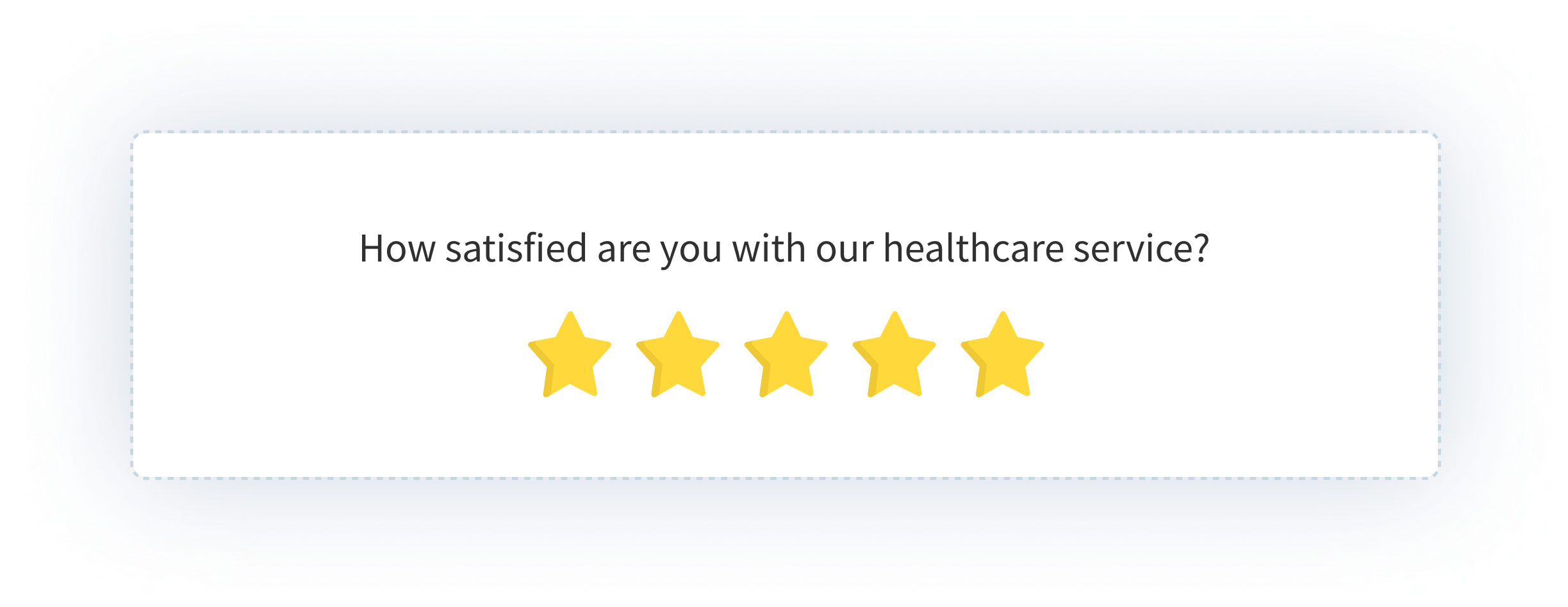
Healthcare
Patient-facing healthcare sites use website surveys for satisfaction measurement across multiple touchpoints: appointment booking flows, information pages, post-discharge care instructions. The anonymous visitor model is especially useful here because patients are more likely to share honest feedback when their identity isn't attached to the response.
Healthcare websites also carry a specific challenge: visitors are often anxious, in a hurry, or coming to the site for information about something that's already stressful. Timing is more consequential here than in most other verticals. An exit intent popup on a page about a serious diagnosis is a bad experience regardless of what it asks. A satisfaction survey on the appointment booking confirmation page, after the visitor has completed what they came to do, is a reasonable ask.
One compliance note worth keeping in mind: for public-facing healthcare pages, anonymous survey mode should be the default. Don't collect personally identifiable information through website survey widgets unless you have the appropriate consent and compliance framework already in place.
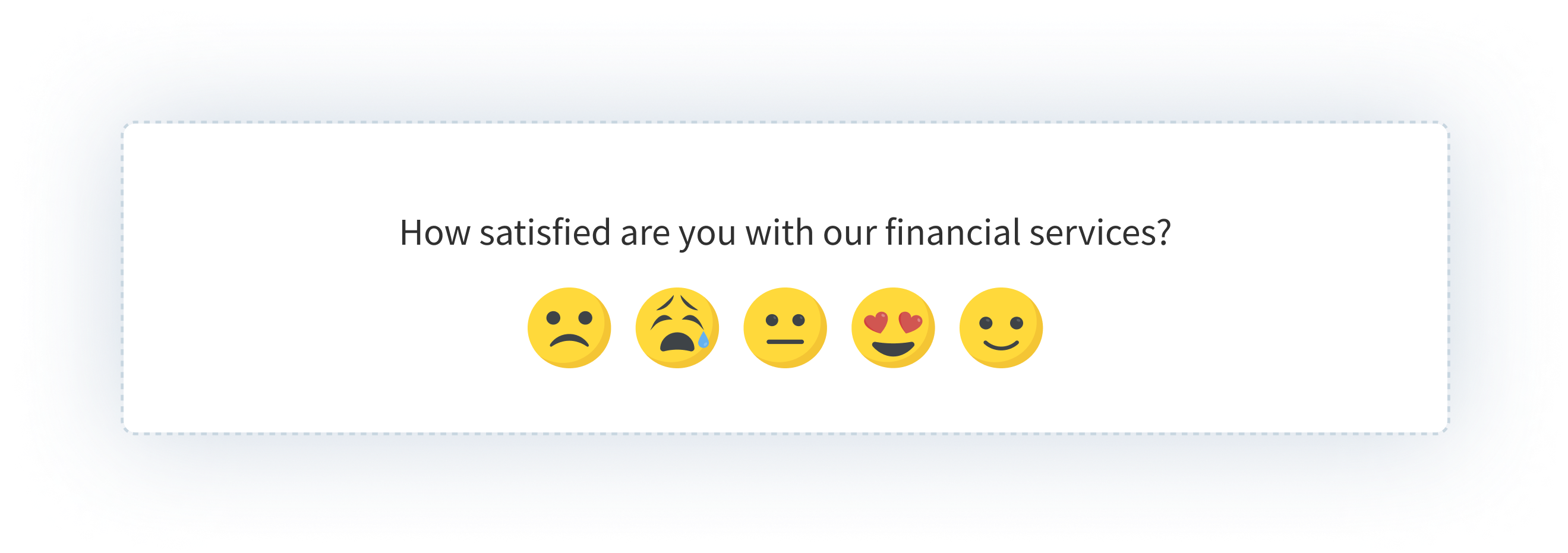
Financial Services
Financial services teams typically care most about effort. Not satisfaction in the abstract, but how hard was it to complete a specific thing? The CES (Customer Effort Score) format maps directly to this: "How easy was it to find what you were looking for on this page?" asked after a visitor spends meaningful time on a branch locator, a product comparison page, or an application flow.
Trust is the underlying metric in fintech. Friction erodes it quietly, before it ever shows up in churn data. Website surveys are how you find the friction points early enough to do something about them.
Website Survey Examples from Real Deployments
The best way to understand what a well-run website survey program looks like is to see specific deployments: what was placed where, triggered how, and what it measured.
G2: Three Surveys, One Workspace, Page-Level Targeting
G2, one of the largest SaaS review platforms globally, runs three separate website surveys across their platform, each targeting a distinct page type with a different question. The review submission page captures feedback on the submission experience. The pricing page captures intent and friction signals from high-consideration visitors. The research content pages capture content relevance ratings from readers.
All three run from a single Zonka workspace. Page-specific targeting rules mean each survey only appears on its designated pages. Not site-wide. The result: over 33,700 responses collected, each tied to the exact page and moment that generated them. No averaging across unrelated contexts. Every response is interpretable.
The deployment principle: one workspace, multiple focused surveys, each scoped to the page where the feedback question actually makes sense.
SmartBuyGlasses: Multilingual NPS and CSAT Across 30+ Countries
SmartBuyGlasses, the global eyewear retailer, faced a specific problem: running meaningful website surveys across 30+ countries without maintaining separate survey versions for each market. Managing individual language versions creates inconsistency in both question wording and response data.
Their solution: website popups and side tabs running NPS and CSAT surveys with automatic multilingual delivery. One survey, translated automatically, same question logic across every market. Over 84,000 responses collected. NPS improved by 30%, driven in part by finally being able to segment responses by country and identify which markets had friction that others didn't.
The deployment principle: for global programs, multilingual survey delivery from a single setup is the difference between consistent data and a patchwork of incomparable results.
Exit Intent on a Checkout Page: The Abandonment Signal
One of the highest-signal deployments in any e-commerce program requires no named case study because the pattern is consistent. An exit intent popup on the checkout page asks one question: "What stopped you from completing your purchase today?" with four multiple-choice options (pricing, shipping costs, payment method, other) and an open-text field.
It fires only when the visitor's cursor moves toward closing the tab. It asks one question. The multiple-choice options produce categorized, quantifiable data. The open-text field catches scenarios that weren't anticipated. The response comes from a visitor who was moments away from converting, which makes it more accurate than any post-event survey.
Website Survey Best Practices (And What Gets Them Killed)
Every guide on website surveys includes "keep it short" as a best practice. That's true, but it's incomplete. The failure modes in website survey programs tend to be more specific.
Website Survey Response Rate Benchmarks
Response rates vary significantly by format and trigger. These ranges are based on industry benchmarks across website survey deployments. Use them as reference points, not targets, since your actual rates will vary based on question clarity, audience, and timing.
| Format | Trigger Type | Typical Response Rate | Notes |
| Exit intent popup | Exit intent | 5–15% | Low rate but high-intent respondents — those who answer are highly motivated |
| Time-delayed popup | 15–30 sec delay | 10–20% | Improves significantly over page-load triggers |
| Scroll-based popup/slide-up | 50–70% scroll depth | 15–25% | Catches engaged readers, not bouncers |
| Post-action popup | Post-purchase / post-form | 15–30% | Highest-quality signal — visitor just completed something |
| Embedded / bottom-bar | Always visible | 25–40% | Best rates when placed at natural content endpoint |
| Side tab / feedback button | Visitor-initiated | 2–8% | Lower volume, but every response is self-selected and high signal |
The pattern across all formats: contextual timing beats convenience timing. A survey shown after a meaningful action always outperforms a survey shown at page load. The format matters less than the moment.
One question beats five. Completion rates drop off sharply after the second question on in-session surveys. For a deeper cut on the tactical side of all of this, website survey best practices goes into more granular detail on question design, timing rules, and frequency management. Exit intent surveys are the extreme case: you have seconds, and a visitor whose cursor is already heading toward the close button won't answer three things. Ask one thing. Ask it clearly. If you genuinely need to understand multiple dimensions of the same visit, run two surveys on two different pages rather than one survey with five questions.
Page-load triggers are the weakest option. Showing a popup the moment someone arrives catches a visitor who hasn't formed a single opinion yet. A 15-second delay, a 50% scroll trigger, or an exit intent condition all produce more useful responses because they catch visitors at a moment of actual engagement with the page. Not the moment of arrival.
Over-surveying compounds. A visitor who dismisses your exit popup today is less likely to engage with your satisfaction slide-up next week. Frequency caps aren't just polite behavior. They protect the long-term health of your feedback program. Run aggressively for two weeks and you train your audience to close surveys on sight.
Mobile design is not optional. If your popup is built for a 1200px viewport and you're not targeting mobile separately, you're serving a broken experience to more than half your visitors. This one gets ignored surprisingly often, usually because the person setting up the survey is looking at a desktop preview.
Acting on feedback closes the loop. A survey program that produces a spreadsheet nobody reads is worse than no survey program. Not for philosophical reasons. For practical ones. Teams that collect feedback and don't change anything eventually stop running surveys. The next team that tries to restart the program has to rebuild trust with visitors who remember being asked and seeing nothing improve.
The fix is to assign ownership to the output of every survey you run before you launch it. Not "someone will look at this." A named person, a specific review cadence, and a clear decision point. Even if the decision is "we reviewed the responses and chose not to change anything yet, and here's why," that decision still needs to be made and recorded. The discipline of deciding what to do with feedback is what separates a survey program from a feedback graveyard.
On question length: each additional question costs more than teams expect. Moving from one question to two typically cuts completion rates roughly in half for in-session surveys. For in-session triggers (exit intent, scroll-based, time-delayed), one question is almost always right. For post-conversion placements on thank-you pages and order confirmations, you have more latitude. Visitors who just completed an action tend to answer two or three questions before moving on.
On response rates: website surveys typically see 10-30% completion rates depending on format and trigger. Exit intent surveys run lower, around 5-15%, because you're catching visitors at a moment of departure. Embedded content surveys run higher, sometimes 25-40%, when placed at a natural read-completion point. Contextually triggered surveys outperform page-load triggers consistently, regardless of format.
Those ranges aren't goals. They're baselines. Your actual rates will vary based on question clarity, timing, visitor intent, and how much trust you've built with your audience over time. A brand new program typically starts at the lower end of each range and improves as you refine targeting and question framing. A mature program, one that's been running for six months with deliberate optimizations, often sits comfortably in the middle or upper end.
Common Website Survey Mistakes
Good mechanics don't prevent bad judgment. These are the mistakes that turn a well-set-up survey program into noise, or no responses at all.
Targeting every page site-wide. The most common default. A survey that runs on every page of your domain collects an averaged signal that obscures every problem beneath it. The checkout page's friction gets diluted by the homepage's satisfaction. Run page-specific surveys. Ask the question where the answer matters.
Firing on page load. Showing a popup the moment someone arrives catches a visitor who hasn't formed a single opinion yet. They haven't read anything, clicked anything, or done anything. The survey fires into a vacuum. A 15-second delay, a 50% scroll trigger, or an exit intent condition all produce more useful responses for the same effort.
Asking five questions when you mean to ask one. Exit intent surveys are the worst offender. A visitor whose cursor is already heading toward the close button won't answer four follow-up questions. Ask one thing. The completion rate on a single well-framed question is often five times higher than on a three-question form shown in the same context.
Not optimising for mobile. Over half of web traffic is mobile. A popup designed for a 1200px desktop screen is unreadable on a 375px phone. If you're not testing the survey on mobile or setting device-specific targeting rules, you're serving a broken experience to most of your audience without realising it.
Surveying the same visitors repeatedly. Frequency caps exist for a reason. Showing the same survey to the same visitor every session trains them to dismiss it on sight. That dismissal habit persists across all your future surveys. Once every session is often too frequent. Once per visitor is almost always the right default for most programs.
Collecting feedback with no action attached. This is the failure mode that kills feedback programs entirely. Responses accumulate, nobody reviews them on a regular cadence, nothing changes, and the program quietly gets turned off. Before launching any survey, assign an owner to the output, set a review cadence, and define what action a response should trigger. The survey is only as useful as the process that follows it.
How to Analyze Website Survey Results
Collecting responses is the easy part. What you do with them determines whether the program was worth running. There are three layers to work through: scoring, open-text, and loop closure.
Metric-Based Scores (NPS, CSAT, CES)
Track scores over time and segment by page, device, and traffic source. A satisfaction score that looks healthy at the site level can be hiding a specific page with a serious problem. The aggregate obscures what the segment reveals. This is the most common analysis mistake.
Segmentation by page is the most immediately useful cut. If your site-wide NPS is 45 but your checkout page satisfaction is 28, the problem isn't your brand — it's your checkout flow. Track trends over time within each page segment, and flag drops that follow specific changes: a redesign, a new checkout step, a pricing change.
Open-Text Responses
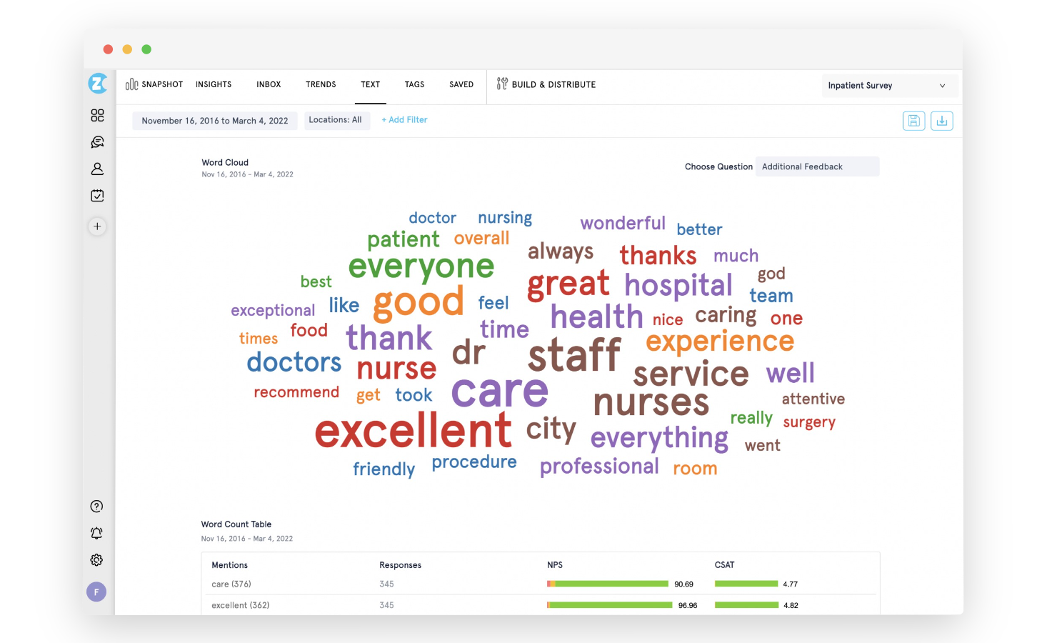
At low volumes (under 100 responses per week), manual categorization works fine. Scan for recurring themes, specific friction points, and language that shows up repeatedly. Group similar responses into buckets. The goal is to understand which problems are common and which are isolated.
At higher volumes, manual review becomes impractical. AI-assisted thematic analysis handles what manual review can't, clustering open-text responses automatically and surfacing the themes that are growing in frequency. The goal isn't to read every response. It's to know, reliably, which themes are increasing, which are declining, and which emerged this week that weren't there last month.
Closing the Loop
A response that identifies a problem should trigger a downstream action. That might mean a Jira ticket for a UX bug, a copy change on a high-friction page, or an alert to the customer success team when a detractor response comes through a post-conversion survey. Closing the feedback loop isn't done when you read the response. It's done when something changed because of it.
A practical framework: triage responses into three buckets on a weekly basis. Responses that point to a known issue get tagged and added to the existing work item. New issues get routed to the relevant owner. Outliers get logged and set aside. The weekly triage shouldn't take more than 30 minutes. The discipline is doing it every week rather than batching it quarterly.
At scale, that weekly triage breaks down. When you're collecting thousands of responses across multiple pages, the analysis layer needs to shift from reactive to proactive — from opening a dashboard to check scores, to the platform surfacing signals before small issues become visible problems.
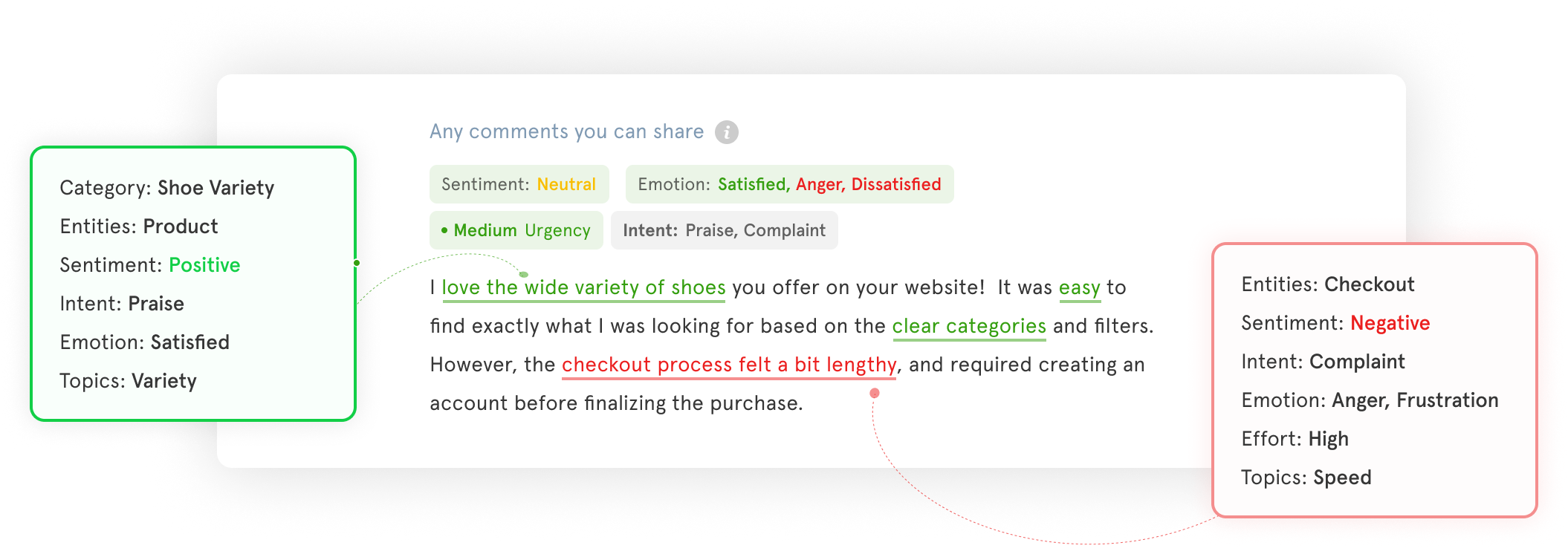
That shift is what Zonka's AI Feedback Intelligence is built for. It clusters open-text responses into themes automatically, scores sentiment at the response level, maps feedback to specific pages, agents, or products, and routes signals to whoever owns that area. A drop in checkout page satisfaction doesn't wait for someone to notice it in a weekly review. It triggers an alert. A new complaint theme surfaces as a signal, not a pattern you discover three months later. It sits inside the same website survey software platform used for collection, so there's no pipeline to build or separate tool to connect.
How to Create a Website Survey with Zonka
Getting a website survey live takes less time than most teams expect. The setup is a one-time code installation; everything after that is dashboard configuration. Here's the exact sequence inside Zonka.
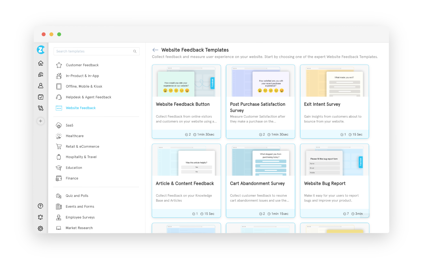
Step 1: Choose a survey template. Log into Zonka Feedback and select 'Add Survey'. Choose from ready-made templates (website feedback, exit intent, post-purchase, bug report, and more) or start from scratch. Picking a template that matches your use case saves time and pre-populates the most relevant question types for that context.
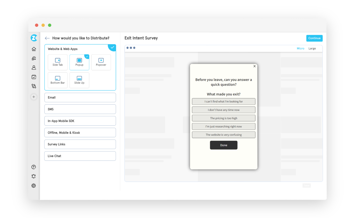
Step 2: Select the website widget type. Choose which widget format you want: popup, popover, slide-up, side tab (feedback button), or bottom bar. Each has different trigger mechanics and visitor relationships. The Types section above covers how to choose. This selection determines how the survey appears on your site.
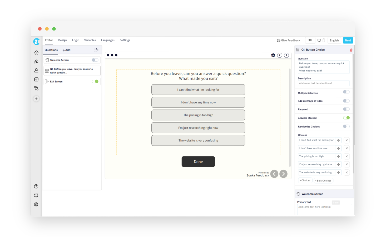
Step 3: Design the survey. In the survey builder, add your question types: NPS, CSAT, CES, star rating, smiley face, open-ended text, multiple choice, or Likert scale. Configure branching logic and skip logic if the survey needs conditional paths. Customise branding (logo, colors, fonts, welcome screen, exit screen) under the Design tab. Switch languages under the Languages tab to serve multilingual audiences from a single survey.
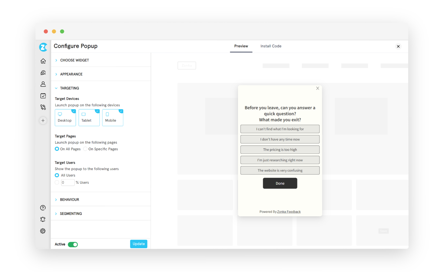
Step 4: Set targeting rules. Under the Targeting tab, define which pages the survey appears on, which devices (desktop, mobile, tablet), and what percentage of visitors should see it. In logged-in mode, you can also target by user attributes: subscription plan, signup date, geographic region, or any custom variable you pass through the JS client code.
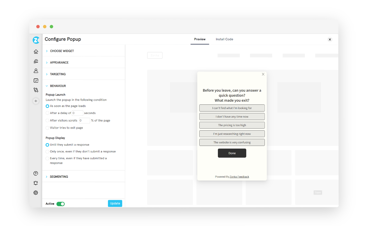
Step 5: Configure behavior. Under the Behavior tab, set the trigger type: time delay (e.g., show after 15 seconds), scroll depth (e.g., after 50% of the page), exit intent, or a custom event. Set display frequency: show once per visitor, show until submitted, or show per session. These settings apply without any code changes; the JS snippet you'll install in the next step reads them automatically.
Step 6: Install the JS snippet once. Go to Settings → Developers → JS Client Code and copy the workspace code snippet. Paste it into the <head> of your site, or deploy it through Google Tag Manager without touching your codebase. Every survey in that workspace goes live automatically after this single installation. No redeployment required when you create new surveys or change settings.
Step 7: Test before going live. Add #zf_debug=true to the end of any page URL where the code is installed. A debug panel confirms whether the snippet is active and communicating correctly with Zonka's servers. Remove the debug flag before sending live traffic to the page.
Most teams get their first survey live in under an hour. The front-loaded investment is in Steps 4 and 5: getting the targeting and behavior right on the first program makes every subsequent one faster.
For a deeper technical walkthrough, the step-by-step guide to creating a website survey covers the build process end to end. If you're still evaluating platforms, best website feedback tools compares the leading options by use case.
Want to see the targeting logic and workspace setup before you build? Schedule a demo and we'll walk through a configuration that fits your site structure.
Conclusion
Most teams get their first survey live in under an hour from the time they create the workspace to the time the first response comes in. The investment is front-loaded in the targeting decisions. Getting those right on the first program makes every subsequent one faster.
If you want a full step-by-step walkthrough with more technical detail, the step-by-step guide to creating a website survey covers the build process end to end. And if you're still evaluating which platform to use, best website feedback tools compares the leading options by use case.
Want to see the targeting logic and workspace setup before you build? Schedule a demo and we'll walk through a configuration that fits your site structure.


.svg)


.svg)


