


.svg)
 Healthcare
 Finance
 Retail
 SaaS & Digital
 eCommerce
 Education
 Salesforce
  HubSpot
 Pipedrive
 Mailchimp
 Zendesk
  Intercom
 Freshdesk
 HelpScout
  Front
Front Jira
Jira Slack
Slack  MS Teams
 Zoom
Zoom Google Sheets
  Zapier
  Integrately
 Make
Make  Webhooks


 MS Teams


TL;DR
- A feedback widget is a small embeddable element (button, popup, slide-up, popover, or bottom bar) that collects user feedback directly on your website without disrupting the session.
- Five widget types cover most use cases. Side tabs and bottom bars work for always-on feedback. Popups and slide-ups work for moment-triggered feedback. Popovers work for inline, page-specific feedback.
- Setup takes ten minutes with a no-code tool. Paste a JS snippet before
</body>, configure triggers, target your audience, test on staging. - Pick the widget that matches the moment, not the one that looks nicest.
Most teams collect feedback the slow way. They send an NPS email a week after a purchase. They schedule user interviews three sprints out. They wait for a support ticket to escalate before anyone asks the question that should have been asked at signup.
The feedback that changes anything is in-the-moment feedback. The feedback you get while the user is still on the page, still annoyed, still in the flow that's about to break. That's the gap a feedback widget fills.
A widget sits on your site, waits for the right trigger, and asks the question while the answer is still fresh. No follow-up email needed. No two-week lag. Just the user, the moment, and a one-line response box.
This guide covers what feedback widgets are, the five types worth knowing, how to pick one for your use case, and how to install one on your site. If you're starting from a website surveys guide and need the widget-level detail, you're in the right place.
What Is a Feedback Widget?
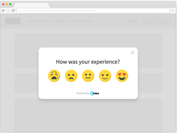
A feedback widget is an embeddable element on your website (a button, popup, popover, slide-up, or bottom bar) that lets visitors submit feedback in the moment, without leaving the page or filling out a separate form.
You install it by pasting a small JavaScript snippet into your site. From there, the widget loads with the page, fires based on triggers you set (time, scroll, exit intent, click, custom event), and routes responses into a feedback dashboard or your CRM. No engineering rebuild. No redirect to a survey URL. The user stays in your flow.
The widget format matters because the format dictates the response rate. A side tab catches passive feedback at 2-4% of traffic. A well-timed exit-intent popup pulls 8-12%. A slide-up after a key event sometimes hits 15-20%. The same question gets a wildly different answer rate depending on how you ask it.
Which Feedback Widget Should You Use?
Before the type-by-type breakdown, here's the shortcut. Match the widget to the moment, not the other way around.
| Your Goal | Best Widget Type | Why |
| Always-on, passive feedback channel | Side Tab or Bottom Bar | Non-intrusive; users self-serve when they want to talk |
| Post-action feedback (purchase, signup, ticket close) | Popup | Grabs attention right after the moment that matters |
| Exit intent or cart abandonment | Popup with exit trigger | Catches them before they leave the funnel |
| Page-specific or content feedback | Popover | Embedded inline; feels like part of the page |
| Scroll-triggered or time-based engagement | Slide Up | Appears without interrupting the read |
| Bug reports on a live product | Side Tab (persistent) | Always available when something breaks |
| Newsletter or content opt-in nudges | Popover or Bottom Bar | Visible without blocking the screen |
The rest of this guide goes deeper on each type: what it looks like, when it works, and the response rates you can expect.
Types of Feedback Widgets
Five widget types cover almost every use case. Here's how each one works, when to use it, and what to expect.
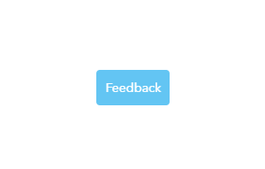
1. Side Tab Feedback Widget
A side tab is a small button anchored to the left or right edge of your page. It stays visible as the user scrolls, opens a feedback form when clicked, and otherwise stays out of the way. It's the lowest-friction widget format on this list.

The button itself usually says "Feedback" or "Share Feedback." On click, a side panel slides out with your survey questions. Users can submit and dismiss without leaving the page. You can set targeting rules so the tab only shows on certain pages, to certain audiences, or only on desktop (mobile real estate is precious).
Characteristics:
- Always visible, scrolls with the user
- Takes minimal screen space
- Captures unsolicited feedback (the user initiates)
- Configurable per page, segment, or device
- Pairs well with bug-report flows for beta users
When to use it:
- Content feedback: on blogs, articles, knowledge base pages where you want reader reactions
- Website usability feedback: on landing pages, paired with a website feedback survey template
- Product feedback: inside SaaS apps where users have ongoing thoughts to share
- Bug reports or feature suggestions: on staging environments or for beta cohorts
- Newsletter prompts: show only to non-subscribers
Typical response rate: 2-4% of visitors who see the tab. Low, but the responses are unsolicited and high-signal — these users wanted to talk. For a deeper look at this format, see the website feedback button guide. If you want to see Zonka's implementation, check out Zonka's feedback button widget.
2. Popup Feedback Widget
A popup is a centered overlay that interrupts the page and asks for feedback. It's the most attention-grabbing widget format. It's also the easiest one to misuse.
The popup works because it can't be ignored. It works in spite of the user's irritation, not because of their willingness. Which means the rule for popups is the inverse of the rule for side tabs: time it perfectly, or don't use it at all.
Characteristics:
- Full attention; nothing else on screen matters until the user closes or responds
- Trigger-driven: time on page, scroll percentage, page visit count, custom events
- Highest response rate of any widget format
- Highest annoyance ceiling, too; bad timing tanks UX scores
- Best paired with a survey software that supports granular triggers
When to use it:
- Post-purchase feedback: fire the popup on the order confirmation page with a quick CSAT or post-purchase survey question set
- Website experience surveys: time-based or scroll-based, after the user has actually engaged with content
- Post-interaction surveys: right after a support chat closes, asking CES-style questions about effort
- Cart abandonment: fire when the user moves to close the tab on a checkout page; ask why they're leaving
- Exit intent: pair with popup surveys configured to detect mouse movement toward the close button
Typical response rate: 15-30% of triggered users for well-targeted popups. Drops to 3-5% if the popup fires too early or shows on every page. The variance is huge, and the variance is mostly your fault.
3. Popover Feedback Widget
A popover is an embedded button that lives inside the page itself, not anchored to an edge. When clicked, the feedback form opens right where the button sits. It's the format you reach for when you want feedback on a specific section without dragging the user's attention elsewhere.
Think of it as a side tab that you place inline. The user is reading a section, sees the button, clicks, answers, and continues reading. No layout shift. No interruption.
Characteristics:
- Embedded anywhere on the page (inside a content block, beside a feature, under an image)
- Opens the feedback form in place, not as an overlay
- Doesn't compete with other UI elements on the page
- Best for context-specific, opt-in feedback
When to use it:
- Content rating on articles: "Was this helpful?" placed at the end of a blog or doc page
- Feature-level feedback in product: beside a new feature in your app, asking what users think
- Post-purchase touchpoints: embedded in the receipt or thank-you page, not popped over it
- Knowledge base pages: at the bottom of help articles, capturing whether the answer worked
Typical response rate: 1-3% of page viewers. Low volume, but the feedback is hyper-contextual — you know exactly what the user was looking at when they answered.
4. Bottom Bar Feedback Widget
A bottom bar is a thin, persistent strip docked to the bottom of the page. It runs across the screen (or a portion of it) and works similarly to a side tab. Click it, the feedback form opens. Otherwise it stays passive.
The difference between a bottom bar and a side tab is mostly visual real estate. A side tab is small and vertical. A bottom bar is horizontal and harder to miss but easier to dismiss as decoration. Both work for the same use cases. Choose the one that fits your page layout.
Characteristics:
- Runs along the bottom edge of the page
- Persistent, scrolls with the user (or stays sticky)
- Slightly higher visibility than a side tab
- Easy to mistake for a cookie banner if you're not careful with copy
- Non-intrusive, like a side tab
When to use it:
- Website usability feedback on landing pages
- Content feedback across a blog
- Product feedback inside a SaaS app
- Newsletter or announcement nudges that need a wider footprint
Typical response rate: 2-5% of visitors. Slightly higher than a side tab because of the larger surface area. Mobile responsiveness is critical here — a bottom bar that covers your CTA on a 4-inch screen will tank conversions faster than it captures feedback.
5. Slide-Up Feedback Widget
A slide-up appears from the bottom corner of the screen, slides into view based on a trigger, and stays until dismissed or answered. It's the middle ground between a popup (intrusive, centered) and a side tab (passive, docked).
The slide-up is the format that most modern SaaS products converge on. It's visible enough to get noticed, contained enough to not block the page, and triggerable enough to fire at the right moment. Think Intercom-style chat widgets, but for feedback.
Characteristics:
- Anchored to a corner (usually bottom-right)
- Trigger-driven, like a popup, but doesn't take over the screen
- Allows the user to keep reading or working while they decide whether to engage
- Lower annoyance ceiling than a popup, higher response rate than a side tab
- Mobile-friendly when sized correctly
When to use it:
- Cart abandonment: slides up when the user lingers on the cart page
- Exit intent: softer than a popup, fires on the same trigger
- Website feedback during the session, after the user has spent X minutes or scrolled Y%
- Post-interaction feedback that doesn't justify a full popup
- Post-transaction feedback on order or signup confirmation pages
Typical response rate: 8-15% of triggered users. The sweet spot between visibility and friction.
Popup vs. Feedback Button: Which Should You Use?
This is the comparison most teams agonize over. The answer is usually "both," but the reasons matter.
A popup interrupts. A feedback button (side tab or bottom bar) waits. They serve different jobs.
| Dimension | Popup | Feedback Button (Side Tab / Bottom Bar) |
| Intrusiveness | High; takes over the screen | Low; sits passively at the edge |
| Response rate | 15-30% of triggered users | 2-4% of all visitors |
| Best for | Time- or action-triggered moments | Always-on, opt-in feedback channel |
| Risk | Annoys users if mistimed | Easy to miss; low volume |
| Mobile behavior | Can feel disruptive on small screens | Scales cleanly if sized right |
| Use when | You know the exact moment that matters | You don't know when feedback will strike |
| Skip when | Users are mid-task and can't be interrupted | You need volume on a specific question |
In practice, most mature feedback programs run both. A persistent button gives users an always-on channel for unsolicited feedback. One or two carefully timed popups capture the moments that matter (exit intent, post-purchase, post-support). The button catches the long tail. The popup catches the spike.
If you have to pick one, pick the button first. It's lower-risk, easier to install, and harder to get wrong.
How to Add a Feedback Widget to Your Website
The general pattern looks the same across most tools. You build the widget in a feedback platform, configure triggers and targeting, copy a JavaScript snippet, paste it into your site, and test before you ship.
Here's the step-by-step.
Step-by-Step Setup
- Choose a feedback widget tool. Look for: visual builder, multiple widget formats (popup, slide-up, side tab, etc.), trigger logic (time, scroll, exit intent, custom events), audience targeting, and CRM integration.
- Design your widget. Pick the type, write 2-3 questions max, set the branding (color, logo, button text). Keep it short. Every extra question drops response rate.
- Configure triggers. Decide what fires the widget: page load, time on page, scroll depth, exit intent, click event, or custom event from your product.
- Target your audience. Set rules for who sees the widget: specific pages, user segments, devices, returning vs. new visitors.
- Copy the JavaScript snippet. Most tools generate it for you in one click.
- Paste before the closing
</body>tag. This is the standard install location across feedback platforms. - Test on staging first. Verify the widget loads, triggers fire correctly, and responses route to your dashboard.
- Publish.
Installing on Specific Platforms
The paste-the-snippet logic is the same everywhere. The location varies.
- WordPress: Use a code-injection plugin (like WPCode) or paste into your theme's
footer.phpbefore</body>. If you're on a managed host, the admin dashboard usually has a "custom HTML" or "header/footer scripts" field. - Shopify: Paste into
theme.liquid, just above the closing</body>tag. Test on a draft theme first. - HubSpot: Use the "Site Settings → Website → Pages" section to add the snippet to footer HTML site-wide, or page-by-page.
- Webflow: Add to "Site Settings → Custom Code → Footer Code."
- Wix: Use the "Custom Code" feature under "Tracking & Analytics" in the dashboard.
- Raw HTML: Paste before
</body>on every page where the widget should fire.
Example Code Snippet
A typical feedback widget snippet looks like this:
<script src="https://widget.zonkafeedback.com/v1/widget.js"
        data-widget-id="your-widget-id"
        async></script>
The data-widget-id attribute tells the script which widget to load. The async attribute makes sure the snippet doesn't block your page from rendering. That's the whole install.
Going Code-Free
You don't need a developer to install a widget. Most modern feedback tools, including Zonka, offer:
- One-click integrations with WordPress, Shopify, HubSpot, Wix, and Webflow
- A Chrome extension for previewing widgets on staging environments
- A no-code visual builder for designing the widget itself
If your CMS isn't on the list, the snippet method works on any site that lets you edit raw HTML.
Best Practices for Using Feedback Widgets
Six practices that separate widgets that get answered from widgets that get ignored.
1. Don't fire popups in the first 10 seconds
A user who's been on your page for eight seconds hasn't formed an opinion yet. They're still scanning your nav, still figuring out what your product does. Triggering a popup now means you're interrupting them, not hearing them. Wait at least 30 seconds, or trigger on a meaningful event (scroll past 50%, second page visit, click on a CTA).
2. Match the widget to the moment, not the brand guidelines
The right widget format is the one that fits the user's mental state at that moment. A user mid-checkout doesn't want a slide-up about your blog. A user reading a help article doesn't want a popup about pricing. Build around the use case first. The branding is the easy part.
3. Two questions, three at the absolute most
Every additional question drops response rate by roughly 15-20%. A 10-question survey in a popup gets the same number of responses as a 2-question survey, except 80% of those responses are partial. Keep it tight. If you need depth, route the user to a longer survey AFTER they've answered the first two.
4. Close the loop visibly
Telling the user "we got your feedback" inside the widget isn't closing the loop. Closing the loop is sending them an email a week later that says "you asked for X, we shipped X." A public changelog beats a private CRM note every time. For more on this, see closing the customer feedback loop.
5. Mobile-first, not mobile-afterthought
Roughly 95% of internet users access websites on mobile devices. Your widget should be tested on a four-inch screen before it's tested on desktop. A bottom bar that covers your "Add to Cart" button on mobile will lose you more revenue than it captures feedback.
6. Don't run two widgets on the same page
A popup, a slide-up, and a bottom bar firing on the same page is hostile UX. Pick one widget per page. If you absolutely need two, time them so they never overlap (e.g., a passive side tab plus an exit-intent popup).
Why Use Feedback Widgets
If you're here, you already know the why. Briefly, the reasons that hold up in practice:
- In-moment capture. You hear the reaction while the experience is still fresh, not two weeks later in a recall-distorted email survey.
- Higher response than email. Widgets typically pull 5-10x the response rate of email-based feedback collection.
- Page-specific context. You know exactly what the user was looking at when they responded, which makes the feedback actionable instead of abstract.
- Lower friction. Users don't have to switch context, open a new tab, or remember a survey link. Click, answer, done.
That's the case. Now let's get to the practical stuff.
Conclusion
Feedback widgets are the difference between feedback you get and feedback you act on. The format you choose dictates the moment you capture, the response rate you see, and the kind of insight you can act on next.
Pick the widget that matches the moment. Run it where the friction is. Close the loop visibly when responses come in. That's the loop.
If you're ready to put a widget on your site, Zonka Feedback's website survey software supports all five widget types covered here, with no-code install across every major CMS.


