


.svg)
 Healthcare
 Finance
 Retail
 SaaS & Digital
 eCommerce
 Education

 Salesforce
  HubSpot
 Pipedrive
 Mailchimp
 Zendesk
  Freshdesk
 HelpScout
  Front
Front Slack
Slack  Zoom
Zoom Google Sheets
  Zapier
  Integrately
 Webhooks
  Blogs
Blogs Webinar
 Product Updates


TL;DR
- A website usability survey is a short, in-context survey that captures why visitors hesitate, struggle, or leave. Heatmaps and analytics show you what happened; usability surveys answer why.
- The 8 question categories below cover every usability dimension worth measuring: general, design, mobile, redesign, navigation, content, payment, and performance.
- Placement matters as much as the questions. The same survey performs differently on the homepage, the pricing page, an exit-intent trigger, and a high-bounce product page.
- The System Usability Scale (SUS) gives you a 10-question, 0–100 benchmark you can track release over release. Average product scores sit around 68.
- Pair usability surveys with session recordings and heatmaps. Surveys answer why, behavioral tools show what happened and where. The three together cut interpretation time in half.
Most usability surveys fail the same way.
They ask 25 questions when 8 would do. They launch as a homepage popup that nobody reads. The responses pile up in a sheet. A month goes by. Somebody looks at the open-ended answers, shrugs, and closes the tab.
The survey ran. The data sat. Nothing changed.
That's the gap this guide is built for. Not the surveys that run. The ones that produce action.
If you're looking for a quick definition and a question bank to copy, the next two sections hand that to you. If you're building a usability program that actually informs design decisions, the kind where a drop in SUS triggers a sprint and not a slide deck, keep reading. The later sections on placement, analysis, and the System Usability Scale are where the work lives.
We've watched customers ship thousands of website surveys across SaaS dashboards, ecommerce checkouts, healthcare portals, and banking apps. A few patterns hold up across all of them. We'll name them as we go.
Website usability survey: A short questionnaire shown to visitors while they're on a website, designed to measure how easily they can find information, complete tasks, and move through the site. Usability surveys sit alongside behavioral tools like heatmaps and session recordings. The recordings show you what visitors did. The surveys tell you why.
What Is a Website Usability Survey?
The formal definition borrows from ISO 9241-11, which frames usability across three dimensions: effectiveness (did the user accomplish the task), efficiency (how much effort it took), and satisfaction (how they felt about it). A usability survey measures those three things directly, in the visitor's own words, while the experience is still fresh.
That's the textbook answer. Here's the working one.
A usability survey is a short survey that intercepts a visitor at a specific moment. After they've completed a task, on a page they're about to abandon, at the end of a redesigned flow. It asks a focused set of questions about that one experience. It's scoped. It's timed. It's built around one decision your team needs to make.
That's what separates it from a generic feedback form. A feedback form catches anything — a bug, a praise, a feature request, a complaint. A usability survey asks one question well: can people use this?
It also sits next to, not on top of, behavioral tools. Heatmaps show where people clicked. Session recordings show where they got stuck. Usability surveys tell you why. Run all three together and they answer different questions: what happened, where it happened, why it happened.
Nielsen's ten usability heuristics (visibility of system status, match between system and real world, user control and freedom, consistency and standards, error prevention) give you a vocabulary for what to ask about. Your survey operationalizes that vocabulary into questions a real visitor can answer.
Why Run a Website Usability Survey
Because analytics can't answer the question you actually care about.
Your dashboard tells you the pricing page has a 68% bounce rate. It doesn't tell you whether the plans are confusing, the pricing feels high, the page is too slow, or the CTA button is below the fold on mobile. All four are common. The fix for each is different. Guessing wrong burns a sprint.
A usability survey closes that gap. In practice, teams run them to:
- Diagnose a specific drop-off. When conversion on one page cracks, a 4-question exit-intent survey on that page surfaces the reason in a week.
- Validate a redesign before and after. Run a SUS baseline before launch. Run it again 30 days after. If the number moves the wrong way, you know before the quarterly dashboard tells you.
- Pressure-test a campaign landing page. Before a paid traffic push, a usability survey on the landing page catches the clarity gaps your own team stopped noticing weeks ago.
- Close the feedback loop. A survey without follow-up is extraction. A survey with visible follow-up, the kind where a respondent sees the change they asked for, is relationship.
- Feed the product roadmap. Open-ended responses over a quarter reveal patterns no one-off interview can. The top three themes usually surprise someone on the team.
Here's the pattern that holds across our customers: exit-intent placements pull higher response rates than static homepage surveys. Homepage surveys get scrolled past. Exit-intent surveys catch people at the moment they've decided something didn't work. That's exactly when their answer is most useful.
Industry reporting puts typical bounce rates between 41 and 55 percent. That's a third to a half of your traffic leaving with a reason you don't know. Usability surveys turn a slice of those exits into specifics.
Three things to acknowledge before the reframe.
The fear is real. Teams worry surveys annoy visitors, skew toward the angry minority, or surface complaints with no budget to fix. All three are legitimate concerns.
The fix isn't to skip surveys. It's to run them with the discipline that kills all three at once: short, well-timed, with a commitment to close the loop. That's what the rest of this guide is about.
Short surveys. Right moment. Visible action.
Everything else is noise.
When to Run a Website Usability Survey
The short answer: whenever the cost of guessing is higher than the cost of asking.
The longer answer has six clear triggers.
After a Redesign or Major Release
Redesigns are the single most common trigger, and also the one most teams get wrong. They run the survey once, after launch, and call it validation. That tells you how the new thing lands. It doesn't tell you whether it landed better than the old one.
The fix: baseline the SUS score on the current site before the redesign ships. Run the same SUS survey 30 days after launch. If the score moved up, the redesign paid off. If it flatlined, something shipped that wasn't worth the sprint. If it dropped, you have your priority list.
When a Page's Bounce or Exit Rate Spikes
A sudden spike on a previously stable page is the clearest signal for an exit-intent survey. Deploy it on that page only. Keep it to 3–4 questions. Give it two weeks. The responses will tell you whether it's content, speed, navigation, or something your team broke in the last deploy.
Before a Marketing Campaign Pushes Traffic to a Page
The expensive version of this lesson: a team buys a quarter of paid traffic to a landing page that tests well internally and converts at half the expected rate externally. The copy was clear to the people who wrote it. It wasn't clear to the audience.
A 5-question usability survey on that landing page the week before the campaign kicks off catches the gap early. Fixing it costs a morning. Discovering it after the campaign launches costs the campaign.
After Content or Copy Changes
A/B testing tells you which version converted better. It doesn't tell you why. A short content usability survey running alongside the test answers the why. The why is what you need to carry the learning to the next page, the next flow, the next rewrite.
Post-Purchase or Post-Conversion
The freshest impression. The highest-intent respondent. The cleanest signal.
Post-purchase surveys catch every friction point the buyer just walked through: payment, trust, speed, clarity. Miss that window by a week and you get generic answers.
On Pages With Persistent High Bounce
Some pages bounce hard not because something broke, but because something was never right. A pricing page that's always confused people. A comparison table that's always been cluttered. These pages need a different trigger: not an event-based launch, but a rolling survey that collects over time.
Practitioner rule of thumb: Keep usability surveys to 10–15 questions, or fewer if every question is rating-based. Anything longer burns your completion rate and skews responses toward the patient minority. That's not the audience you need to hear from.
Where to Place Website Usability Surveys
Five placements cover most needs. The same survey produces different results on each, so match the placement to the question you're trying to answer.
1. Homepage
The homepage is where first impressions form. It's also where 90% of usability surveys get ignored, because visitors arrive with a task in mind and a popup in their way reads as an interruption.
The fix is tone and timing. A non-intrusive website feedback button that sits in the corner, available but not demanding, outperforms a centered popup on most homepages. For active questions, trigger only after the visitor has scrolled past the fold or spent 20+ seconds on the page. By then they've made a choice to stay.
Sample questions:
- What brought you to our website today?
- How did you first hear about us?
- What caught your attention first when you landed on the page?
- Did you find the information you were looking for?
What good answers look like: Specific sources ("Reddit thread about NPS tools") and specific intents ("comparing pricing with Qualtrics"). Generic answers like "Google" or "just browsing" usually mean the question was too broad or arrived too early.
2. Pricing or Post-Purchase Page
Pricing pages are where research turns into decision. Post-purchase confirmation pages are where decision turns into memory. Both moments are high-signal, and the questions differ.
On the pricing page: you're measuring clarity. Do visitors understand what they're paying for, and at what tier.
On the post-purchase page: you're measuring the purchase journey itself, while it's still fresh. Post-purchase survey templates structure the timing and question set so you don't have to build from scratch.
Sample questions:
- Do you believe our pricing offers good value for the features you receive?
- How satisfied are you with the pricing structure?
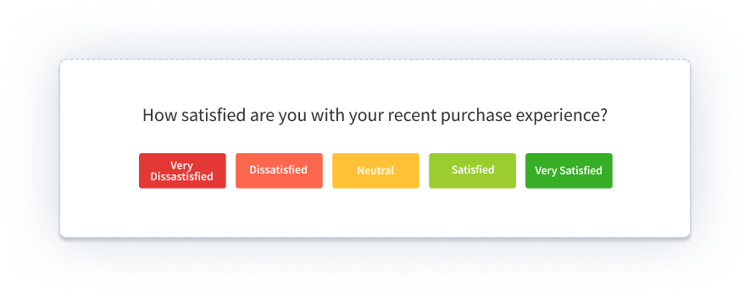
- How would you rate your purchase experience?
- What almost stopped you from completing the purchase?
What good answers look like: Named features ("I wasn't sure if the Pro plan included API access") and named friction ("the discount code field was hidden"). These are roadmap and copy fixes, not abstract perception issues.
3. Landing Page
Landing pages have one job: convert a specific audience into a specific next step. A usability survey on a landing page measures whether the message and the audience match.
Run it before a paid traffic push, or during the first two weeks of a campaign. Keep it to three questions.
Sample questions:
- Did you find the product information on this page clear?
- Were you able to understand the key features and benefits?
- On a scale of 1 to 5, how satisfied are you with your experience on this page?
-png.png?width=2022&height=1258&name=frame_generic_light%20(58)-png.png)
What good answers look like: Disconnects surface fast. "I thought this was a free tool, not a paid platform." "I couldn't tell if this works for my industry." These are messaging fixes, often worth a full copy rewrite before the campaign scales.
4. Exit-Intent
Exit-intent is the highest-yield placement for usability diagnosis. It catches visitors at the exact moment they've decided something didn't work, which is when their answer is most useful.
The exit-intent survey triggers when the mouse moves toward the browser close button or the back button. Keep it to 2–3 questions, maximum. A visitor who's already decided to leave won't fill out a 10-question form.
Sample questions:
- What led you to leave our website today?
- Was our website's performance satisfactory during your visit?
- Why didn't you complete your purchase?
- Is there anything we can do to make your experience better?
What good answers look like: A theme repeated across dozens of responses. One person saying "it's slow" is noise. Forty people saying "it's slow on mobile" is a ticket.
5. High-Bounce Pages
Some pages bounce not because of a sudden break, but because they've always been confusing. A pricing page with unclear tiers. A feature page with too much text. A comparison page that reads as biased.
For these, run a slow-collect usability survey: low trigger frequency, no aggressive popups, 3–4 questions. Let it gather 50+ responses over a month. Then read the themes.
Sample questions:
- What were you hoping to find on this page?
- What stopped you from finding it?
- Where would you have expected to find it instead?
What good answers look like: Mental-model mismatches. "I thought this page would show me customer examples, not feature lists." "I expected pricing to be on this page, had to click through." Each answer is a sitemap or content-hierarchy insight.
50+ Website Usability Survey Questions, Organized by Category

These eight categories cover every usability dimension worth measuring. Pick the category that matches your goal; pull 3–5 questions from it; don't try to run all eight at once.
Before you build from scratch: a pre-built website usability survey template with the question logic already wired saves the first afternoon of work.

1. General Usability Questions
The opener category. Useful when you don't have a specific page in mind, just a general pulse on whether the site works for the people using it. It's also where NPS sits most naturally as a loyalty proxy, measuring how likely visitors are to recommend the site to someone like them.
Sample questions:
- What did you like most about our website?
- Would you like to change anything on the site?
- On a scale of 0 to 10, how likely are you to recommend our website to a friend or colleague?
- Did you face any challenges while using the site?
- Did you accomplish what you came here to do?
- Feel free to share any comments or suggestions.

What good answers look like: Specific friction points ("I couldn't tell which plan included the API"). Generic answers like "it was fine" usually mean the question was too broad. If you're getting a lot of those, tighten the timing or swap to a more targeted category below.
2. Design Usability Questions
Design questions measure visual clarity and hierarchy, not aesthetic preference. Nobody cares if your visitor likes teal. Everyone cares whether the primary CTA is distinguishable from the secondary one.
A structured website design survey template covers visual hierarchy, color contrast, typography, and button clarity in one scoped set.
Sample questions:
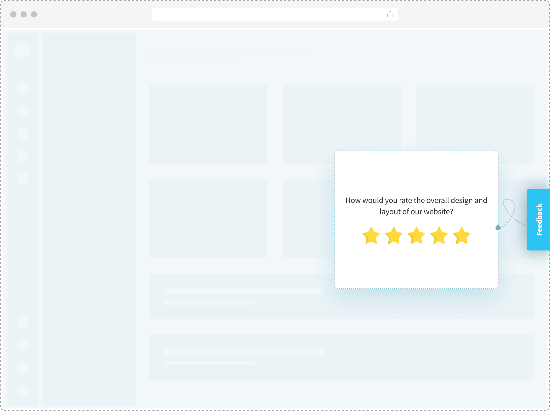
- How would you rate the overall visual design of our website?
- Were you able to clearly distinguish clickable elements from regular content?
- How useful and relevant did you find the images?
- Did the color contrast make text easy to read?
- Did any element on the page feel visually cluttered or distracting?

What good answers look like: Specific element callouts ("the green button and the green link looked identical") and accessibility flags ("text over the image was hard to read"). Generic "it looks nice" or "it's ugly" isn't usable feedback; it's taste.
3. Mobile Responsiveness Questions
Mobile is where most design problems become usability problems. Touch targets that work on desktop are too small on mobile. Text that's readable in a browser is illegible on a phone held at arm's length.
Ask these questions from respondents who actually completed the survey on mobile. Use device detection to filter.
Sample questions:
- How would you rate the usability of our website on your smartphone?
- How would you rate the design of our website on your smartphone?
- Were buttons and links easy to tap without accidentally hitting the wrong one?
- Was the text size readable without zooming?
- Did the website render correctly on your mobile browser?
- How did page load speed feel on mobile?

What good answers look like: Core Web Vitals failures showing up as human complaints. "The page jumped while I was trying to click" is Cumulative Layout Shift. "It took forever to load" is Largest Contentful Paint. These are engineering tickets, not design opinions.
4. Website Redesign Questions
Redesign questions work in two passes: before and after. The before-pass catches what people liked about the old site that you might accidentally throw out. The after-pass measures whether the redesign moved the number in the right direction.
Use a website redesign survey template to standardize the question set across both passes so scores are comparable.
Sample questions:
- How would you rate the usability of our new website compared to the previous version?
- What did you like most about the existing website that you'd want preserved?
- What aspects of the current website do you dislike?
- Is there anything on the new website that feels missing compared to the old one?
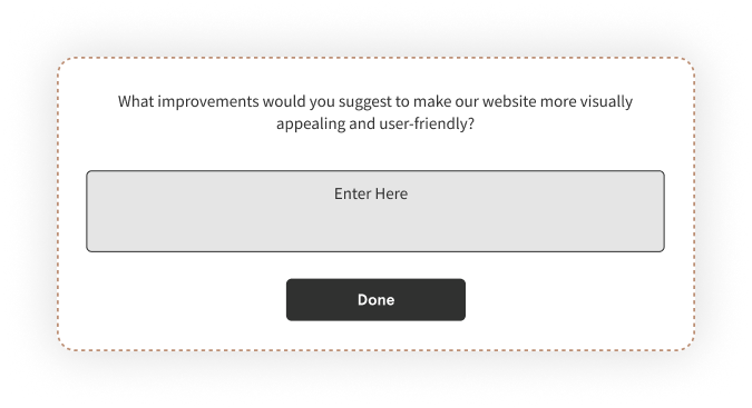
- What suggestions do you have to make the redesign stronger?

What good answers look like: Specific preservation requests ("the side navigation was faster than the new mega menu") and specific new-version wins ("checkout is three clicks shorter"). Vague "I liked the old one better" without detail is a data point, not an insight. Ask a follow-up.
5. Navigation Usability Questions
Navigation is where most bounce happens. If a visitor can't find what they came for in 15 seconds, they leave. Navigation questions measure whether your information architecture matches the mental model your visitors bring in.
Sample questions:
- How would you rate the ease of navigating our website?
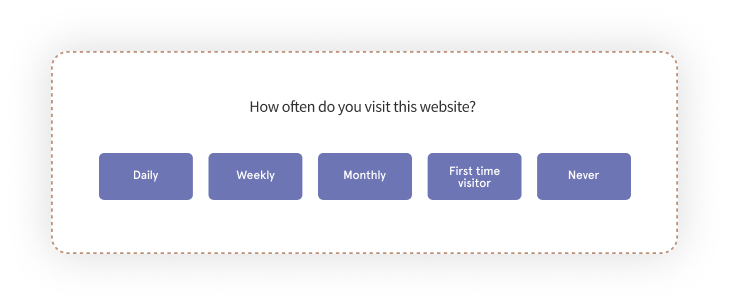
- Were you able to find the page you were looking for?
- How many clicks did it take to reach your destination?
- Did the menu structure feel intuitive?
- Did the search function return useful results?
- Did internal links take you to the pages you expected?

What good answers look like: Path friction ("I had to click Products, then Features, then scroll, then the link was called something different than what I searched for"). These are sitemap and taxonomy fixes. Breadcrumb visibility, mega menu structure, and search relevance all surface here.
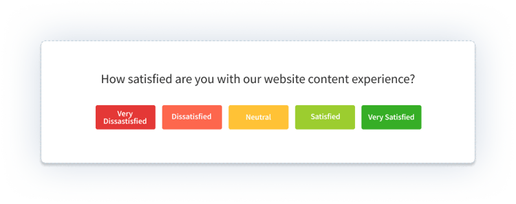
6. Content Usability Questions
Content questions measure clarity, relevance, and format. They answer: was the information on the page what the visitor needed, delivered in a way they could absorb.
The content rating survey template handles the question set for content-heavy pages like guides, articles, and documentation.
Sample questions:
- How would you rate the effectiveness of the content on this page?
- How useful did you find the information?
- Did you find the content relevant to what you were looking for?
- Were you easily able to find the content you were looking for?
- How would you rate content clarity?
- Do you think the content could be presented in a better way?
- Were videos and audio playable without extra controls?
- Was the content length appropriate for the topic?

What good answers look like: Scannability failures ("I couldn't tell what this page was about until I read three paragraphs"), format mismatches ("I wanted a table, got a wall of text"), and depth mismatches ("I wanted a quick answer, got a deep guide"). All three are content design problems, not writing problems.
7. Payment and Checkout Questions
Payment questions capture the highest-stakes usability moment on the site. Every second of confusion during checkout is abandoned revenue. Every missing payment method is a visitor who came with money and left without spending it.
Pair these with a cart abandonment survey template to catch the drop-offs you couldn't prevent in real time.
Sample questions:
- How would you rate the payment security on our website?
- How would you rate the availability of payment methods?
- Were you able to complete the payment quickly and without friction?
- Is there a payment method you expected that we don't offer?
- Did any trust signals (security badges, payment provider logos) feel missing or unclear?
- Based on your payment experience, how likely would you be to buy from us again?
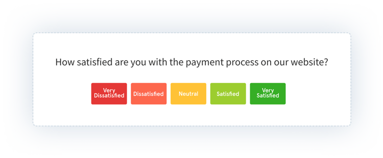

What good answers look like: Named payment methods ("I wanted to pay with UPI"), named trust friction ("no security badge near the card field"), and named timing pain ("the page froze after I clicked pay"). PCI compliance, guest checkout, and trust architecture all show up in these answers.
8. Performance Usability Questions
Performance questions translate Core Web Vitals into human language. They catch the technical issues your visitor felt even if your uptime dashboard didn't flag them.
Sample questions:
- How satisfied were you with the page loading time?
- Did interactive elements (buttons, forms, menus) respond quickly?
- Did you encounter any technical errors or glitches?
- Were you able to retrieve or save your data smoothly?
- Did anything feel broken or inconsistent across browsers?
- How would you rate the site's overall stability during your visit?
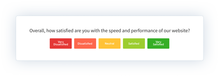
What good answers look like: Specific symptoms. "The button didn't respond on the first click." "I lost what I typed when the page reloaded." "The video player buffered every 10 seconds." These map directly to engineering tickets: LCP, FID, CLS, error rate, browser compatibility.
Industry-Specific Question Variants
The eight categories above are universal. But the specific questions worth asking shift by industry. A SaaS onboarding usability survey and a healthcare appointment-booking survey ask different things, even when both are technically "navigation" questions.
SaaS
For SaaS websites, usability questions cluster around activation and feature discoverability. You're measuring whether a prospect can tell what the product does, whether a user can find the feature they need, and whether the path from signup to first value is friction-free.
- What's the one thing you were hoping to do with this product that isn't clear yet?
- Which feature on this page felt most/least clear?
- How many clicks did it take to start using the product after signup?
Ecommerce
For retail and ecommerce, usability questions focus on product clarity, filter usability, and checkout trust. Product detail pages and cart pages do the heaviest lifting.
- Which product detail did you wish was more visible on the page?
- Were the filters useful for narrowing your search?
- Did the shipping and return information feel trustworthy and clear?
Healthcare
For healthcare sites, usability questions center on accessibility, trust signals, and appointment flow. HIPAA-compliant forms, WCAG accessibility, and clear scheduling all matter more than aesthetic polish.
- Was it clear how to book, reschedule, or cancel an appointment?
- Did you feel comfortable entering personal or medical information?
- Were accessibility features (text size, screen reader support) sufficient?
Banking and Financial Services
For banking and financial services, usability questions focus on trust signals, security perception, and calculator or document usability. Every moment of doubt costs a conversion.
- Did anything on this page make you hesitate to enter financial information?
- Were security indicators (lock icons, bank logos, certifications) visible and clear?
- Did calculators and tools behave the way you expected?
The pattern across industries: the universal questions get you 80% of the signal. The industry-specific questions get you the last 20%, which is usually the most actionable.
The System Usability Scale (SUS)
If you measure usability with only one instrument, measure it with SUS.
SUS is a 10-question standardized usability survey developed by John Brooke in 1986. Ten statements, alternating positive and negative, each rated on a 5-point Likert scale. The score compresses to a single number between 0 and 100. Industry average sits around 68. A score above 80 is considered good; above 85 is excellent.
The 10 standard SUS statements:
- I think that I would like to use this website frequently.
- I found the website unnecessarily complex.
- I thought the website was easy to use.
- I think that I would need the support of a technical person to use this website.
- I found the various functions in this website were well integrated.
- I thought there was too much inconsistency in this website.
- I would imagine that most people would learn to use this website very quickly.
- I found the website very cumbersome to use.
- I felt very confident using the website.
- I needed to learn a lot of things before I could get going with this website.
How to score: For odd-numbered statements (positive), subtract 1 from the rating. For even-numbered statements (negative), subtract the rating from 5. Sum all 10 adjusted scores and multiply by 2.5. The result is a number between 0 and 100.
When to use SUS vs. custom questions: Use SUS for benchmarking and tracking trends over releases. Use the 8 category-specific question sets above for diagnosis. SUS tells you your score dropped; category questions tell you why.
SUS is boring. It's repetitive. It works across 40 years of research and hundreds of industries. That's why it's the default.
How to Set Up a Website Usability Survey in 5 Steps
Setup takes one afternoon. Doing it well takes one clear goal.
Step 1: Define the goal in one sentence
Write down what decision the survey will inform. "Find out why visitors abandon the pricing page" is a goal. "Improve the website" is not. If you can't compress the goal to one sentence, the survey will be too broad and the answers will be too vague.
Step 2: Pick the placement
Match the goal to one of the five placements. Goal about homepage clarity → homepage placement. Goal about abandonment → exit-intent. Goal about a specific page → targeted page survey. The placement is the second biggest determinant of signal quality, after question design.
Step 3: Write 8–12 focused questions
Mix rating scales with open-ended. One question per concept. No double-barreled questions ("Was the site easy to use and fast to load?" is two questions, ask them separately). Start with the easiest question (a rating scale) and end with the hardest (an open-ended).
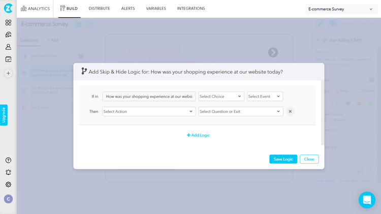
Step 4: Add branching and skip logic
Skip logic keeps the survey relevant to each respondent. First-time visitors skip the "compared to previous version" questions. Mobile users skip the desktop-specific questions. Skipping is a feature, not a gap. It's the difference between a 40% completion rate and an 80% one.
Step 5: Launch, review weekly, close the loop
Set a weekly calendar reminder to read the responses. Don't wait for the monthly readout. Usability data goes stale fast, and the early responses often reveal the biggest issues. Tag themes as they emerge. When you ship a fix based on feedback, tell the respondents who flagged it.
Best Practices for Website Usability Surveys
Seven rules that compound. Skip one and the others stop working.
Keep It Short and Focused
Ten to fifteen questions is the ceiling, not the target. If every question is rating-based, stay at the low end. Every extra question cuts your completion rate. Ask only what you'll act on.
Use a Mix of Question Types
Rating scales give you quantitative trends. Open-ended questions give you the reasons behind the trends. Multiple choice captures decisions. Yes/no captures binary facts. A usability survey without an open-ended question is a survey you can't learn from; a survey without rating scales is a survey you can't track. Use both.
Use Conditional Branching
Survey logic makes a 12-question survey feel like a 6-question one. Each respondent answers only what's relevant to them. This is also what makes multi-persona surveys work: the PM sees one path, the support lead sees another, the end user sees a third.
Pair Surveys With Session Recordings and Heatmaps
Surveys tell you why. Session recordings show you what happened. Heatmaps show you where it happened. Running all three in parallel cuts the interpretation time in half. When a respondent says "the checkout was confusing," the session recording shows you exactly which step they got stuck on.
Optimize for Cross-Device
Test the survey on desktop, tablet, and mobile before launch. A survey that works on one device and breaks on two is a survey that skews your data.
Pilot Test Before Launch
Show the survey to five people inside the company before pushing it live. Ambiguous questions, typos, and logic failures surface in the first three minutes. A pilot test costs you half a day and saves you a quarter of bad responses.
Close the Loop Publicly
When you ship a change based on feedback, tell the respondents. "You said the filters were confusing. Here's the rebuild." This one move increases future response rates more than any design change to the survey itself. It's the difference between a survey program and a feedback relationship.
Well-built website feedback forms handle the always-on collection layer that runs in parallel to your scoped usability surveys. Both matter; neither replaces the other.
Usability Survey vs. Usability Testing vs. Session Recording
These three methods get conflated often. They solve different problems.
| Method | What It Captures | Best For | Cost / Effort | Sample Size |
|---|---|---|---|---|
| Website usability survey | Self-reported reasons, sentiment, suggestions | Diagnosing why and prioritizing fixes | Low | High (passive collection) |
| Usability testing (moderated or unmoderated) |
Observed behavior + think-aloud commentary | Catching issues you didn't know existed | Medium to High | Low (5–8 participants per study) |
| Session recording and heatmaps | Behavioral traces, clicks, scrolls, friction signals | Spotting rage clicks, dead clicks, drop-off points | Low | Very high (every session) |
Use all three together. Session recordings flag the page and the moment. Usability surveys explain why. Usability tests validate the fix before you ship it. Each is weakest on its own and strongest in combination.
If you only have the budget for one, start with the usability survey. It's the highest-volume, lowest-friction source of why in your stack.
How to Analyze Website Usability Survey Responses
Collecting responses is the easy part. Reading fifty open-ended answers and turning them into a roadmap is where most usability programs break.
Quantitative Analysis
Start with the numbers. For each rating question:
- Average per question. Compare across segments (device, traffic source, page, user type).
- Distribution, not just average. A bimodal distribution signals two different user groups hiding behind the same score.
- Trend over time. One week of data is noise. Six weeks of data is a pattern.
Qualitative Analysis
This is the hard part. A quarter's worth of open-ended responses might be 500+ paragraphs. Reading them manually doesn't scale, and manual tagging is slow, subjective, and inconsistent across team members.
The manual approach: tag each response by theme, count the themes, prioritize by frequency × severity. It works. It just eats a lot of time.
The AI-assisted approach: thematic analysis clusters responses into recurring themes automatically. Sentiment scoring rates each response positive, negative, or neutral. Entity recognition maps feedback to specific pages, features, and flows. You go from 500 paragraphs to 8 themes in minutes, with examples cited under each theme.
Zonka Feedback's AI Feedback Intelligence does this layer automatically. Responses come in, themes cluster, sentiment scores apply, and a dashboard shows you the top 3 pain points ranked by impact, not just frequency. The top theme isn't always the most mentioned one. Sometimes a theme mentioned by 12 people is more urgent than one mentioned by 40, because those 12 are your highest-value accounts.
From Insight to Action
The analysis is only useful if it ends in a ticket, a fix, and a follow-up.
Prioritize by a simple framework: severity × frequency × ease of fix. A theme that's severe, frequent, and easy to fix is your next sprint. A theme that's severe and frequent but hard to fix is a quarterly priority. Everything else goes in the backlog.
Then close the loop. Tell respondents what changed. This is what separates a feedback program from a feedback archive. A practical guide to closing the feedback loop covers the workflow end to end.
Common Mistakes to Avoid
Six patterns that waste usability programs.
- Asking 25 questions when 8 would do. The instinct is to ask everything while you have their attention. The effect is a 20% completion rate and a thin dataset.
- Leading or double-barreled questions. "Don't you agree our new checkout is faster?" is a leading question. "Was the site easy and fast?" is double-barreled. Both produce unusable answers.
- Skipping mobile testing. The survey works on your laptop and breaks on a phone. Half your respondents can't submit. You never know why the sample is skewed.
- Launching without a pilot. Five colleagues finding three problems in 30 minutes is cheaper than 500 respondents finding the same three problems over a month.
- Collecting feedback and never acting on it. The fastest way to kill future response rates. Silence after a survey trains visitors to ignore the next one.
- Picking the wrong tool. A survey platform that can't target by page, device, or user segment cannot run a serious usability program. Compare options against your actual use cases, not against a feature list. Most of the website feedback tools that rank for the obvious keywords fail one of those three tests.
Conclusion
A usability survey is three things stacked together: the right questions, the right placement, and the right analysis. Get one of them wrong and the program produces noise. Get all three right and every sprint starts with evidence instead of opinion.
The 8 question categories above are a menu, not a checklist. Pull 3–5 questions from the category that matches your current goal. Pair them with the placement that surfaces the right moment. Then commit to the loop that most programs skip: review weekly, theme the open-ended responses, ship fixes, close the loop publicly.
The teams that do all four consistently don't have mystical usability programs. They have disciplined ones. That's the whole move.
When you're ready to run your first one, Zonka Feedback's survey software handles the build, the targeting, and the AI analysis in one place. Schedule a demo to see it on your actual site.


.svg)


.svg)


