


.svg)
 Healthcare
 Finance
 Retail
 SaaS & Digital
 eCommerce
 Education

 Salesforce
  HubSpot
 Pipedrive
 Mailchimp
 Zendesk
  Freshdesk
 HelpScout
  Front
Front Slack
Slack  Zoom
Zoom Google Sheets
  Zapier
  Integrately
 Webhooks
  Blogs
Blogs Webinar
 Product Updates
.svg)


TL;DR
- Exit intent surveys are short feedback pop-ups that trigger when a visitor is about to leave. Desktop tracks cursor movement. Mobile relies on back-button presses, scroll-up, and inactivity.
- An exit intent popup pushes an offer to stop the exit; an exit intent survey asks a question to learn from it. Many sites run both.
- Page-specific questions outperform generic ones. A cart page asks "What stopped you from buying?" A pricing page asks "Was anything unclear?" Generic "Why are you leaving?" collects noise.
- Placement matters more than question design. Checkout, pricing, product, landing, and homepage each need different trigger rules and different questions.
- Keep it to 1-2 questions, and measure three things: completion rate (10-15% is healthy at that length; 4+ questions drop it to 2-3%), top exit reasons aggregated weekly by page, and conversion change after fixes.
- In Zonka Feedback, you set up an exit intent survey by creating a survey, configuring it as a Popup web widget, setting the exit intent trigger in Widget Targeting, and installing the workspace JS code.
E-commerce websites lose roughly 38.7% of visitors to bounce, according to Statista. That's not a small leak. That's four out of every ten people walking away before they do anything useful.
Most teams respond by guessing. They redesign pages, test new headlines, rearrange CTAs. Some of it works. Most of it doesn't. And nobody can explain why.
But there's a five-second window right before a visitor leaves where you can stop guessing and start asking. That's what website exit intent surveys do. They trigger at the exact moment someone signals they're about to leave, capture one or two targeted questions, and hand you the specific reason they didn't convert.
This guide covers how exit intent detection actually works (desktop and mobile are different), which questions to ask on which pages, how to set one up step by step, and the benchmarks that tell you whether yours is working.
What Is a Website Exit Intent Survey?
A website exit intent survey is a short feedback form, typically a pop-up, that triggers when a visitor shows signs of leaving a webpage. On desktop, the trigger fires when a cursor moves toward the browser's close button or address bar. On mobile, it fires on back-button presses, rapid scroll-up, or inactivity. The survey captures feedback at the moment of departure, surfacing the specific reason a visitor didn't convert.
Unlike always-visible feedback widgets or scheduled email surveys, exit intent surveys are event-triggered. They only appear when the visitor is about to leave. That makes them less intrusive than timed pop-ups and more contextual than post-visit surveys. If you're new to collecting feedback on your website, the complete guide to website surveys covers the broader landscape first.
What they can tell you:
- Why visitors abandon their cart, pricing page, or signup flow
- Whether the page had the information visitors needed
- What competitors or alternatives they're considering
- What specific friction point stopped them from converting
One pattern we've seen repeatedly: a SaaS company placed a single-question exit survey on their pricing page. They expected visitors to say the price was too high. Instead, 40% of respondents said the plan comparison table was confusing. The issue wasn't pricing. It was information design. They restructured the table. Conversion rates improved measurably within 30 days.
Exit Intent Survey vs. Exit Intent Popup
An exit intent survey asks a question; an exit intent popup pushes an offer. The popup version, a discount code, a newsletter form, a "wait, don't go" banner, tries to stop the exit. The survey version tries to learn from it. Both use the same detection mechanics, but they measure success differently: popups by recovered conversions, surveys by the quality of the reasons collected. Many teams run both. The popup rescues the sale in the moment. The survey tells you why the sale needed rescuing, so fewer visitors reach the exit at all.
How Exit Intent Detection Works (Desktop vs. Mobile)
Exit intent detection uses behavioral signals to predict when a visitor is about to leave a page. On desktop, it tracks mouse cursor movement toward the browser chrome. On mobile, where there's no cursor, it relies on alternative signals like back-button presses, rapid scroll-up toward the URL bar, or periods of inactivity. The two environments require different detection logic, different survey designs, and different expectations for accuracy.
Desktop Detection
Desktop exit intent is the more reliable of the two. JavaScript event listeners monitor mouseout events on the document element, specifically watching for the cursor crossing the top boundary of the viewport. When the cursor moves outside the active browser window toward the close button or address bar, the trigger fires.
Cursor velocity matters. A fast upward movement signals intent more reliably than a slow drift. Most exit intent tools factor in speed, not just position, to reduce false positives. The result is a detection mechanism that's accurate enough to trigger a survey right before the visitor clicks "close."
Mobile Detection
Mobile exit intent is heuristic. It approximates departure, it doesn't confirm it.
Three signals dominate. Back button press is the most reliable. The visitor is actively navigating away, usually back to the search results or a previous page. Rapid scroll-up is the second signal. In mobile browsers, the URL bar hides as you scroll down. Scrolling up quickly to reveal it suggests the visitor is about to type a new URL or leave. Inactivity is the weakest signal. If a visitor stops interacting for a set period, the system infers disengagement.
Here's the honest limitation: false positives happen more on mobile than desktop. A visitor scrolling up to recheck a headline isn't leaving. A visitor pausing to read a long paragraph isn't disengaged. Design your mobile exit survey to be lightweight and easy to dismiss, because some percentage of the people who see it weren't actually leaving. (Mobile in-app surveys face similar detection challenges, but with SDK-level control over triggers that web-based exit intent doesn't have.)
Timing and Trigger Rules
Don't trigger instantly. Wait for meaningful engagement before firing. A visitor who bounces in three seconds didn't engage enough to give useful feedback. Set a minimum threshold: 30+ seconds on page, or 50%+ scroll depth, combined with an exit signal.
Frequency caps matter just as much. Show the survey once per session, or once every 3-7 days for returning visitors. Showing the same survey repeatedly trains visitors to dismiss it reflexively.
Page-specific triggers are non-negotiable. A cart page exit survey should only fire for visitors who have items in their cart. A pricing page survey should only trigger after the visitor has spent enough time to have actually read the pricing. Blanketing every page with the same trigger logic produces noise. For more on how popup surveys work across different trigger types beyond exit intent, see our popup guide.
Where to Place Exit Intent Surveys (and What to Ask on Each Page)
The most effective placement depends on where in the customer journey visitors are dropping off. High-intent pages, the ones where visitors have already shown purchase or signup interest, yield the most actionable feedback. Low-intent pages like blog posts or resource pages can still capture useful data, but the question framing needs to be different. The goal is to listen to the voice of customer at the exact moment it's most honest.
Checkout / Cart Page
Cart abandonment rates average 70%+ across industries, according to Baymard Institute. These visitors had intent. Something stopped them.
Trigger rule: Only fire for visitors who have items in their cart. Keep to 1 question maximum. This is the highest-friction point on your site, and the visitor's patience is already thin.
Best questions:
- What stopped you from completing your purchase today? [multiple choice: price, shipping costs, payment options, trust/security, found better elsewhere, just browsing]
- Is there any information you need to complete your order?
- Were there any concerns about payment security?
- Did you encounter any issues during checkout?
Include "unexpected costs" as a default answer option. It's consistently the top reported reason for cart abandonment across industries and verticals.
Pricing Page
For SaaS and subscription businesses, the pricing page is where consideration becomes decision. Exits here signal specific objections, not general disinterest.
Trigger rule: Trigger after the visitor has spent 15+ seconds on the page. Anything less means they bounced before reading, and a survey won't capture useful signal.
Best questions:
- What pricing concerns made you hesitate?
- Did you find the pricing competitive compared to alternatives?
- Was there any confusion about the pricing structure or what's included?
- Is there a price point that would make the offering more compelling?
Healthcare organizations can apply similar surveys to service cost pages or insurance coverage pages. The same principle holds: visitors leaving a pricing-adjacent page have specific objections worth surfacing.
Product Pages
Low conversion on product pages often means insufficient information. Not disinterest.
Best questions:
- Was the product easy to understand?
- Did you find the information you needed to make a decision?
- How does this compare to similar products you've evaluated?
- What would have made you more likely to proceed?
This pattern applies across e-commerce product pages, SaaS feature pages, travel booking pages, and course enrollment pages. The common thread is a visitor who showed interest (they landed on the page) but didn't find enough to act.
Landing Pages
Paid traffic landing pages need tight message-offer fit. Exit surveys reveal mismatches between the ad promise and the page delivery.
Best questions:
- Were you able to find the information you were looking for?
- Did the content on this page match your expectations?
- What was missing that would have made you take action?
- Was anything confusing or unclear?
Trigger consideration: Paid visitors arrive with a more specific expectation set by the ad copy. If 30% of your landing page exit survey respondents say "I didn't find what I was looking for," the problem is message mismatch, not page design.

Homepage
First-time visitors who leave from the homepage are awareness-stage. They may not be ready to convert. But you can capture intent.
Best questions:
- Did you find what you were looking for?
- What brought you to our site today?
- Would you like to receive updates about [topic relevant to your business]?
- Would you like to schedule a demo or speak with someone?
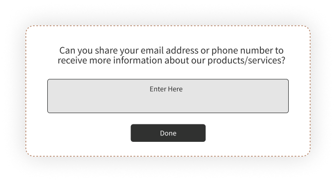
The homepage exit survey doubles as a lead generation touchpoint. If they won't convert now, offer something valuable, a guide, a webinar invite, a free consultation, in exchange for an email. That turns an abandoned visit into a nurture opportunity.
Here's the full placement logic in one view:
| Page Type | Trigger Rule | Best First Question | What It Reveals |
| Checkout / Cart | Fire only when items are in cart; 1 question max | What stopped you from completing your purchase today? | Cost, trust, and payment friction |
| Pricing | After 15+ seconds on page | What pricing concerns made you hesitate? | Plan confusion and value objections |
| Product | After meaningful scroll plus exit signal | Did you find the information you needed to make a decision? | Information and content gaps |
| Landing | Exit signal on paid traffic | Did the content on this page match your expectations? | Ad-to-page message mismatch |
| Homepage | Exit signal after 30+ seconds | Did you find what you were looking for? | Navigation gaps and lead capture opportunities |
For guidance on structuring questions across other use cases beyond exit intent, the website usability survey guide covers 50+ examples. And if you're evaluating tools for the job, our roundup of website feedback tools covers the broader landscape.

How to Create an Exit Intent Survey with Zonka Feedback
Setting up an exit intent survey involves five steps: build the survey, configure it as a popup web widget, set the exit intent trigger and page targeting, install the workspace code on your site, and test before going live. The entire process takes under 30 minutes for a first-time setup.
Step 1: Build Your Survey
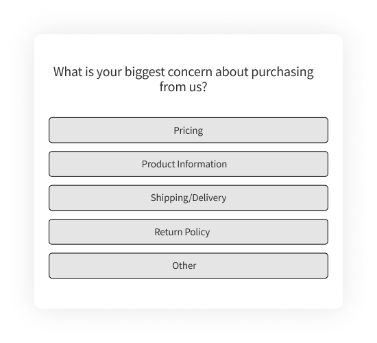
Log in to Zonka Feedback and navigate to Survey Hub. Create a new survey. You can start from the exit intent survey template shown above or build from scratch using the survey builder.
For exit intent, keep it to 1-2 questions. Lead with a multiple-choice question (fast to answer), then optionally follow with a free-text field ("Anything else we should know?"). If you need inspiration for question wording, our collection of survey question examples covers multiple feedback channels. Use conditional logic where it makes sense: if a respondent picks "pricing too high," follow up asking what price point would work. If they pick "missing information," follow up asking what information was missing.
Step 2: Set Up as a Popup Web Widget
Go to the Distribute tab and select Web Widget. Choose Popup as the widget type.
Exit intent surveys deploy as popups because they need to capture attention at the critical departure moment. Zonka Feedback offers other widget types for website surveys: Side Tab, Slide-up, Bottom Bar, Popover, and Embedded. For exit intent specifically, Popup is the standard choice. If you want a less intrusive format for mobile, Slide-up is a reasonable alternative.
Step 3: Configure Exit Intent Trigger and Page Targeting
In Widget Targeting settings, set the trigger to Exit Intent. Then configure:
Page-level targeting: Specify which URLs should display the survey. Don't run the same survey on every page. Set it to fire only on /checkout, or only on /pricing, or only on product category pages.
Device targeting: You may want different survey questions for mobile vs. desktop visitors. Their exit behaviors differ, and their reasons for leaving often differ too.
Display frequency: Show once per session or once per visitor. Never show the survey to someone who already responded.
Display behavior: Set the survey to stop showing after submission. Visitors who've already given feedback shouldn't see it again.
Step 4: Install the Workspace JS Code
Each Zonka workspace has its own JavaScript snippet. If you've already installed the workspace code on your site for other web widgets, a website feedback button or an embedded survey, you don't need to reinstall anything. The exit intent popup will automatically deploy through the same code.
If this is your first web widget: copy the JS Client Code from your workspace settings and add it to the <head> tag of your website, or use your tag manager. The code is workspace-scoped, not survey-scoped. Any new survey or widget you create in that workspace works through the same snippet without reinstalling. This matters because it means your marketing team's exit intent popup and your product team's NPS survey can live in separate workspaces, each with their own code snippet, without conflicting.
Step 5: Test and Launch
Preview the survey to verify it renders correctly on both desktop and mobile. Test the exit intent trigger: move your cursor to the top of the page on desktop, press back on mobile. Check that page targeting works and the survey only appears on intended pages.
Launch. Monitor completion rates in the first 48 hours. If completion is below 10%, the survey is either too long, poorly timed, or the question wording isn't resonating. Adjust and retest.
Best Practices (and Mistakes That Kill Response Rates)
The highest-impact exit intent survey practices come down to three things: keep the survey short (1-2 questions), match questions to the specific page the visitor is leaving, and trigger only after meaningful engagement. Getting any of these wrong tanks your response rate and produces data you can't act on.
Keep It to 1-2 Questions
Exit intent surveys with 1-2 questions typically see 10-15% completion rates. Surveys with 4+ questions drop to 2-3%. These ranges are drawn from exit intent deployments across Zonka customer sites rather than a formal industry study, so treat them as calibration points. The math is simple either way. The visitor already decided to leave. They won't invest time in a long survey.
Use 1 question on high-friction pages like checkout. Stretch to 3 only on lower-friction pages like blog posts or the homepage. And always include a free-text option as the last field. The most valuable exit survey insights often come from write-in responses that reveal problems you hadn't considered.
Match Questions to the Page
The most effective exit surveys ask page-specific questions. "What stopped you from completing your purchase?" on a cart page. "Was the pricing clear?" on a pricing page. "Did you find what you were looking for?" on the homepage.
Don't use the same generic "Why are you leaving?" on every page. Create separate surveys for each high-value page type. Generic surveys produce generic answers. Page-specific surveys produce fixable answers.
Time the Trigger Right
Wait for meaningful engagement before triggering. Trigger after 50%+ scroll or 30+ seconds on page, combined with an exit signal. Cap frequency to once per session or once every few days for returning visitors.
Don't trigger the instant someone moves their mouse upward. Too early means too many false positives, and visitors who get hit with a survey before they've even engaged will dismiss it without reading.
Design for Dismissibility
Include a clear, visible close button. Use slide-ins or compact popups on mobile. Never use full-screen overlays on phones.
Google's documentation on intrusive interstitials advises against overlays that obstruct content, especially on mobile. Intrusive popups can negatively affect search rankings. A small, dismissible overlay preserves the user experience and still captures feedback from visitors willing to share.
Close the Feedback Loop
Track top exit reasons weekly. Prioritize fixes. Measure conversion change after implementing fixes. Then connect exit survey responses to your customer feedback loop workflow so nothing gets collected and forgotten.
The survey is the diagnostic tool. The conversion lift is the outcome. If you're collecting feedback but not acting on it, the survey is just annoying visitors for no return.
Measuring the Impact of Exit Intent Surveys
Track three metrics to assess whether your exit intent surveys are working: survey completion rate, top exit reasons by page, and conversion rate change after implementing fixes. Everything else is secondary.
Completion rate tells you whether the survey itself is designed well. A healthy benchmark is 10-15% for 1-2 question surveys. Below 10% means the survey is too long, poorly timed, or the question isn't connecting. Test a shorter version or adjust the trigger timing.
Top exit reasons tell you what to fix. Aggregate weekly and look for patterns. Cart page reasons differ from pricing page reasons. If "unexpected costs" accounts for 40%+ of cart abandonment responses, that's a pricing transparency problem. Not a product problem.
Conversion rate change is the metric that justifies the survey's existence. Measure before and after deploying fixes based on survey feedback. If exit survey data told you visitors found the comparison table confusing, and you restructured it, did conversions improve?
Segment by device. Mobile and desktop visitors often cite different reasons for leaving. Analyze separately. A friction point that dominates mobile responses might not even appear in desktop data.
For deeper analysis, use reporting and analytics to segment exit survey data by page, device, and visitor behavior.
Exit Intent Surveys Across Industries
E-Commerce
The primary use case is cart abandonment. Extra costs like shipping, taxes, and fees are consistently the top reported reason. Exit surveys quantify this so you can test solutions: free shipping thresholds, transparent pricing displays, or upfront cost breakdowns.
Secondary use: post-purchase subscription exit surveys for understanding churn. When someone cancels a subscription or unsubscribes, the exit survey captures the specific driver. That data feeds directly into retention strategy and your broader customer experience program. Understanding customer satisfaction at the point of exit is where the most honest feedback lives.
SaaS and Digital Products
Pricing page exits and free trial drop-offs are the two highest-value targets. "Did you find what you needed?" on feature pages frequently reveals content gaps. Visitors want to evaluate a specific capability, and the page doesn't cover it. That's a fixable content problem, not a product problem.
For product feedback teams, exit surveys on feature pages and in-product flows provide signal that complements NPS and CSAT data.
Healthcare
Patient portal exits, appointment booking friction, and treatment information gaps are the primary applications. Collected data may fall under HIPAA or regional privacy regulations, so verify that your survey tool supports compliant data handling. Healthcare feedback requirements differ from standard web survey deployments.
Education and Travel
Education: course enrollment drop-off, financial aid page confusion, and campus visit page exits. Travel and hospitality: booking abandonment (dates, pricing, availability) and post-stay guest feedback. Both industries see high research-stage traffic where visitors aren't ready to convert. Exit surveys can capture email for nurture, turning abandoned visits into longer-term pipeline and reducing customer churn by keeping the conversation alive.
What Comes Next
Every visitor who leaves your site without converting has a reason. Most of those reasons are specific and fixable: a confusing comparison table, missing shipping costs, unclear pricing tiers, information that wasn't on the page.
Exit intent surveys surface those reasons in the visitor's own words. But the survey itself is just the beginning. The value comes from what you do with it: the pricing page you redesign, the checkout flow you simplify, the FAQ you add because 30% of respondents asked the same question.
That's the feedback loop that turns exits into improvements. And it starts with one question at the right moment.


.svg)


