


.svg)
 Healthcare
 Finance
 Retail
 SaaS & Digital
 eCommerce
 Education
 Salesforce
  HubSpot
 Pipedrive
 Mailchimp
 Zendesk
  Intercom
 Freshdesk
 HelpScout
  Front
Front Jira
Jira Slack
Slack  MS Teams
 Zoom
Zoom Google Sheets
  Zapier
  Integrately
 Make
Make  Webhooks


 MS Teams


TL;DR
- A website feedback button is a persistent UI element, docked to the side or corner of a webpage, that opens an inline feedback form on click so visitors can share input without leaving the page.
- Fewer than 1 in 3 consumers now give companies feedback after an experience, an all-time low per Qualtrics XM Institute. A website feedback button is the lowest-friction channel for hearing from that silent majority.
- The three dominant button types are fixed side tabs (best for SaaS dashboards and content sites), floating corner buttons (e-commerce and marketing pages), and feedback banners (launches, betas, and redesigns).
- Trigger beats placement, and placement beats design. Exit-intent buttons on checkout pages reach 3% to 8% click rates, while always-visible buttons on SaaS dashboards average 0.3% to 1.2%.
- Button forms should stay under 3 questions; response rates collapse past that. Match the question to the page: "Did you find what you were looking for?" on search pages, "What made you want to leave?" on exit intent.
- Feedback becomes signal only after the click. Tagging responses by theme, scoring sentiment and urgency, and routing each category to the owning team is what closes the loop.
Most customer feedback tools are built on an assumption: that unhappy users will speak up.
They won't. And the silence is getting worse.
Research going back to the TARP studies of the 1980s and Esteban Kolsky's later work found the same pattern: for every customer who complains to the business, roughly 26 stay silent. Four decades on, that pattern has hardened. Qualtrics XM Institute's Q3 2025 study of 20,001 consumers across 14 countries found that fewer than 1 in 3 consumers now give companies feedback after an experience. An all-time low. They don't send an email. They don't open a ticket. They just spend less, or leave.
A website feedback button exists for that silent majority: the user who can't find the pricing page, the shopper whose promo code didn't apply, the reader who wanted to know which survey tool fits their stack but closed the tab before asking.
Here’s what most blogs get wrong when they cover this topic. The button itself is the least interesting part. Placement matters more. Trigger matters more. The question you ask matters more than all of it. This guide covers what actually works, with real examples, directional benchmarks, and the patterns that separate a feedback button that gets clicked from one that gets ignored.
What Is a Website Feedback Button?
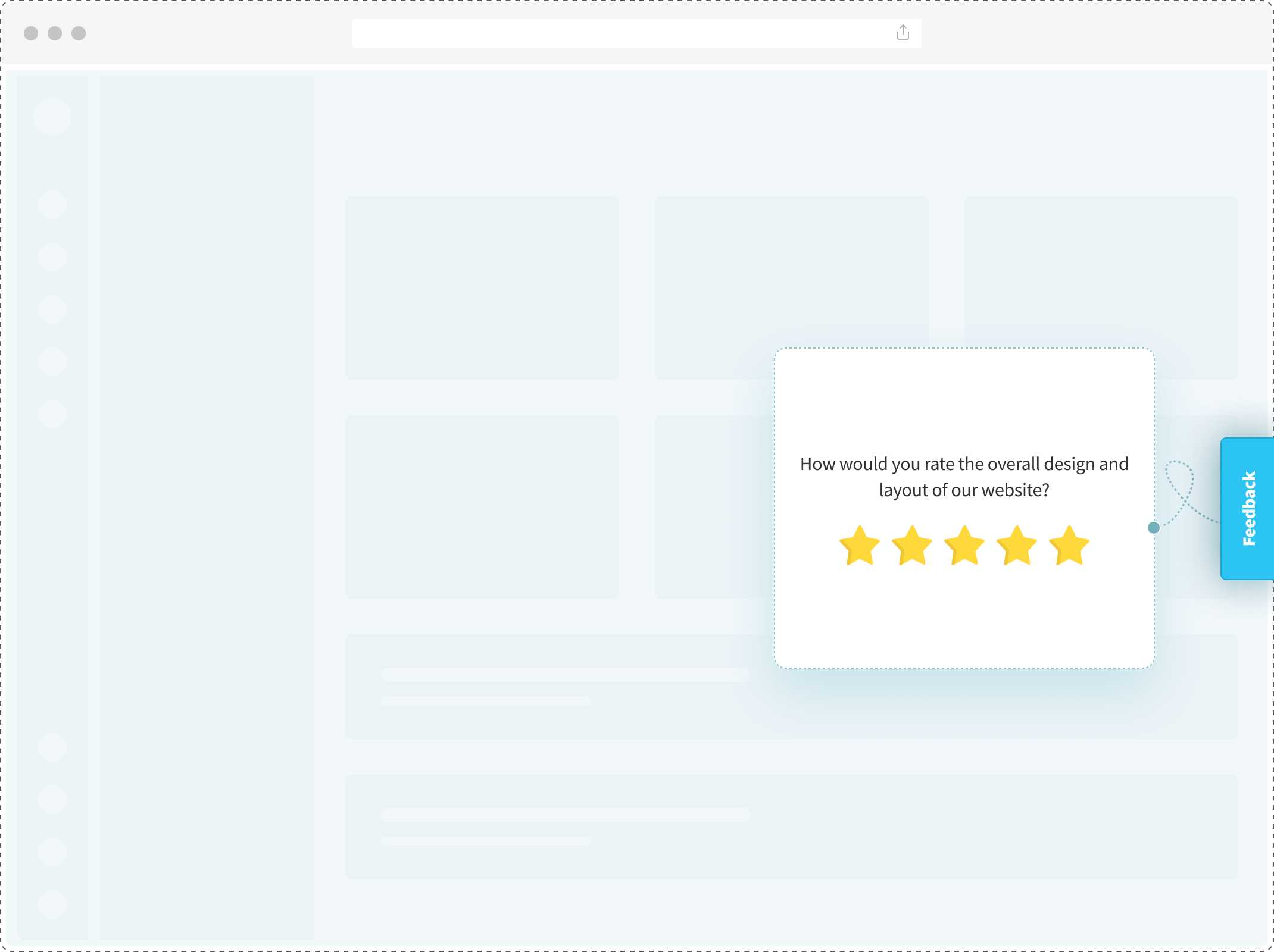
A website feedback button is a small, persistent UI element embedded on a webpage that opens an inline feedback form when clicked, allowing visitors to share input without leaving the page. It sits in the same layer as chat widgets and cookie banners: always visible, never intrusive.
When a visitor clicks it, a form overlay appears on top of the current page. They fill it out, submit, and return to whatever they were doing. No redirects. No new tabs. No page reloads. The form itself can carry any question type: a rating scale, a single open-ended field, an NPS question, an emoji set, a multi-step sequence.
The button is one piece of a larger category that also includes pop-ups, slide-outs, and embedded inline forms. The distinction matters because the intent behind each is different, and people often conflate them.
Feedback button vs. feedback form vs. popup survey
| Format | What It Is | When to Use |
| Feedback button | Persistent trigger that waits to be clicked. User-initiated. | Always-available, unobtrusive feedback. Visitors click when they have something to say. |
| Feedback form | Dedicated page or embedded inline section asking for feedback. | When you’re soliciting feedback for a specific purpose (beta access, content review, bug report). |
| Popup survey | Feedback form that appears automatically based on a trigger (exit intent, time, scroll). System-initiated. | Proactive feedback at a specific moment. Higher visibility, higher potential for interruption. |
The button is passive. The popup is active. Neither is better. They solve different problems on different pages.
Three Types of Website Feedback Buttons
There are three dominant patterns in how teams deploy feedback buttons on live sites. Each has a different visual footprint and serves a different page context.
- Fixed Side Tab. A vertical tab docked to the left or right edge of the viewport, usually reading “Feedback.” Click it, and a modal opens. This is the default choice for SaaS dashboards and content sites. Stays out of the way, always one glance away. GitLab uses it on product pages, and most B2B tools default to it when they want feedback without committing to a full chat widget.
- Floating Corner Button. A circular or rounded button fixed to the bottom-right or bottom-left corner, usually with an icon (chat bubble, speech balloon, or “?” mark). Visually similar to a chat widget, which is both its advantage (users recognize it instantly) and its disadvantage (users may mistake it for live chat). Intercom’s Messenger popularized the pattern; most e-commerce storefronts now use some version of it.
- Feedback Banner. A horizontal bar pinned to the top or bottom of the viewport with a single line of copy and a CTA button. “How’s our new checkout experience? [Share feedback],” that kind of thing. Banners are the most intrusive of the three, which is why they work for time-bound campaigns: feature launches, beta releases, redesigns. They feel event-driven. They don’t belong on every page.
Which type fits which page
| Button Type | Best For | Visibility | Example |
| Fixed Side Tab | SaaS dashboards, content sites, long-form pages | Medium | GitLab’s “Feedback” tab on product pages |
| Floating Corner | E-commerce, marketing sites, storefront pages | High | Most Shopify storefronts |
| Feedback Banner | New launches, beta tests, redesign periods | Very High | Temporary “Tell us what you think” bars after UI updates |
One more pattern deserves a mention. Inline thumbs or ratings, the “Was this article helpful?” widget embedded directly within content, is technically a feedback button too, just contextual rather than persistent. Notion’s help docs use this pattern. It doesn’t compete with the three above; it complements them. You can run both on the same site without friction, and most feedback widgets let you mix formats.
6 Website Feedback Button Examples From Real Sites
Most guides on this topic describe button types in the abstract. Real examples teach more. Here are six live-site patterns worth studying, with the design decisions that shaped them.
1. Intercom. Floating Messenger Button.
The bottom-right floating button with an orange chat icon, pulling double duty as live chat, bot, and async feedback channel. What works: the icon is universally recognized, always reachable on mobile and desktop, and feedback integrates directly with support conversations. What could be better: the high visibility comes at a cost. Some users engage expecting instant human reply and disengage when they get a bot.
2. GitLab. Fixed Side Tab.
A discreet “Feedback” tab docked vertically on the right edge of product documentation pages. Click it, and a modal opens asking what could be improved. What works: the placement signals “we want feedback on THIS page.” Page-specific context is captured automatically. What could be better: the tab is easy to miss on mobile, and the modal doesn’t make clear what happens next.
3. Notion. Inline “Was this helpful?”
Every Notion help article ends with a thumbs-up/thumbs-down question, followed by a text box if the user selects thumbs-down. Content-level feedback at its cleanest. What works: the question is tied to something the reader just consumed. Response rates are high and answers are specific. What could be better: the binary format misses nuance. “Partially helpful but missed X” doesn’t have a clean path.
4. Shopify Storefronts. Bottom-Right Chat-Style Button.
Most Shopify stores deploy a bottom-right floating button that opens a chat widget, a feedback form, or a hybrid. Icon-only button with a small red dot (often there even when there isn’t actually a message). What works: conversion uplift on e-commerce is well-documented when post-purchase feedback flows into the same widget. What could be better: many stores over-index on visual prominence, so the feedback button ends up competing with promo banners, newsletter popups, and chat overlays.
5. Stripe Docs. Inline Contextual Feedback.
A prompt at the bottom of every Stripe documentation page asking whether the page was helpful, followed by a text box for specifics. What works: Stripe’s docs team uses the data to prioritize rewrites. Pages with repeated “not helpful” feedback get flagged for review. What could be better: it only runs on docs, not on the marketing or product-landing pages where pre-purchase friction actually happens.
6. A Zonka customer deployment. Checkout Exit-Intent Feedback.
A mid-market e-commerce retailer running a floating feedback button on their checkout page, triggered by exit intent. Question: “Something stopping you from completing your order?” Follow-up: pre-categorized options plus a free text field. What works: the trigger fires only when intent-to-leave is detected, keeping the ask from feeling annoying. What could be better: the initial categories (“Pricing,” “Shipping,” “Payment”) were too broad. Response usefulness jumped when they split “Pricing” into “Price too high” and “Promo code didn’t work.”
The common thread: every one of these examples got one decision right. They matched the button’s form, placement, and trigger to the specific page context. No two patterns fit every page.
You can build versions of these using a website feedback survey template for the general case, or a blog feedback survey template for the inline-content pattern specifically.
Where to Place a Website Feedback Button
Placement is the single biggest driver of whether a feedback button gets used. A well-designed button in the wrong spot dies. A plain button in the right spot gets clicked. The same holds for the website surveys you serve through the widget layer: context decides whether anyone answers.
The rule that governs everything: match the button’s placement to the page’s dominant user intent.
A page-by-page placement guide
| Page Type | Recommended Placement | Button Style | Why |
| Homepage | Side tab or floating corner | Discreet icon + label | Visitors are browsing, not in transaction mode. Low-key availability is enough. |
| Pricing page | Floating corner with exit-intent trigger | High-contrast color | Users either convert or leave. Catching them mid-exit is where you learn why. |
| Checkout | Floating corner with abandonment trigger | Clear text: “Having trouble?” | Checkout friction is the single highest-value feedback moment. Make intent obvious. |
| Blog post / article | Inline “Was this helpful?” | Thumbs + optional comment | Readers engage with content, not persistent UI. Context matters. |
| Help docs | Inline + fixed tab combined | Both (layered) | Documentation users want to rate the page AND report a broader issue. Two channels. |
| SaaS dashboard | Fixed side tab with feature-level context | Tool-agnostic label | Users are in workflow mode. Side tab stays out of the way until needed. |
| Mobile (all page types) | Bottom bar, NOT bottom-right corner | Icon-only | Bottom-right conflicts with thumb zones on most phones. A slim bottom bar works better. |
Design principles that matter more than most blogs admit
Color contrast carries more weight than fancy design. A button that matches your site’s primary action color (the one you use for “Buy” or “Sign Up”) signals clickability instantly. A button in neutral gray tries to be unobtrusive and ends up invisible.
Copy matters. “Feedback” is clear but generic. “Tell us what’s broken” is clear AND direct. On checkout pages and help docs, specific copy outperforms generic. Users who know what the button is for click it more.
Mobile behavior needs its own test. Bottom-right floating works on desktop because it’s far from content. On mobile, that corner is where the thumb naturally rests when scrolling. Accidental taps are common, and so is deliberate avoidance once users learn the pattern. The fix is either a dedicated exit-intent trigger for mobile or a bottom-bar variation that doesn’t compete with thumb space.
Accessibility gets skipped most often. The button must be keyboard-reachable, screen-reader-labeled, and meet WCAG AA contrast for low-vision users. If it fails here, the feedback you collect skews toward a subset of your audience, and you’ll never know what you’re missing.
When Should a Feedback Button Appear? (Trigger Rules)
The difference between a feedback button that gets ignored and one that gets clicked is often just the trigger. When the button appears, or when it becomes prominent, shapes the response rate more than placement or design.
Six trigger types, and when each fits best
| Trigger | What It Does | ||
| Always-visible | Button is permanently shown on the page. | SaaS dashboards, content sites, help docs. | Low click rate, high-quality responses when clicked. |
| Exit intent | Button becomes prominent (or opens automatically) when cursor moves to close/back. | Pricing, checkout, high-consideration pages. | Highest signal-to-noise ratio for commerce pages. |
| Scroll depth | Button surfaces after user scrolls past a threshold (e.g., 50% of page). | Long-form content, landing pages, product pages. | Captures engaged users who’ve invested time in the content. |
| Time on page | Button appears after N seconds on the page. | Product tours, tutorial flows, onboarding pages. | Good for catching stuck users. Can feel interruptive if timed too early. |
| URL match | Button only appears on specific pages or page patterns. | Campaign landing pages, beta features, regional rollouts. | Targeted feedback tied to specific initiatives. |
| User segment | Button behaves differently based on logged-in status, plan tier, or cohort. | SaaS products, multi-tier pricing pages, power-user workflows. | Highest-quality data; respondents are pre-qualified. |
Exit intent deserves special attention. It’s the most under-used trigger in B2B. Most teams default to always-visible buttons and lose their best feedback moments as a result. A user about to leave a pricing page has more to tell you than one comfortably browsing. Same with checkout abandonment: the moment a shopper moves toward closing the tab is when the friction is most top-of-mind. Deploying a website exit-intent survey at that moment, wired through the feedback button, is where the highest-signal data lives. Start with an exit-intent survey template and adapt the copy.
Scroll-depth and time-on-page triggers work well together on content pages. A reader who’s scrolled 70% of a blog post has consumed the content. Asking “was this useful?” is natural. A user on a pricing page for 90 seconds is weighing options. Asking “anything stopping you from signing up?” catches them mid-decision.
One trigger to avoid on most pages: auto-opening modals that load without user action. These feel like interruptions, not invitations. Volume goes up short-term, but completion drops and response quality suffers. Users close quickly to return to what they were doing. Button-based triggers, where the user initiates, produce more useful data even at lower volume. Where automatic triggering genuinely fits (exit intent on checkout, for instance), popup surveys are the right tool, not an auto-opening button.
What’s a Good Website Feedback Button Click Rate?
Click rates on website feedback buttons range widely by industry, page type, and trigger configuration. Typical numbers fall between 0.5% and 5% of page views.
The ranges below are directional, drawn from deployment patterns across Zonka customer sites rather than a formal study. Treat them as calibration points, not targets.
Directional benchmarks by industry
| Industry | page Type | Typical Click Rate Range |
| SaaS (B2B) | Product dashboard | 0.3% – 1.2% |
| SaaS (B2B) | Pricing / plans page | 1.8% – 4.5% |
| E-commerce | Product detail page | 0.4% – 1.5% |
| E-commerce | Checkout (exit-intent triggered) | 3% – 8% |
| Content / Publishing | Blog post (inline) | 2% – 6% |
| Help docs / Support | Article page (inline) | 4% – 12% |
| Marketing site | Homepage | 0.2% – 0.8% |
Factors that move click rates the most, ranked by impact
- Trigger type. Exit-intent and scroll-depth triggers routinely outperform always-visible buttons by 2x to 4x on commerce pages.
- Button copy. Specific copy (“Something stopping you?”) beats generic (“Feedback”) on decision-stage pages. On low-stakes pages, generic works fine.
- Placement. Bottom-right floating buttons outperform side tabs on marketing and storefront pages. Side tabs outperform floating buttons on SaaS dashboards where users are in workflow mode.
- Color contrast. Buttons matching the site’s primary action color outperform neutral-colored buttons by a measurable margin. Gray buttons underperform consistently.
- Page context match. A feedback button on a checkout page gets more engagement than the same button on a homepage. Higher stakes, higher intent to share.
What poor performance usually means
Click rates under 0.3% on any page type usually point to one of three problems. The button is invisible (color contrast too low). Placement is wrong (users don’t see it in their scroll path). Or the trigger is miscalibrated (always-visible when the page needs exit-intent, or vice versa). Before concluding “feedback buttons don’t work,” check these three.
What “good” looks like
For B2B SaaS marketing pages, anything above 1% on always-visible buttons is solid. Above 2% with exit-intent is strong. For e-commerce checkout with abandonment triggers, 5%+ indicates you’ve nailed copy and placement. For help docs with inline feedback, 8%+ suggests docs are generating engagement and users are motivated to reciprocate.
The numbers matter less than the patterns. Watching click rate relative to page type, trigger, and copy, and iterating from there, is how you move from “we have a feedback button” to “our feedback button is giving us signal.”
Website Feedback Button Questions to Ask
The question you ask determines the usefulness of the response. A badly-worded question on a perfectly-placed button wastes the opportunity.
Here are 14 question patterns mapped to specific page contexts and user moments.
-
How would you rate your experience on this website?
Measures: Overall customer satisfaction (CSAT) with site experience.
Where to place: Homepage or end-of-session trigger. Not on individual content pages (too generic).
-
How did you hear about us?
Measures: Marketing attribution.
Where to place: First-time visitor landing pages, post-signup confirmation.
-
Did you find what you were looking for today?
Measures: Intent satisfaction and navigation effectiveness.
Where to place: Search results pages, category pages, help docs, product listing pages. Binary + text follow-up works best.
-
How satisfied are you with your recent purchase?
Measures: Post-transaction CSAT.
Where to place: Order confirmation page, 24 hours post-purchase. Not on pre-purchase pages.
-
Was this article helpful?
Measures: Content effectiveness.
Where to place: Blog posts, help articles, documentation. Thumbs + optional comment is the highest-response format.
-
How would you rate the design of this page?
Measures: Visual design and first impressions.
Where to place: After significant redesigns, new feature launches, A/B test experiences. Time-bound works better than permanent.
-
Please describe the issue you’re facing.
Measures: Bug reports and broken experiences.
Where to place: Error pages, help docs, post-checkout failure screens. Keep the form short. Users reporting bugs are already frustrated.
-
How satisfied are you with the site’s speed and performance?
Measures: Technical performance perception.
Where to place: On pages known to have load issues, after heavy media pages (video, large images).
-
How satisfied were you with your support interaction?
Measures: Support agent performance and resolution quality.
Where to place: Post-chat close, post-ticket resolution, in-app after help center use. Must fire immediately after the interaction ends.
-
Is there anything missing from this page?
Measures: Content gaps and unmet intent.
Where to place: Exit intent on blog posts, help articles, product pages. Open-ended only. Closed options limit what you learn.
-
How likely are you to return to this website?
Measures: Retention intent and visit satisfaction.
Where to place: Exit intent after multi-page sessions. Not on first-page exits (not enough context).
-
On a scale of 0–10, how likely are you to recommend us to a colleague?
Measures: Net Promoter Score (NPS), the customer-loyalty metric introduced by Fred Reichheld in his 2003 Harvard Business Review article.
Where to place: Post-purchase, post-support resolution, after key value moments (feature adoption, first successful use). Not on first visits.
-
Would you like to hear about our newsletter?
Measures: Subscription intent.
Where to place: End of blog posts, post-content-consumption moments. Binary Yes/No with optional email field.
-
What made you want to leave?
Measures: Exit reasons and friction sources.
Where to place: Exit-intent trigger on pricing, checkout, and signup pages. Open-ended with pre-categorized options for skimmers.
A ready-to-deploy website experience survey template combines several of these patterns for the general case.
What to avoid: stacking 5+ questions in a single feedback button form. Response rates collapse past 2-3 fields. If you need detailed feedback, run a longer survey via email. The button form should be short enough to complete in 15 seconds.
From Click to Action: What Happens After Feedback Is Submitted
The most ignored part of website feedback is what happens after the form submits. Most teams set up the button, collect responses, and assume someone will read them. Nobody does. Responses pile up in a dashboard nobody opens.
Here's what separates a feedback button that produces signal from one that produces noise: closing the customer feedback loop between click and action.
The components of a closed loop
- Tagging. Raw text responses need to be grouped by theme. Categories like “pricing confusion,” “mobile bug,” “feature missing,” “confusing copy.” Manual tagging works at low volume. AI-driven thematic analysis scales when volume grows.
- Routing. A bug report fires into engineering’s queue. A pricing complaint surfaces in sales enablement. A positive comment triggers a customer-success follow-up. When feedback routes to the team that can actually act on it, the loop starts to close.
- Sentiment and urgency scoring. Not every response needs the same response time. A rage-filled checkout complaint and a casual “love the new design” shouldn’t land in the same queue at the same priority. AI that runs sentiment analysis and urgency scoring turns the stream into a triaged list.
- Respondent follow-up. If the user left a contact, someone should reach back. Within a day for negative feedback. Within a week for feature suggestions. Response volume drops sharply when users feel their feedback vanished.
- Trend detection. The step most teams skip. One complaint is an anecdote. Ten complaints in the same theme over two weeks is a signal. Catching emerging themes before they become crises separates teams running a real website feedback program from teams merely collecting feedback.
Zonka’s AI agents surface signals across each step: tagging, routing, scoring, and emerging-theme detection. The point isn’t the tool. The point is that installing a feedback button without a plan for what happens after the click is how feedback programs quietly fail.
How to Add a Feedback Button to Your Website
The implementation path depends on your stack. Zonka’s feedback button gives you a no-code path for most cases and raw code for when you need more control.
Using Zonka Feedback (4 steps):
Step 1: Create a survey
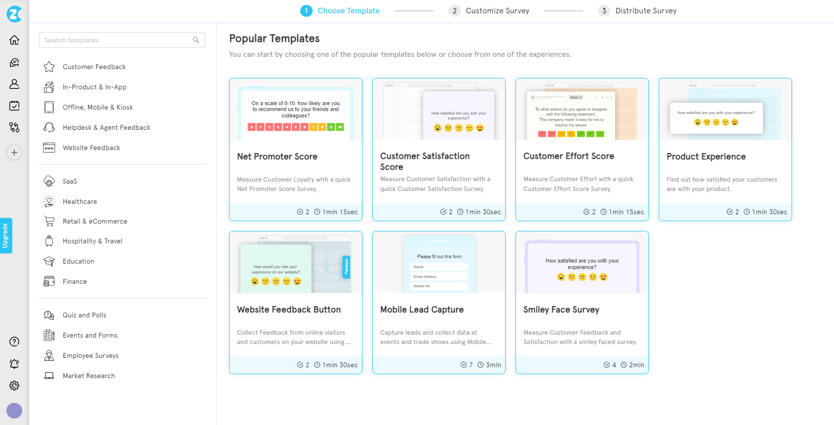
In the Zonka dashboard, click “Add Survey” and pick a template, or start from scratch. For a basic feedback button, the “Website Feedback” template covers the standard pattern.
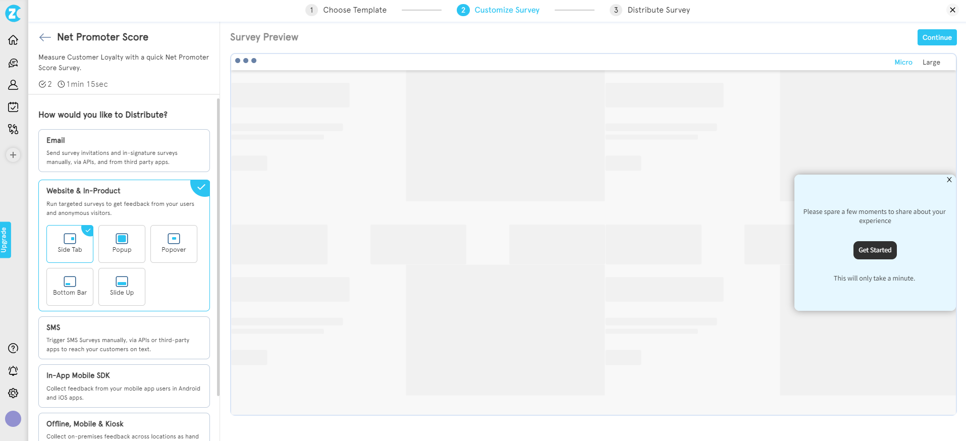
Step 2: Select the widget type
In Distribution settings, choose “Web widget” and select “Side Tab” or “Feedback Button” as the format.
Step 3: Customize the form
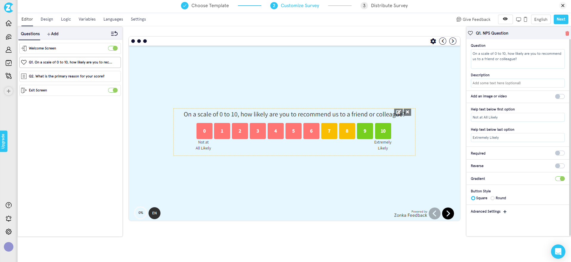
Edit the survey questions, adjust design to match your brand, and configure survey logic if you need conditional flows (e.g., different follow-ups based on a thumbs-up or thumbs-down response).
Step 4: Embed the code
Zonka generates a JavaScript snippet. Copy it and paste it into your site’s HTML before the closing </body> tag. The button loads asynchronously and doesn’t block page render.
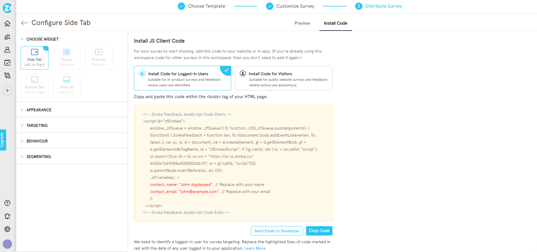
Once deployed, you can configure triggers (exit intent, scroll depth, time on page), targeting (specific URLs, user segments, device types), and frequency (show once, show until they submit, show every visit). Full configuration details are documented in the Zonka help center.
Other installation paths
- WordPress: Install the Zonka Feedback plugin, or paste the JavaScript snippet into your theme’s
<head>via a code-injection plugin. - Webflow: Paste the snippet into Project Settings → Custom Code → Footer Code. Publish.
- Raw HTML: Place the snippet before
</body>. Works like any third-party script. - Google Tag Manager: Create a Custom HTML tag, paste the snippet, set trigger to “All Pages,” publish. Cleanest path for teams routing all third-party scripts through one tag manager.
- Shopify / hosted e-commerce: Paste into theme.liquid for storefront-wide deployment. Most platforms restrict script injection on checkout pages, so check platform docs first.
If you want a free starter option, the no-cost route works for basic deployments. Most free tiers hit feature walls quickly once you need triggers, targeting, or routing.
When to Pick Which Tool
This guide covers what a feedback button is, how to place it, and how to get it working on your site. It doesn’t cover every tool on the market. That’s a separate job.
- For a full comparison of tools: website feedback button tools walks through 10+ options with pros, cons, and fit-by-use-case.
- For no-cost options: best free website feedback widgets covers the free tier and where each one breaks.
- For a head-to-head with a common alternative: Zonka vs Hotjar feedback button covers the direct comparison on feature parity, pricing, and deployment speed.
Benefits of Using a Website Feedback Button
A well-deployed feedback button compounds in value over time. The button itself is cheap to install. The program it enables is what matters.
- It catches issues your users would never otherwise report. The majority of friction on a site goes unmentioned. The feedback button turns that silent 90% into at least a visible 5-10%.
- It reduces support ticket volume. Users who can flag a small issue through a feedback button rarely bother to open a ticket. Routing navigation-issue feedback through the button cuts related tickets measurably within the first 60 days of deployment.
- It surfaces feature ideas you’d never think to ask about. Open-ended questions on exit intent produce the best roadmap inputs most product teams receive.
- It gives anonymous users a voice. Not every visitor wants to email with a contact form. An anonymous feedback button is where honest friction shows up.
- It builds the dataset that a serious customer feedback program runs on. One button equals one data point. A year of button feedback equals a signal-rich dataset that informs product, design, and content decisions.
Each of these works only if you close the loop. Feedback collected and ignored is worse than no feedback at all. It teaches your users their input doesn’t matter.
Getting Started
A website feedback button isn’t the end of the program. It’s the start. The button itself takes five minutes to install. The work that makes it useful — the triggers, the question design, the loop-closing, the trend analysis — is where teams either build a real website survey program or end up with another dashboard nobody opens.
If you’re ready to test a button on your site, schedule a demo and the team will walk you through it. The install takes minutes. What you build on top of it is what matters.


.svg)


.svg)


