


.svg)
 Healthcare
 Finance
 Retail
 SaaS & Digital
 eCommerce
 Education

 Salesforce
  HubSpot
 Pipedrive
 Mailchimp
 Zendesk
  Freshdesk
 HelpScout
  Front
Front Slack
Slack  Zoom
Zoom Google Sheets
  Zapier
  Integrately
 Webhooks
  Blogs
Blogs Webinar
 Product Updates
.svg)


TL;DR
-
A website feedback form is an embedded survey on a webpage (popup, slide-up, embedded form, or feedback button) that collects visitor input on usability, content, intent, or experience using metrics like NPS, CSAT, or CES.
-
The three highest-impact ideas for most sites: page-specific surveys, exit-intent forms on high-bounce pages, and segmented forms tied to user behavior.
-
Response rate benchmarks to plan against: popups land at 3–5%, embedded forms at 10–15%, exit-intent forms at 5–15% (cart-abandonment exit popups can run higher), feedback buttons at 1–2%.
-
Keep forms to 1–5 questions. Always pair a closed-ended rating (NPS, CSAT, or CES) with one open-ended "why."
-
Tools like Zonka Feedback run all ten ideas in this piece. Page-targeted, segmented, with auto-responses and white-label branding.
Most teams already know which page is bleeding traffic.
Heatmap shows it. Session replay shows it. The bounce rate column in your analytics dashboard shows it in red. You can watch the cursor hover over the pricing table for nine seconds before the tab closes.
What you can't see is why.
Why the cursor stopped on row three. Why the trial signup button got skipped. Why the visitor who spent four minutes on your case studies page never came back. Analytics tells you what people did. A feedback form tells you what they were thinking while they did it.
That gap is what this piece is about. We'll cover ten ways to run website feedback forms on a live site — the actual ideas, the questions to put inside each form, templates you can copy, and the placements that get response rates above 15%. Every idea here is tied to a goal, a question, and a page type. No abstract benefits. Just forms that work.
What is a Website Feedback Form?
A website feedback form is an embedded survey on a webpage that collects visitor input on usability, content, navigation, or product experience. It usually contains 1–5 questions, fires through a popup, embedded form, slide-up, or feedback button, and uses metrics like NPS, CSAT, or CES to score the response.
Three things separate it from a regular website survey:
It's short. A survey can ask twenty questions over five minutes. A feedback form gets one shot. Three questions. Ninety seconds. Done.
It's contextual. The visitor on your pricing page sees a different form than the visitor on your help docs. Each form catches the visitor at a moment of intent: about to leave, just finished reading, just completed a task, just hit a wall.
It runs continuously. It's not a project. It's a channel. The form fires every day on the page it lives on, collecting fifty responses a week without anyone touching it.
Together, those three things make feedback forms the cheapest piece of CX research most teams will ever run.
Website Feedback Form vs Website Survey: What's the Difference?
| Dimension | Website Feedback Form | Website Feedback Survey |
| Length | 1–5 questions | 5–20+ questions |
| Trigger | Contextual: popup, exit-intent, button click | Sent via link, email, or scheduled |
| Purpose | Catch the in-the-moment reaction | Structured research over time |
| Response rate | 5–25% depending on trigger | 5–10% via email |
| Where it lives | Embedded on the webpage | Standalone landing page or inbox |
| Example | Exit-intent popup on /pricing | Quarterly NPS email to all customers |
Both are useful. They answer different questions. The form catches the reaction; the survey captures the considered response. Most teams need both running in parallel.
Why Do Website Feedback Forms Matter? (The Data)
Three forces are reshaping how digital businesses gather feedback right now. They're worth naming up front because every idea below depends on understanding them.
The cost of a bad first session has gone up. In PwC's 2025 Customer Experience Survey, more than half of consumers (52%) said they stopped using or buying from a brand because of a bad product or service experience, and nearly a third (29%) walked away because of poor customer experience either online or in-person. On a website, that experience is often invisible in your analytics. The feedback form is what surfaces it.
Form length punishes you fast. Baymard Institute's checkout research shows 18% of US online shoppers have abandoned an order purely because the checkout was too long or complicated. The average US checkout has 23.48 form elements; the ideal is 12–14. The pattern travels: every additional field is a chance to lose the visitor. Feedback forms operate on the same physics, just at a smaller scale. Three questions completes. Five is the ceiling. Past five, the response rate drops fast.
Form usability is a measurable conversion lever. Nielsen Norman Group's research on website forms shows that forms following basic usability guidelines hit 78% one-try completion, versus only 42% for forms that violate them. That gap — almost double — is why form design isn't a polish task. It's the conversion task.
Visitors won't tell you twice. The friction the visitor felt at 11:42 a.m. is gone by lunch. By the time you ask in a follow-up email two days later, they've forgotten the moment, the page, and the intent. The feedback form catches them while it still stings.
These three forces sit underneath every idea in this article. They're also why the old-school 30-question website survey doesn't work anymore. The visitor closed the tab six questions ago.
But here's the thing. Running short, contextual feedback forms isn't enough by itself. Where you place them and what you ask inside them matters more than the format. The next two sections cover both.
Where Should You Place a Website Feedback Form? (6 Formats Compared)
The right format depends on goal and page type. Use exit-intent popups on high-bounce pages. Use embedded forms inside long content. Use slide-ups on engagement pages. Use feedback buttons sitewide as an always-on channel. The decision isn't which format is "best." It's which format matches the moment.
Here's how the six common formats compare on response rate, intrusion, and best-fit page type:
| Format | Best For | Avg Response Rate | Best Page Placement | Intrusion Level |
| Pop-over / popup | Catching attention mid-session | 3–5% | Pricing, blog, product | High |
| Embedded form | In-content feedback | 10–15% | Long-form blog, help docs | Low |
| Exit-intent popup | Reducing bounce | 5–15% | Cart, pricing, checkout | Medium |
| Bottom bar | Always-visible, non-intrusive | 2–4% | Sitewide | Very low |
| Feedback button | Voluntary reporting | 1–2% | Sitewide | Very low |
| Slide-up | Mid-engagement check-in | 5–8% | Articles, videos, tutorials | Low–medium |
1. Pop-over Forms
A small overlay that fires on a trigger: page load, time on page, scroll depth, click. They're high-attention by design, which means high response when they're relevant and high annoyance when they're not. The fix is restraint. One popup per session. One per page type. Never on the first visit.
When to use: pricing pages, product pages, blog posts where you need a fast read on whether the page worked.
2. Embedded Forms
The form lives inside the page body. No overlay, no trigger, no interruption. The visitor scrolls into it. Embedded forms read as part of the content rather than something fighting for attention, which is why they consistently land at 10–15% completion on long-form blog posts and help articles.
When to use: in-article CSAT, "Was this helpful?" feedback at the end of help docs, content rating after a video.
3. Pop-up Surveys (Exit-Intent)
The form fires when the visitor's cursor heads for the close tab or the back button. Exit-intent forms outperform other popup placements because the visitor has already decided to leave. There's nothing left to interrupt. They'll often tell you exactly why they're going. Popupsmart's benchmark of 10,000+ popup campaigns puts general exit-intent conversion in the 4–7% range, with cart-abandonment exit popups specifically averaging 17%. We've gone deeper on this format in our breakdown of popup surveys.
When to use: high-bounce pages like pricing, signup, checkout, and comparison pages.
4. Bottom Bar Forms
A thin strip at the bottom of the page. Always visible, never demanding. Response rates sit at 2–4%, which is lower than the others, but they're effectively invisible until the visitor wants them. That makes them the right choice for sites where intrusion costs trust.
When to use: editorial sites, knowledge bases, B2B SaaS dashboards where you can't afford to interrupt flow.
5. Feedback Button
A persistent button, usually right-side or bottom-right, that opens a small form when clicked. Response rates are the lowest on this list (1–2%), but the responses themselves are the most engaged. People who click a feedback button actually wanted to tell you something. Most teams use it for bug reports, feature requests, and "something's broken" alerts. We've covered the setup specifics in our website feedback button breakdown.
When to use: SaaS apps, B2B platforms, any site where users are logged in long enough to have an opinion worth volunteering.
6. Slide-Up Forms
A small panel that slides up from the bottom corner on a trigger, usually scroll depth or time on page. Less aggressive than a popup. More visible than a bottom bar. They land in the middle on response rate (5–8%) and the middle on intrusion. Predictable and quietly effective.
When to use: blog posts, video content, tutorials, onboarding flows.
Quick decision rule: High-bounce page → exit-intent. High-engagement page → embedded or slide-up. Always-on channel → bottom bar or button. Don't run all four on the same page. The visitor will close the tab on principle.
10 Website Feedback Form Ideas For Different Use Cases
Ten ideas, grouped by the goal they serve. Each one names the form, the question to put inside it, and the page type where it works hardest. Pick the two or three that match what's broken on your site this quarter. Running ten at once is how you train visitors to ignore your forms.
Ideas to Reduce Bounce and Exit
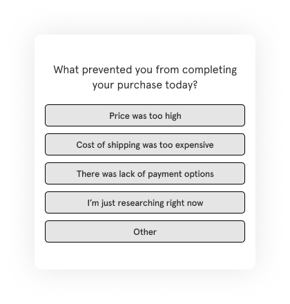
1. Add an Exit-Intent Survey to Find Out Why Visitors Leave
The form fires when the visitor's cursor heads for the close tab. By that point they've already decided to go. There's nothing to lose by asking. Response rates on exit-intent forms typically run 5–15% on high-bounce pages, and cart-abandonment exit popups can run higher still. Both rates sit well above what most other placements deliver.
Sample question: "Before you go, what stopped you from signing up today?" Pair it with three multiple-choice options (price, missing feature, just browsing) plus an "other" with a comment box.
When to use: pricing pages, signup pages, checkout, comparison pages. Anywhere bounce rate is above your site average. See more in our deep dive on website exit-intent surveys.
2. Use a Time-Delayed Popup for Visitors Who Linger
Some visitors don't bounce. They sit on a help doc for two minutes, scroll, scroll again, and you can tell from session replay they're confused but they aren't leaving. A time-delayed popup catches that moment. It fires after 60 or 90 seconds of dwell time and offers help instead of asking for a sale.
Sample question: "Looks like you've been here a while. What are you trying to figure out?" Open-ended. The answers tell you exactly which page sections need rewriting.
When to use: help articles, long-form documentation, comparison pages, complex product pages. Read more in our piece on popup surveys.
Ideas to Improve Specific Pages and Content
3. Run Page-Specific Surveys Instead of One Generic Form
A site-wide form gets diluted feedback. The visitor on your pricing page wants to talk about cost. The visitor on a blog post wants to talk about whether the article was useful. Asking both groups the same question gets you mush. Different page, different form.
A homepage form might ask "How did you find us?" to track traffic source quality. A blog post might end with a thumbs-up/thumbs-down. An order confirmation page is the perfect spot for a post-purchase shopping experience question.
When to use: always. Every page type that gets meaningful traffic deserves its own form aimed at the question that page is supposed to answer.
4. Take Content Feedback Right After Engagement
The best moment to ask "was this useful?" is the moment the visitor finishes reading. Not in an email three days later. The slide-up form that appears at 90% scroll depth on a blog post catches the reader while the article is still fresh. Same for video content, tutorials, and help docs.
Sample questions: "Was this article helpful?" (yes / partly / no) + "What's missing from this page?" (open-ended). The "what's missing" comments are gold for your content team.
When to use: blog posts, knowledge base articles, tutorial videos, website usability surveys on landing pages.
Ideas to Capture Qualitative Intent
5. Add a Floating Feedback Button as Your Always-On Channel
A floating website feedback button sits on every page, doesn't interrupt anyone, and waits. People who click it actually wanted to tell you something. That self-selection means the responses are usually substantive. Bug reports, feature requests, the "your search is broken on Safari" alerts that nobody else surfaces.
Response rate is low (1–2%). Response quality is the highest of any format on this list.
When to use: SaaS apps, B2B dashboards, any site where logged-in users spend real time and develop opinions worth hearing.
6. Use Smiley Face Surveys for Fast Sentiment Capture
Five emojis. One click. Done. Smiley face surveys work because they bypass the cognitive load of reading a question and translating a number into a feeling. The visitor sees a face and taps the one that matches their mood.
They also travel across languages. A user in Tokyo and a user in São Paulo both understand the angry face. That's why they're the right call for global sites and multilingual surveys.
When to use: mobile-heavy traffic, post-checkout, post-support, any moment where you want a fast read and don't need a paragraph.

7. Show Different Forms to Different User Segments
A new visitor and a returning customer don't have the same questions. A free-plan user about to churn isn't thinking about the same things as an enterprise customer who just renewed. Asking them all the same question wastes the visitor's time and yours.
Conditional logic and user segmentation let you fire different forms based on who's looking. Free-plan users see a churn-risk form. Enterprise renewals see an NPS prompt. New visitors see "what brought you here today?"
When to use: any site with logged-in users, returning visitors, or a CRM that knows who's who.
Ideas to Drive Conversion and Brand
8. Use Feedback Forms as Lead Magnets
This one's underused. A feedback form doesn't have to end at "thank you for your response." It can deliver a personalized result, a discount code, or a recommendation in exchange for an email address. The form becomes the lead magnet itself.
A skincare brand asks five questions about skin type and ends with a personalized routine plus a 10% off code. A B2B SaaS quizzes prospects on their use case and ends with a tailored case study. The visitor gets something useful. You get a qualified lead with context attached.
Auto-responses in Zonka Feedback can fire follow-up emails based on the answers given. Different message, different segment, all triggered by the form submission.
When to use: ecommerce, B2C subscription, info products, any B2B funnel where qualifying questions help sales prioritize.
9. Take Product Feedback Inside the Product
If you sell software, the highest-signal feedback comes from inside the product, not from a marketing site. An in-product survey tied to a specific feature catches the user the moment they've tried something and formed an opinion. The opinion is fresh. The friction (if any) is still on screen.
Sample question: "How easy was it to [specific action you just attempted]?" + "What would have made it easier?" Two questions. Tied to one feature.
When to use: SaaS, mobile apps, anywhere users are logged in and actively doing something. Read more in our product feedback guide.
10. White-Label Your Feedback Forms for Brand Trust
White-labeling and branding a feedback form means stripping the third-party tool's logo and replacing it with yours. Custom domain. Brand colors. Your logo. No "powered by" footer.
For most consumer sites this is cosmetic. For enterprise, regulated industries, and agencies running feedback for client sites, it's not optional. Visitors complete branded forms at noticeably higher rates because the form looks like part of the site they're already on rather than a third party crashing the conversation.
When to use: enterprise software, financial services, healthcare, agencies, any brand where the feedback form being visibly third-party would erode trust.
If any of these ideas land on your roadmap, the fastest start is a pre-built website feedback form template you can customize in fifteen minutes rather than building from scratch.
What Questions Should You Include in a Website Feedback Form?
The best website feedback form questions are short, single-focus, and tied to a goal. Use 1–3 questions per form, max five. Lead with a closed-ended rating (NPS, CSAT, CES, or smiley scale) so the data's quantifiable. Follow with one open-ended "why" so you understand the rating you just got.
Below is a starter library, grouped by what you're trying to learn.
Questions to Measure Satisfaction (CSAT, NPS)
- "How satisfied are you with [page / product / experience]?" (1–5 scale)
- "How likely are you to recommend us to a colleague or friend?" (0–10 NPS scale)
- "What's the main reason for your score?" (open-ended follow-up)
- "What would have made today's experience a 5 out of 5?" (open-ended)
- "Which part of [page / product] worked best for you?" (open-ended)
Questions to Measure Effort and Friction (CES)
- "How easy was it to [complete the task you just did]?" (1–7 CES scale)
- "What slowed you down today?" (open-ended)
- "Was anything confusing on this page?" (yes / no, plus comment box if yes)
- "How many tries did it take to get this right?" (1 / 2 / 3 / more)
- "What would you remove from this page if you could?" (open-ended)
Questions to Capture Intent and Goals
- "What brought you here today?" (multiple choice tied to your top 4–5 use cases)
- "Did you find what you were looking for?" (yes / partly / no)
- "What were you hoping to do that you couldn't?" (open-ended)
- "What's the next thing you'll do after leaving this page?" (multiple choice)
- "Who else at your company would care about [topic]?" (open-ended, B2B only)
Questions to Improve Content and Pages
- "Was this article helpful?" (thumbs up / thumbs down)
- "What's missing from this page?" (open-ended)
- "Did this answer your question?" (yes / no / partly)
- "How clear was the explanation?" (1–5 scale)
- "What page should we write next on this topic?" (open-ended)
Questions for Churn and Cancellation Forms
- "What's the main reason you're cancelling today?" (multiple choice with "other")
- "What could we have done differently?" (open-ended)
- "Are you switching to another tool? Which one?" (open-ended)
- "What would bring you back?" (open-ended)
- "Would you be open to a 15-minute call to share more?" (yes / no with email capture)
Question-writing rules: Keep each question under 12 words. Avoid double-barreled questions ("How easy and useful was this?" is two questions). Avoid leading questions ("How much did you love our new pricing?"). Always offer "other" as an option for multiple choice. The shorter the question, the higher the response rate.
Website Feedback Form Examples & Templates
Ten ready-to-use templates, grouped by what you're trying to measure. Each one shows a sample question inline so you can decide if it fits before opening the editor. Use any of them as a starting point and customize from there.
General CX Metric Templates
1. Net Promoter Score (NPS) Survey
The Net Promoter Score survey measures loyalty by asking how likely a user is to recommend you. Their score sorts them into promoters, passives, and detractors. Add an open-ended follow-up to find out why.
Sample question: "On a scale of 0–10, how likely are you to recommend us to a colleague or friend?" + "What's the main reason for your score?"
When to use: after a purchase, after onboarding, or as a periodic loyalty check on logged-in users. See our breakdown of NPS surveys for trigger timing.

2. Customer Satisfaction Score (CSAT) Survey
CSAT measures how satisfied a user is with a specific interaction or transaction. Where NPS asks about the relationship overall, CSAT asks about this one moment.
Sample question: "How satisfied were you with [the support call / the checkout / the onboarding]?" (1–5 scale, often paired with smiley faces)
When to use: after a support call, after checkout, after onboarding completes. Read more in our CSAT surveys guide.

3. Customer Effort Score (CES) Survey
Customer Effort Score measures how hard it was to complete a task. CES is the metric that catches friction. A high effort score means something on the page is in the way.
Sample question: "How easy was it to [complete the task you just did]?" (1–7 CES scale, where 7 = very easy) + "What made it easier or harder?"
When to use: after a purchase, after a support resolution, after a help-doc visit, after any task that's supposed to be simple. See our CES survey guide.

Page-Level Feedback Templates
4. Website Visitor Experience Survey
A periodic pulse on how visitors perceive your site overall. Less about a specific transaction, more about the whole experience: navigation, design, content, perceived speed.
Sample question: "Overall, how would you rate your experience on our website?" (1–5 scale) + "What would you change if you could?"
When to use: quarterly pulse on logged-in users, or as a sitewide bottom-bar form running continuously. Use this website feedback form template as a starting point.

5. Website Content Feedback Form
A specific check on whether a piece of content (article, blog post, video, help doc) actually delivered. The data feeds back into your content team's priority list.
Sample question: "Was this article helpful?" (yes / no / partly) + "What's missing?"
When to use: at the end of every long-form blog post, knowledge base article, and tutorial video.

Transactional Templates
6. E-Commerce Website Feedback Survey
Post-purchase feedback from customers who just completed a transaction. The window is short. Ask within 24 hours of order or you've lost the moment.
Sample question: "How was your shopping experience today?" (1–5 stars) + "Was there anything that almost stopped you from buying?"
When to use: on the order confirmation page or in the order confirmation email, fired immediately after checkout completes.

7. Subscription Cancellation Survey
The cancellation flow is the only chance you get to hear directly why someone's leaving. The visitor is already going. They have nothing to lose by being honest. Use it.
Sample question: "What's the main reason you're cancelling?" (multiple choice: too expensive / missing feature / switching tools / not using enough / other) + "What could we have done differently?" (open-ended). Read our piece on the main causes of customer churn for context on what the answers usually reveal.
When to use: mid-cancellation flow, before the user clicks the final confirm button.

Product Feedback Templates
8. Product Feedback Form
A general-purpose form for gathering product input. Improvements, observations, things that surprised the user. Best used as a floating button in the product, not a popup.
Sample question: "What's one thing about [product] you'd change if you could?" (open-ended) + "How important is this to you?" (1–5 scale)
When to use: always-on inside the product. Lower volume than other forms but the responses are usually substantive.

9. Feature Request Form
Feature requests deserve their own form because they need different fields than general feedback. You want the use case, not just the request itself.
Sample question: "What feature would help you most right now?" + "What are you trying to accomplish that you can't today?" + "How urgent is this for you?" (1–5 scale)
When to use: in-product, in your community forum, or as a clearly-labeled link in your help center.

10. Bug Report Form
The fastest path from "user found a bug" to "engineering can fix it." Structure matters here. Unstructured bug reports waste developer hours. Read our breakdown of bug report form questions for the full field list.
Sample question: "What page were you on when this happened?" + "What did you expect to happen?" + "What actually happened?" + browser/device auto-capture if possible.
When to use: as a floating button labelled "Report a bug" in your product, or as a footer link sitewide.

For UX-focused use cases, the website experience survey template is a strong companion to these. It's set up specifically for navigation, design, and perceived performance feedback.
How to Create a Website Feedback Form (Step by Step)
Two parts to this. First, the planning steps that apply no matter which tool you use (our breakdown of website feedback tools compares the major options if you're still picking one). Second, the Zonka Feedback walkthrough so you can see exactly how a form goes live.
The Planning Steps (Tool-Agnostic)
Step 1: Pick one goal per form. Satisfaction. Effort. Intent. Content quality. Pick one. A form that tries to measure all four ends up measuring none. The visitor abandons at question three.
Step 2: Choose the metric that matches the goal. NPS for loyalty. CSAT for satisfaction with a specific moment. CES for friction. Smiley scale for fast sentiment. Custom multiple choice for everything else.
Step 3: Write 1–3 questions. One closed-ended rating. One open-ended "why." Optionally one multiple-choice qualifier. Stop there. Use the question library above as your starting point.
Step 4: Pick the placement and trigger. Match format to page type using the table above. Exit-intent on high-bounce. Embedded on long content. Slide-up on engagement pages. Button as always-on.
Step 5: Set targeting. Who sees this form? New visitors only? Logged-in customers? Mobile users? Cap frequency: don't show the same form twice in 30 days. The fastest way to train a visitor to ignore your forms is to repeat the same one.
Step 6: Test, launch, iterate. Preview on staging. Watch the first 50 responses. If the response rate is below 2% or the open-ended box is mostly empty, the question's wrong. Rewrite it.
How to Build a Website Feedback Form in Zonka Feedback
Here's the actual workflow inside Zonka, end to end.
Step 1: Create the Website Feedback Form
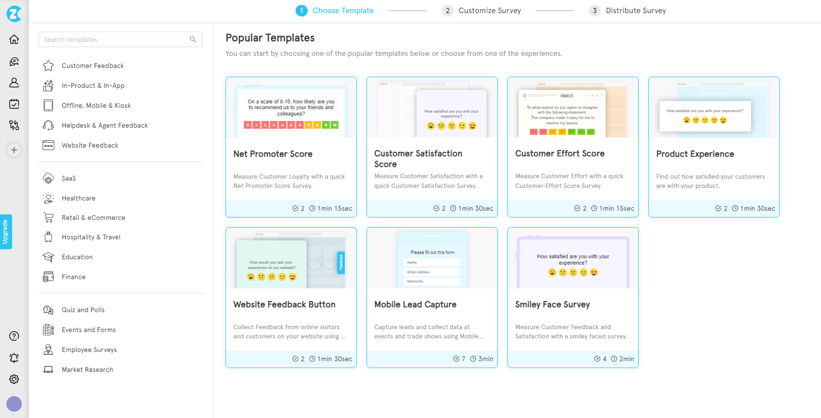
Log in. Click 'Add Survey'. Pick a template that matches the metric you chose in your planning, or start from scratch.
Step 2: Select the Distribution Channel
Once the template's open, pick the distribution. For a website feedback form, choose 'Website & In-product' from the left side.
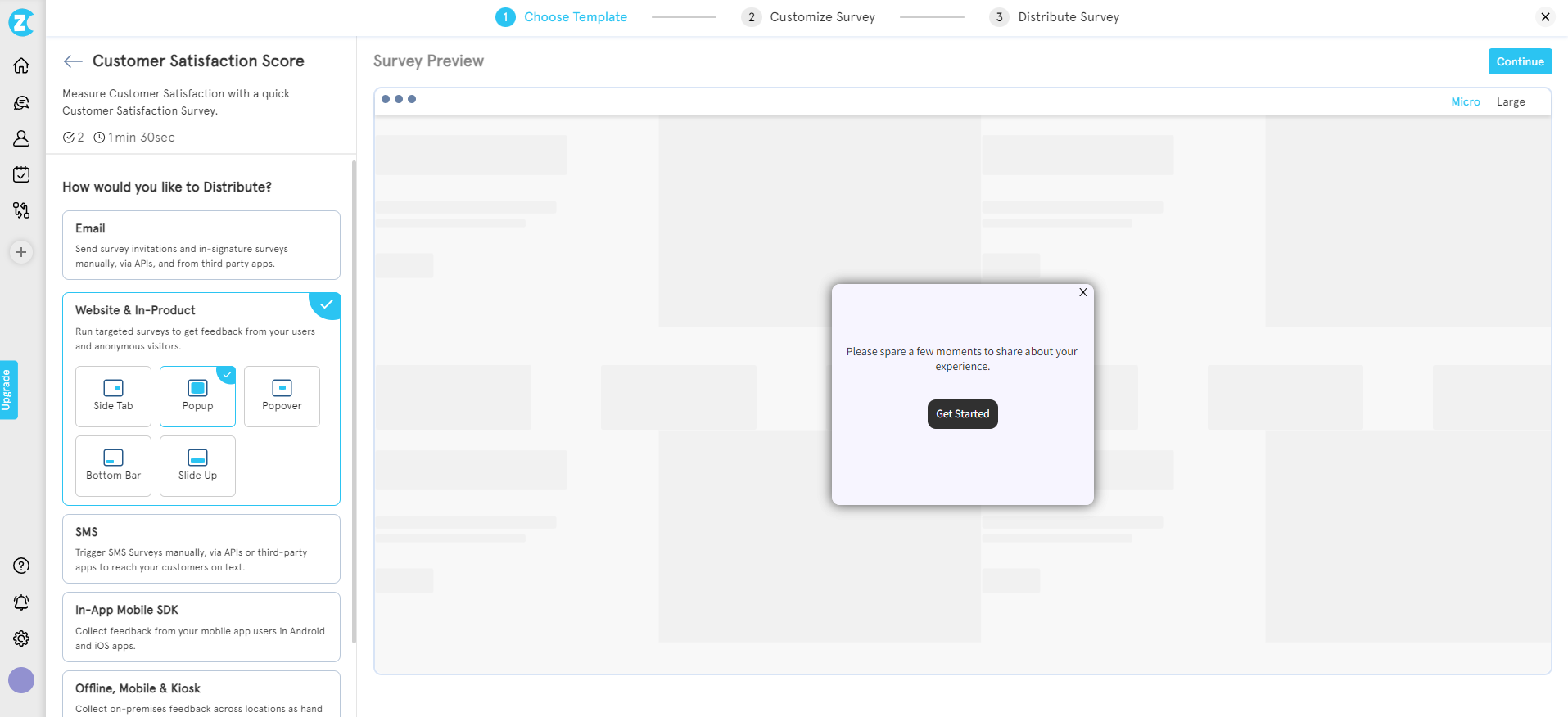
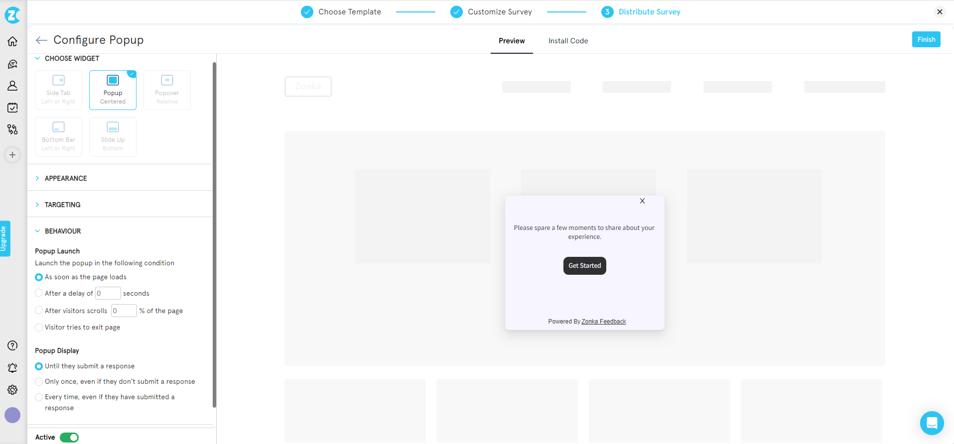
Step 3: Pick the Web Widget
Pick the widget format that matches your placement decision: popup, slide-up, embedded, bottom bar, or feedback button. Click 'Continue'.
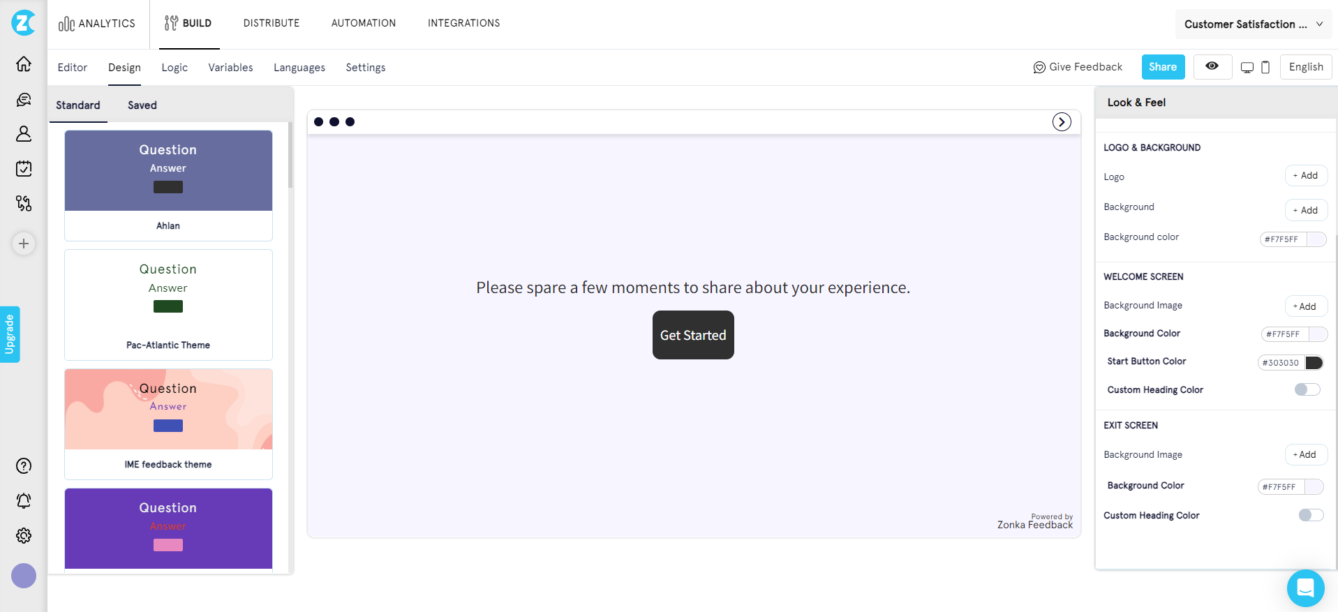
Step 4: Customize the Form
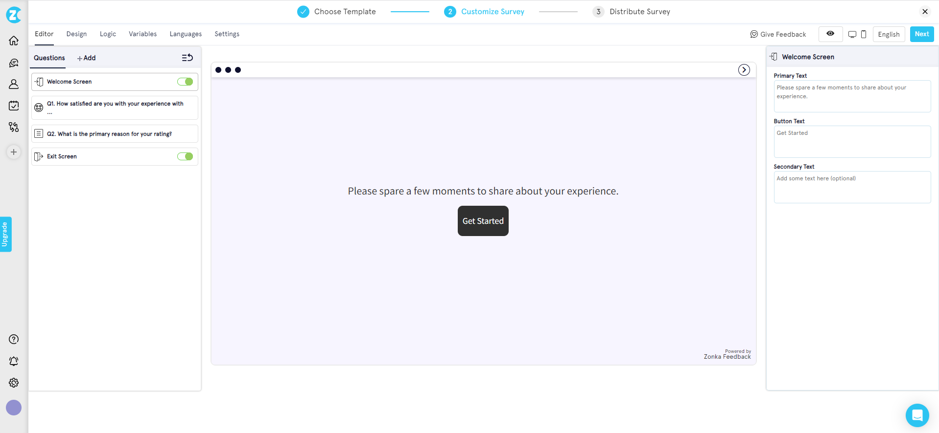
Edit the questions, add survey logic, set rating scales, and adjust the design to match your brand. Reposition questions if you want a specific flow. Add or remove fields.
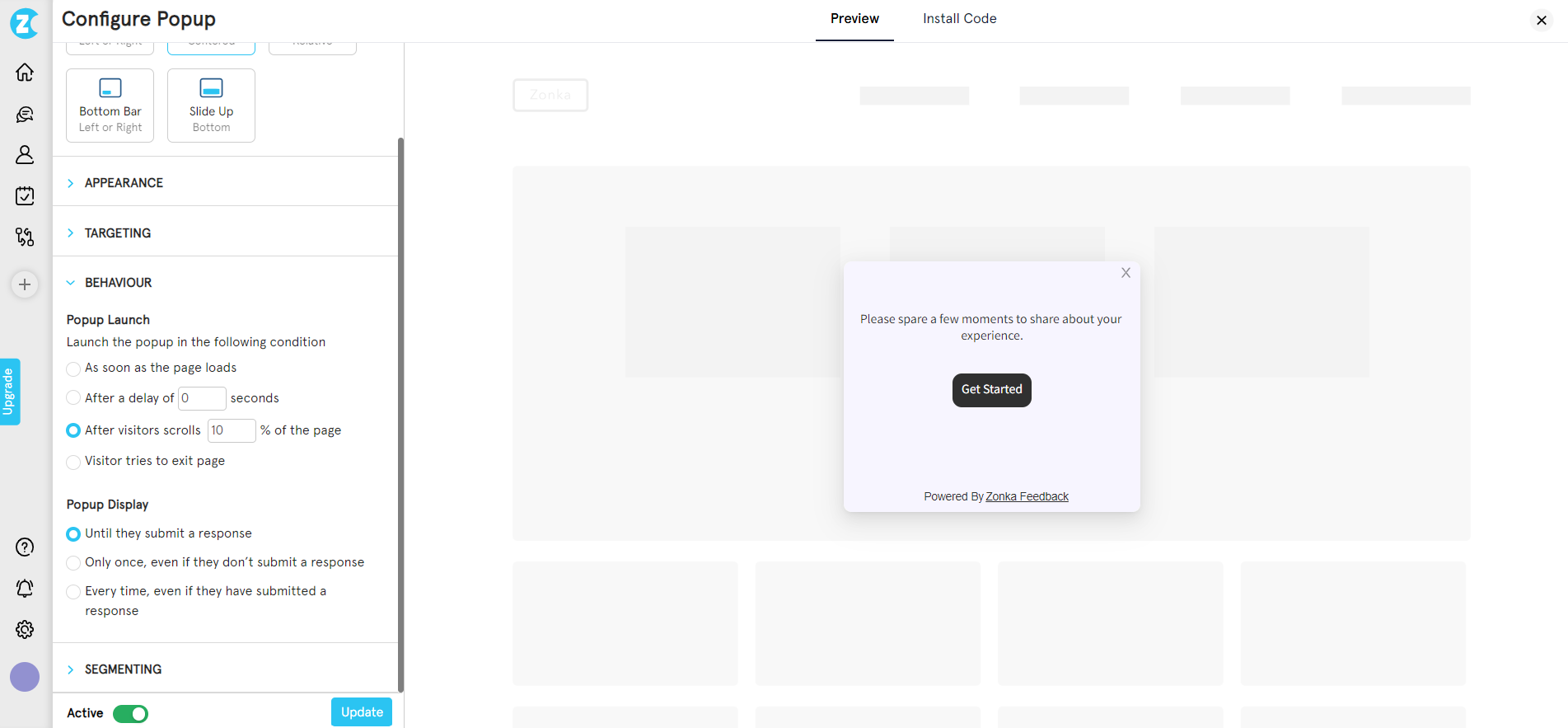
Step 5: Configure the Web Widget
This is where targeting and behavior live. Set which devices, which user segments, which pages. Decide when the form fires: page load, time delay, exit intent, scroll depth.
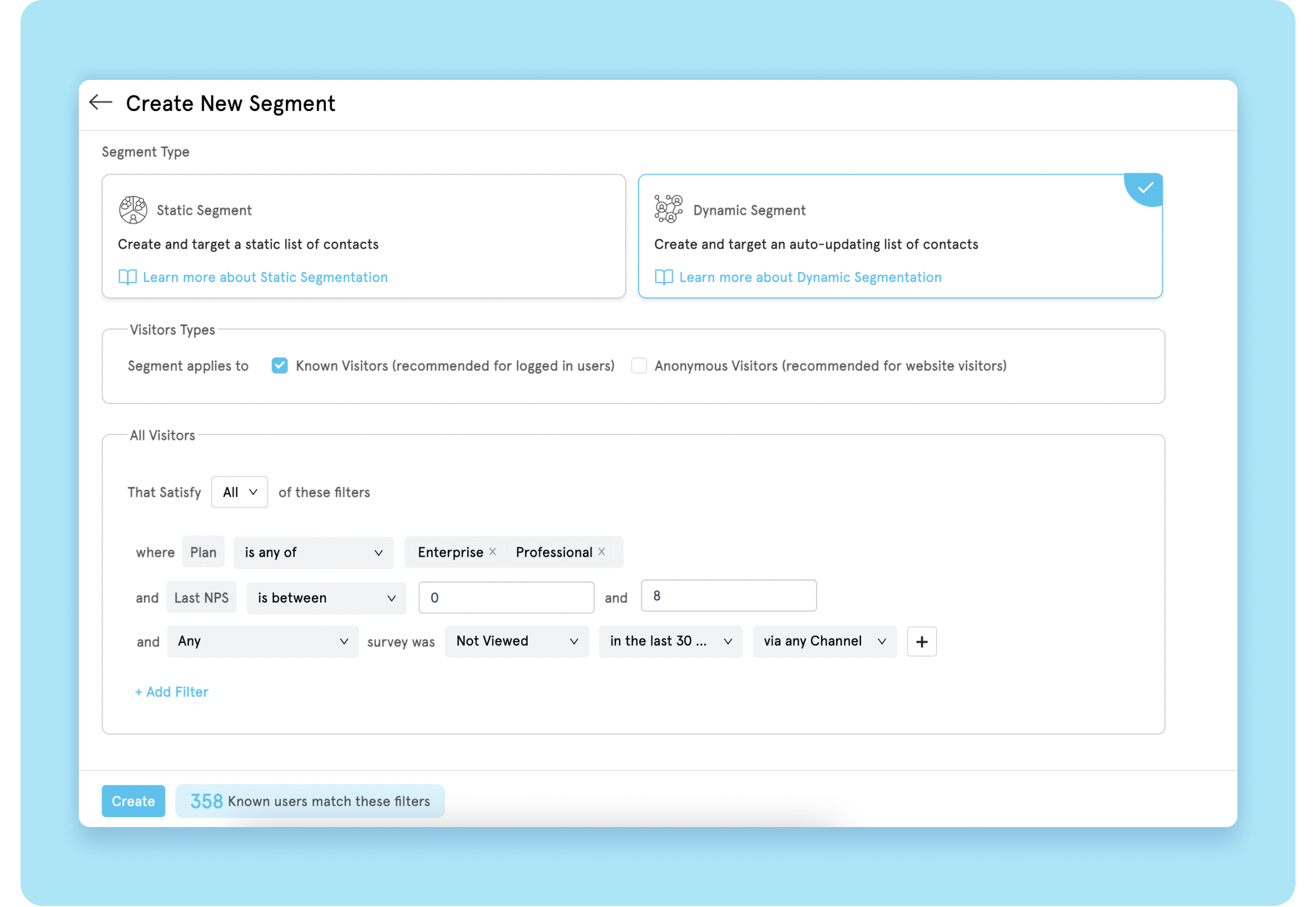
To target a segment (say, only show a CSAT survey to visitors who haven't taken one in the last 30 days), go to 'Contacts and Segments' on the left, click 'Segments', and add a new one. Define the conditions.
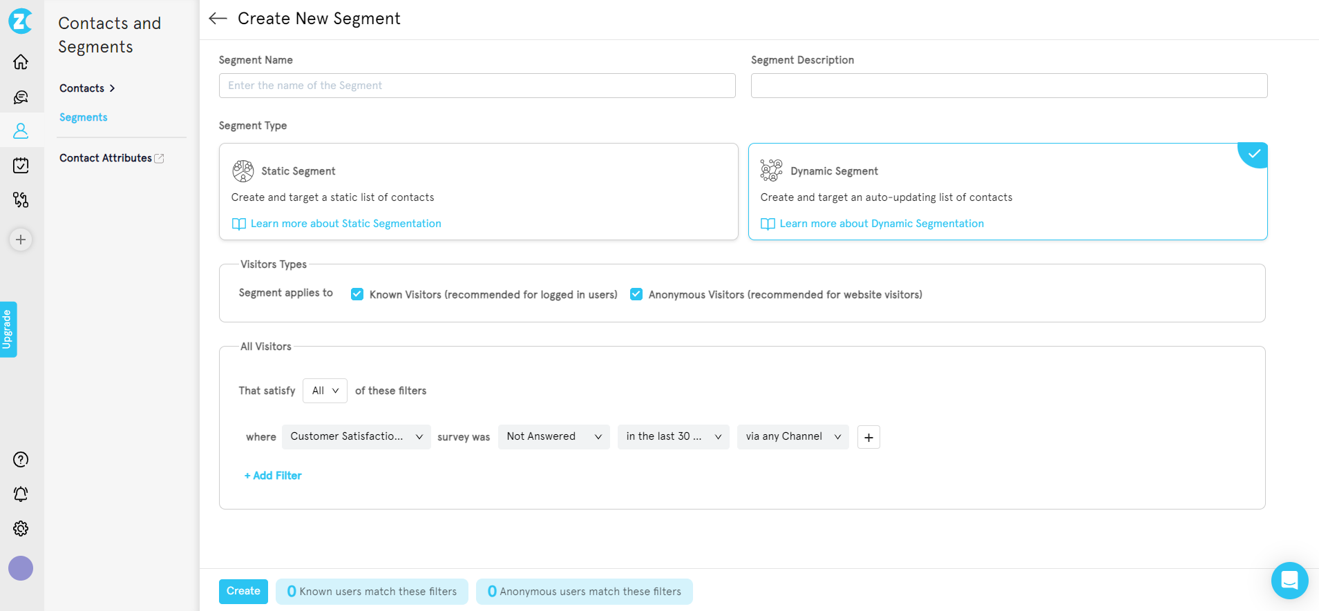
Then return to the form configuration, click 'Segmenting', and pick the segment you just built from the dropdown.

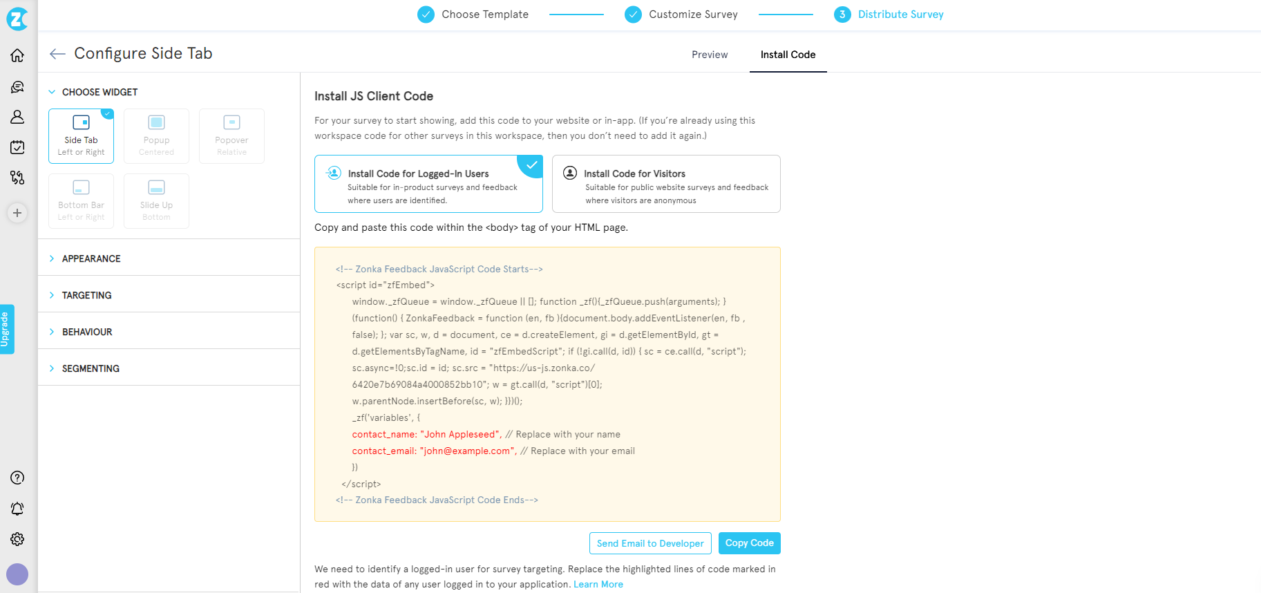
Step 6: Embed the Code on Your Site
Open 'Install code'. Copy the snippet. Paste it into your site's HTML, usually in the footer or via your CMS plugin. The form goes live the moment the code propagates.
Website Feedback Form Best Practices
The teams whose feedback forms actually move metrics share five habits. None of them are about design or color choices. They're about restraint and follow-through.
1. Keep It to 1–5 Questions
Every question past the third drops your completion rate. Nielsen Norman Group's form usability research puts the principle plainly: every time you cut a field or question, you increase conversion. Three is the practical sweet spot for feedback forms. Five is the ceiling. If you have a sixth question, ask it in a follow-up email after they've engaged.
2. Trigger at the Right Moment
The same form fired at the wrong moment gets 1% completion. Fired at the right moment, 25%. Post-purchase. Exit-intent. End of help article. After support resolution. The timing is the form. The questions are secondary.
3. Always Pair Closed With Open-Ended
A rating without a "why" is a number you can't act on. A "why" without a rating is anecdote. Pair them. The closed-ended question gives you data. The open-ended one gives you the reason. Together they tell you what to fix and how badly to prioritize it.
4. Design Mobile-First
More than half of web traffic is mobile for most sites. Build the form on a phone screen, not a 27-inch monitor. One question per screen on mobile. Big tap targets. No drop-downs that hijack the keyboard. Test the actual form on the actual device.
5. Close the Loop
The number-one reason visitors stop responding to feedback forms isn't fatigue. It's that nobody ever heard back. Acknowledge every submission. Tell them what happens next. When you ship a change based on feedback, email the people who asked for it. Read more in our piece on closing the customer feedback loop.
Other foundational habits to layer on top: avoid leading questions, mix scale types when appropriate (Likert scale surveys, 5-star surveys, smiley), and run the form across the right customer touchpoints instead of betting everything on one placement.
Start With Three Ideas, Not Ten
Three ideas matter more than the rest: page-specific surveys, exit-intent on high-bounce pages, and segmented forms tied to who's looking. Pick those first. Layer in the others as you learn what your visitors actually want to tell you.
The reason most website feedback programs fail isn't bad forms. It's bad placement, lazy questions, and silence after submission. Get the trigger right. Pair every rating with a "why." Acknowledge every response. The rest follows.
Analytics will keep telling you what visitors did. The right form, on the right page, asked at the right moment, tells you why. That's the whole game.


.svg)


