.svg)
 Healthcare
 Finance
 Retail
 SaaS & Digital
 eCommerce
 Education

 Salesforce
  HubSpot
 Pipedrive
 Mailchimp
 Zendesk
  Freshdesk
 HelpScout
  Front
Front Slack
Slack  Zoom
Zoom Google Sheets
  Zapier
  Integrately
 Webhooks
  Blogs
Blogs Webinar
 Product Updates


TL;DR
- A mobile app survey is a short feedback form embedded natively inside your app: no redirects, no external links, no friction.
- In-app surveys triggered via SDK average around 13% response rates. Email surveys opened on mobile average 1-3%. The difference is context, not device.
- The 15-category question bank below covers everything from general UX to exit intent, pricing, bug reports, and NPS.
- Timing matters more than question wording. Trigger surveys close to the event: post-onboarding, post-purchase, post-support, not at random intervals.
- For platform-specific setup, see Zonka's SDK tutorials for iOS, Android, React Native, and Flutter.
Most teams assume mobile survey responses are hard to get. They send a link, hope someone clicks it, and accept that 1-3% completion as just the way mobile works.
That number is accurate. Just not for the right kind of mobile survey.
When a survey runs natively inside your app, triggered by an SDK, rendered in your own UI, appearing right after a user completes onboarding or makes a purchase: response rates jump to around 13%. Not because users suddenly became more cooperative. Because the friction is gone, the context is right, and the question lands at the exact moment it's relevant.
That's the difference this guide is built around. Mobile app surveys are one of the most direct methods of collecting product feedback while users are actively inside the app. For the broader framework on how that feedback connects to product decisions, the product feedback guide covers the full system.
Below, you'll find a question bank covering 15 use cases and 50+ mobile app survey questions designed for the moments that actually matter. You'll also find the mechanics of running them well: when to trigger, how to design for small screens, what SDK-based delivery looks like in practice, and what mobile survey data reveals that app store reviews never will.
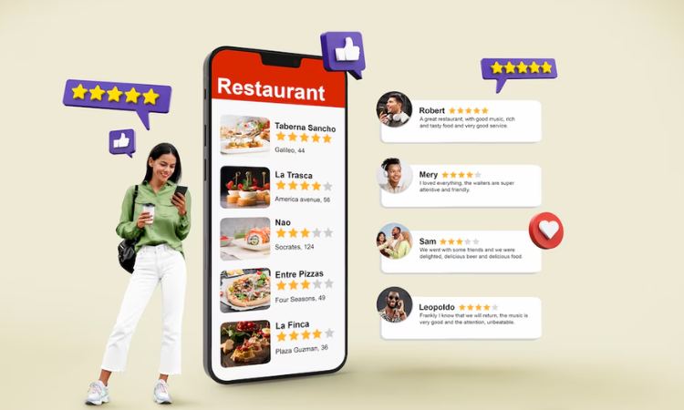
Measure Mobile User Feedback & Insights
With Mobile Feedback Surveys, understand what users need and learn ways to delight your customers.

What Exactly Is a Mobile App Survey — and How Is It Different from an In-App Survey?
A mobile app survey is a feedback form that appears directly within a mobile application (as a pop-up, banner, slide-in, or embedded card), triggered by a user action or timing rule, without ever redirecting the user to a browser or external page.
The response is captured inside the app and mapped back to that user's session data. No click-through. No context switch. No friction.
One clarification worth making: mobile app surveys and in-app surveys are often used interchangeably, but they're not quite the same thing. In-app surveys can run inside desktop apps, SaaS web products, or browser-based tools too. Mobile app surveys are the mobile-specific subset. They run through a native iOS or Android SDK, or a cross-platform SDK like React Native or Flutter, which gives you tighter control over trigger timing, UI rendering, and screen placement. For dedicated survey platforms with SDK integration, the best in-app survey tools guide covers the options. For always-on feedback widgets, see in-app feedback tools.
Why does the mobile context change things? Users on mobile are usually in the middle of something: finishing a transaction, navigating a new feature, reading a notification. The attention window is short. A survey that matches the app's interface, appears at the right moment, and asks a single focused question fits into that window. A survey that opens a browser tab does not.
Small screens also change what question formats work. Text fields are harder to use with one thumb. Tap-to-select options, star ratings, and emoji scales get completed. Long forms get abandoned.
Why Do Mobile App Surveys Get Better Response Rates Than Email Surveys?
The assumption most teams carry into this: surveys are surveys. Write the question, send it out, get back what you get back.
That's not what the data shows.
In-app surveys running through a native mobile SDK average around 13% response rates. Email surveys that users click through to on mobile average 1-3%. That's not a marginal gap. It's a structural one.
Not about devices. About context.
The user doesn't click through to an unfamiliar page. The user doesn't wait for a browser to load. The user doesn't evaluate whether this form is from a trusted source before deciding whether to engage. The survey is just there, part of the flow they're already in, and the question is about something they just did.
That's three things working together that email surveys can't replicate:
- Zero redirect friction: Users stay inside the environment they already trust. No click-through, no browser load, no unfamiliar interface to evaluate.
- Contextual relevance: The question is about a specific event they just completed, not a vague impression of the product overall.
- Moment capture: The feedback reflects what the user actually felt, not a reconstructed version shaped by whatever else happened before the email survey arrived.
Here's what we see in practice. The surveys that perform best aren't the shortest or the most beautifully designed. They're the ones that trigger at the right moment. A three-question survey 45 seconds after onboarding completes will consistently outperform a one-question survey shown at random during a session. Timing is the lever most teams underestimate.
One platform-specific note worth knowing: in-app feedback using Android SDK users tend to dismiss surveys faster than in-app feedback with iOS SDK users. Surveys with single-tap inputs (star ratings, yes/no options, emoji scales) outperform text-first formats on Android. iOS users tolerate slightly longer flows before abandoning. User segmentation by platform, plan tier, or lifecycle stage makes that split-testing possible.
What's a realistic response rate to target? Here's what we see across programs:
- General pulse check (shown during an active session): 10-20%
- Post-event survey (right after onboarding, a purchase, or a support resolution): 25-40%
- Email surveys opened on mobile: 1-3%
The biggest lever is proximity. The closer the survey fires to the experience it's asking about, the more signal you get back.
What Are the Most Common Mobile App Survey Questions?
Before getting into use-case-specific questions, here are the ones that appear most frequently across mobile survey programs. For a broader bank of product feedback questions beyond mobile, and for structured product survey questions organized by metric type, those guides cover the full range.
- How would you rate your overall experience of using this app?
- How would you rate the app's overall design in terms of visual appeal?
- Did you find any difficulties or confusion while using the app?
- How would you rate this app in terms of ease of use?
- Do you agree that our support staff made it easy to resolve your issues and concerns?
- How would you rate this app in terms of value for money?
- Are you able to use all the features of the app easily and conveniently?
- Is there any feature you feel is missing in the app?
- Did you encounter any technical issues or bugs while using the app?
- How would you rate your purchase experience with this app?
- What is the main reason for exiting the app?
- How likely are you to recommend this app to your friends and colleagues on a scale of 0 to 10?
These work well as quick, single-screen check-ins. For a deeper read on specific moments in the user journey, the use-case questions below give you more to work with.
What Should You Ask? Mobile App Survey Questions by Use Case
Below are targeted survey questions designed to capture valuable user feedback at the right moments.
1. General App Feedback Questions
Understanding users' overall experience is where most mobile survey programs start. These questions give users space to rate their experience, name what works, flag what doesn't, and share anything that doesn't fit elsewhere in the survey.
- How would you rate your overall experience of using this app?
- What do you like the most about this app?
- Is there anything that you don't like about this app?
- Were you able to achieve your objectives of using the app?
- Do you want to share anything else about your experience with this app?

2. App Design Feedback Questions
Design shapes first impressions and long-term retention. These questions surface user reactions to visual appeal, branding consistency, and navigation. They're often the first to reveal why users drop off before any functional issue ever shows up.
- How would you rate the app's overall design in terms of visual appeal?
- Do you agree that the colors and visual elements used in the app are consistent with the brand's identity?
- Were you able to locate important features and information easily within the app?
- Is the app's font size and style comfortable for reading and interacting with the content?

3. App Usability Feedback Questions
Usability problems don't always generate complaints. Users often just stop using the feature, find a workaround, or quietly churn. These questions help surface the friction before it turns into a drop-off number on a dashboard.
- Were you able to achieve your goals of using the app?
- Did you find any difficulties or confusion while using the app?
- Were the menu options clear and logically organized?
- Do you think we should do something to improve the app's usability?

4. Overall Experience Questions
A quick read on overall Customer Satisfaction Score (CSAT), useful for periodic benchmarking and for catching changes in user sentiment after major updates or releases.
- How would you rate your overall experience of using the app?
- Do you think we can do something to improve your overall experience of using the app?

5. Ease of Use Questions
Ease of use is what keeps users coming back. These questions identify where the learning curve is steeper than it should be and where specific features need simplification. Product managers and mobile teams use Customer Effort Score (CES) data from these questions to prioritize UX improvements.
- How would you rate this app in terms of ease of use?
- Were you able to quickly understand how to use the app's features and functionalities?
- Were there any features or processes that you found complicated or difficult to use?
- Do you think any specific features can be simplified to make them easier to use?

6. Support Feedback Questions
Support quality is a direct driver of retention. These questions, which function as part of CES survey programs that measure how much effort users had to put in to get an issue resolved, not just whether they were satisfied with the outcome. Often the two diverge. Valuable support feedback enables you to refine your support processes and build more positive user relationships over time.
- How was your experience with our customer support team?
- Do you agree that our support staff made it easy to resolve your issues and concerns?
- How would you rate the responsiveness of our customer service team?
- Were your issues and queries resolved to your satisfaction?
- Based on your recent interaction with our customer support team, how likely are you to recommend this app to your friends and colleagues on a scale of 0 to 10?

7. Pricing Feedback Questions
Pricing perception affects both conversion and churn. These questions surface mismatches between what users expect to pay and what they're experiencing, which is often a framing or communication problem rather than an actual pricing one.
- How would you rate this app in terms of value for money?
- Did you face issues or confusion related to the app's pricing structure?
- How would you rate our pricing plans in terms of suitability for your requirements?
- How satisfied are you with the pricing options available such as yearly, monthly, and lifetime subscriptions?
- Do you think there should be more flexibility in pricing options?
- Do you agree that the pricing of the app is justified considering the updates and improvements in the app?

8. Feature Feedback Questions
Not every feature lands. These questions help you identify what users actually use, what's confusing, and what's taking up space without adding value. Useful inputs for collecting product feature requests and roadmap prioritization.
- Are you able to use all the features of the app easily and conveniently?
- Which feature do you like the most?
- Do you think there is any feature in the app that is not very useful?
- Do you have any issues with any feature and do you feel it should be improved?
- How would you rate the recently added latest feature of the app?

9. New Feature Request Questions
What users want next is different from what they think about what already exists. These two questions open a direct line to feature demand. Simple, low-effort, and worth running after any major release. For teams running early access programs, a beta testing survey captures structured feedback before the feature reaches your full user base.
- Is there any feature that you would like to see in the app in the near future?
- Is there any feature you feel is missing in the app?

10. Bug Report Questions
Bugs get reported through support tickets and app store reviews, after users have already lost trust. These questions catch technical issues earlier, while users are still in the app and still engaged enough to tell you what went wrong. For a deeper question set, bug report form questions covers the full design.
- Did you encounter any technical issues or bugs while using the app?
- Do you want to share any experience of facing any technical issues or bugs?

11. Post-Purchase Feedback Questions
Send these within minutes of a completed transaction, not hours later. A post-purchase survey captures the user's reaction while it's still fresh and surfaces checkout friction before it starts showing up in abandoned cart numbers.
- How would you rate your purchase experience with this app?
- Based on your recent purchase experience, how likely are you to recommend this app to your friends and known ones on a scale of 0 to 10?

12. Open-Ended Questions
Open-ended questions give users space to say the thing they couldn't fit into a rating scale. Use them sparingly: one optional open-ended question per survey is usually enough, but don't skip them. The most useful feedback often lives in free-text responses. Qualitative voice of customer data from these responses is where AI-assisted thematic analysis adds the most value.
- Would you like to share additional comments, suggestions, or any specific experience with the app?

13. Exit Intent Questions
Understanding why users leave a session, a screen, or a cart is different from understanding why they stay. These questions catch the moment of exit and give you the reason without waiting for a churn event or a churn survey questions flow weeks later.
- Are you sure you want to exit this app?
- What is the main reason for exiting the app?
- On a scale of 0 to 10, how likely are you to return to the app?
- What is the most prominent reason that is stopping you from making the purchase today? (for cart abandonment flows)

14. NPS Survey Questions
The NPS survey is the standard measure of user loyalty: one question, a 0-10 Net Promoter Score scale, and a follow-up asking why. It belongs at relationship moments: post-onboarding, quarterly check-ins, before renewal, not after individual support interactions. For the full methodology, the Net Promoter Score guide covers it in detail.
- How likely are you to recommend this app to your friends and colleagues on a scale of 0 to 10?
- How likely are you to continue using this app in the future?
- How likely are you to make more purchases in future through this app?

15. Follow-Up Questions
The follow-up question turns a rating into a reason. It's most commonly used in CSAT survey programs, NPS, and CES, and works after any question that asks users to score their experience. A good survey tool lets you personalize follow-ups based on the prior response so the question actually connects to what the user said.
- Could you please tell us the primary reason for your rating?
You can adapt the follow-up based on the rating received:
- For positive responses: "Thank you for appreciating our efforts, we are glad that we were able to serve you right! We would love to know what made you rate us the way you did."
- For neutral responses: "Thank you for sharing your valuable feedback! Can we do something to make this app better and improve your experience?"
- For negative responses: "We apologize for your bad experience! Can you please let us know the primary reason for your disappointment so that we can serve you better?"

How Do You Run Mobile App Surveys That Actually Get Responses?
Most mobile survey guidance focuses on the question. Keep it short. Make it clear. Avoid jargon.
That's all correct. But it's not where the difference is.
The surveys that perform aren't the most carefully worded. They're the ones that fire at the right moment, respect what the user is doing, and look like they belong in the app. Those three things determine whether someone answers or dismisses. The question wording is almost secondary.
So where does the real variable live? Execution. Here's what it looks like in practice.
Keep it to two steps — a rating, then a reason
The format that survives mobile: one quantitative question (NPS, CSAT, a star rating, a thumbs up/down), followed by one optional open-ended follow-up.
Not ten questions. Not five. Two.
Completion rates drop sharply after the second question on a small screen. And the data you actually collect is more useful than the data you hoped to get from a survey 80% of users abandoned after question three. One well-answered rating tells you more than six partially answered scales.
Timing is the variable most teams underestimate
There's a mistake that shows up constantly: triggering surveys after session three, or session five, or some arbitrary engagement threshold that feels logical in the product meeting but captures nothing specific in practice.
By session five, the user's memory of the onboarding friction they hit on day one is gone. What you're measuring is a blurred impression, not a fresh reaction.
The moments that consistently outperform:
- Right after onboarding completion
- Right after a first purchase
- Right after a support issue resolves
Those are the windows where users have a specific, intact experience to react to.
New users in the first 72 hours are the highest-signal cohort for onboarding feedback. A single well-placed question at day two ("Did you find what you needed?" or "What brought you here today?") is worth more than a monthly NPS blast to your entire user base. It catches the specific onboarding gap. It names the moment the new user got confused, or didn't, before they normalize it or forget it entirely.
Trigger proximity to the event is the lever most teams never test.
Design for the thumb, not the cursor
Mobile surveys are navigated with one thumb. That changes everything about which question formats work.
Tap-to-select options, star ratings, and emoji scales get answered. Text fields, especially long ones, especially mandatory ones, get abandoned. Use them as secondary optional follow-ups, never as the primary question format.
Screen size matters too. Test on actual devices. A button that looks fine in a design file can be too small to tap comfortably on a mid-range Android device. Flagship phones render differently than the devices most of your users actually own. Test on a Redmi or a Moto, not just the latest Samsung. That's where rendering breaks first.
One thing that's non-negotiable: include a "Skip" or "Remind me later" option. A user who's mid-task doesn't want to complete a survey. Force the survey and you'll get rushed, hostile data. Give them the exit, and the users who respond are the ones who actually have something to say. That's the cohort worth hearing from.
Keep surveys in-app: redirect kills response rates
Redirecting a user to a browser to complete a survey breaks the context entirely. Response rates drop by roughly half on redirect flows versus native in-app triggers.
The practical implication: use a tool that renders surveys natively inside your app, matching your fonts, your colors, your UI components, rather than opening a webview. A survey that looks like part of your app gets completed. A survey that looks like a third-party form gets dismissed. That's not a hypothesis. It's consistent across programs of every size.
Mobile surveys and privacy: what you need to know
GDPR and CCPA apply to survey data collected from mobile users. The rules aren't complicated: don't collect personal identifiers you don't need, include a consent step if you're asking for identifiable information, and give users a clear opt-out path.
One thing that catches mobile teams off guard: Apple's App Store Review Guidelines have rules about survey prompts. Surveys that obscure app functionality, interrupt critical flows, or feel manipulative can trigger a rejection or removal. Keep surveys non-intrusive, dismissable, and contextually placed — and you'll be well inside the guidelines.
A/B test the trigger moment, not just the question
Most A/B testing in mobile surveys focuses on wording. That's the wrong variable to start with.
Test trigger placement instead. A streaming app running two versions: one fires before a show starts, one fires after it ends. Both will almost always see better completion on the post-watch version. The user has a complete experience to react to. Their opinion is formed. The pre-watch version is asking about something that hasn't happened yet.
Small timing changes produce larger response rate differences than small wording changes. Test that first.
What Does Mobile Survey Data Show That App Store Reviews Miss?
App store reviews are written by two types of users.
The ones who loved something enough to leave five stars. The ones who were frustrated enough to leave one.
The middle 60%, users who quietly stopped using a feature, found a workaround, got confused once and never came back, don't write reviews. They just drift. And that cohort is where most churn actually lives.
Reviews tell you about the user who loved you. Reviews tell you about the user who hated you. Reviews tell you almost nothing about the user who quietly left.
Mobile surveys catch what reviews miss:
- The user who rated the app 3/5 and wrote "I couldn't figure out how to export my data." That's a product roadmap item nobody flagged in support tickets or analytics.
- The user who completed onboarding but never activated the core feature. A post-onboarding survey catches that gap before it becomes a retention number.
- The new user who had a great first session but got stuck on day three. Visible in a day-two survey. Invisible in a day-thirty NPS.
Reviews are self-selected and emotionally triggered. They reflect the extremes of user experience, not the median. And they lag. A review written today might be describing an experience from last week, already partially reconstructed by memory.
The most useful feedback we see from mobile surveys isn't negative. It's neutral. A user who rates 3/5 and explains why has given you something specific to fix. A one-star review that says "terrible app" tells you there's a problem. Not what it is. Not where it is.
The challenge is volume. When hundreds of users leave open-text responses, manually reading each one stops being realistic. That's where AI feedback analysis changes things: thematic clustering groups responses into patterns (34% about navigation, 22% about load times, 18% about a specific feature), sentiment scoring catches the frustration hiding behind a 4/5 rating, and the product team gets a prioritized signal instead of an inbox.
Not removal. A signal.
Reviews tell you reputation. Surveys tell you behavior.
Use both. But if you're deciding where to invest attention first, the survey catches the friction before it becomes the one-star review. That's a different kind of value, and a different kind of timing. When those survey signals feed into a structured product feedback loop, they reduce churn and improve retention in ways that review monitoring alone never will.
How Does SDK-Based Survey Triggering Work on Mobile?
An SDK is a small code package integrated into your app once. After integration, you manage survey logic (what triggers a survey, which users see it, when it fires) from a dashboard, without resubmitting the app to the App Store or Google Play every time you want to change something.
Here's how the trigger flow works in practice.
Here's how it works in three steps:
- Define a trigger condition in the dashboard: "user completes onboarding step 3," "user makes their first purchase," "user opens the app for the fifth time."
- The SDK renders the survey natively when that condition fires, in your fonts, your colors, your component style, directly inside the user's current screen.
- The response is captured immediately and mapped back to that user's session data.
The native rendering is what makes the difference. A survey that looks like it belongs in your app gets more responses than one that looks like a third-party popup landing on top of your UI. Users trust the familiar interface. Unfamiliar interfaces get dismissed.
Zonka Feedback's mobile SDK for in-app surveys is available across iOS, Android, React Native, and Flutter — with platform-specific setup guides linked where each platform is discussed above.
If you're working with a cross-platform codebase, the in-app feedback with React Native SDK and in-app feedback with Flutter SDK let you instrument surveys once and run them on both iOS and Android. The iOS and Android SDKs give you more granular native control for platform-specific builds.
You can also pair SDK-triggered surveys with a mobile app feedback survey template to get your question structure right before integration.
Start with One Survey. Do It Right.
Pick one moment from the question bank above, the one where your users experience the most friction right now. Post-onboarding. Post-purchase. Exit intent. Set it up this week.
One question, properly triggered, will tell you more than a ten-question quarterly survey you've been meaning to build for six months.
Start there.
Ready to start collecting mobile feedback? See how Zonka's in-app SDK works or schedule a demo to see it in action.


-3.png)
-Feb-11-2025-06-44-08-4705-AM.png)
-1.png)