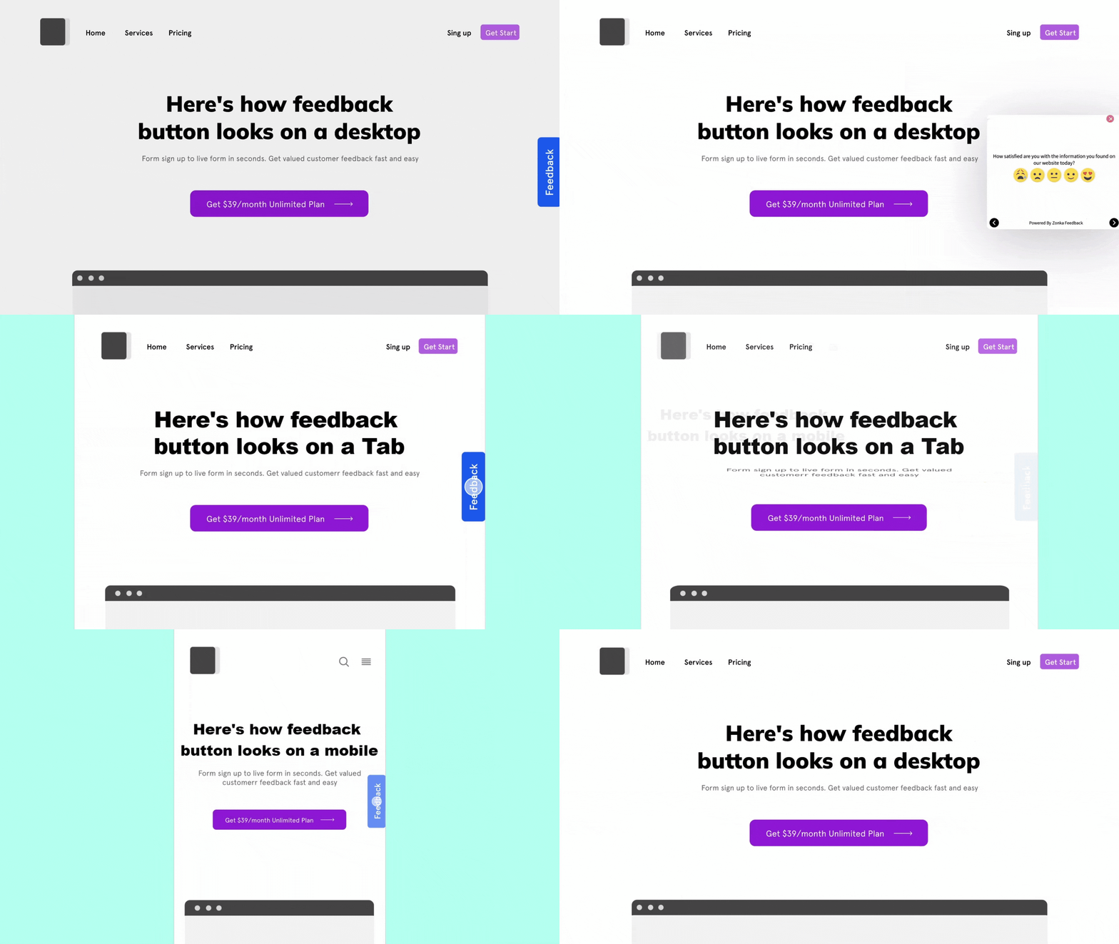
Ever wondered what’s going through your customers' minds as they navigate your website? Imagine a visitor who's just encountered a confusing checkout process. Instead of abandoning their cart in frustration, they spot a small, friendly button on the side of the page—a feedback button. One click, and they can tell you exactly what went wrong, giving you the chance to fix it before it costs you more customers.
That’s the magic of a website feedback button. It’s not just another widget; it’s a direct line to your users' thoughts, helping you identify what’s working and what needs improvement—right when it matters. For enterprises, this means gaining actionable insights without the hassle of complicated surveys or third-party plugins.
Why choose a feedback button over traditional methods? Simple. It’s quick, easy, and doesn’t disrupt the user’s journey. Your customers can share their feedback without leaving the page, and you get those valuable insights in real-time. No fuss, no friction.
In this blog, we’ll explore everything you need to know about website feedback buttons—how they work, real-life examples, and a rundown of the best website feedback button tools out there. By the end, you’ll see how a simple feedback button can transform user feedback into a game-changer for your website. Let’s dive in!
TL;DR
- A feedback button allows users to easily provide feedback without prompting which enhances customer experience and engagement level.
- It can be used to collect user insights by leveraging surveys like website usability surveys, NPS surveys, product surveys, lead generation surveys, Likert scale surveys, and more.
- Some of the best website feedback button tools include Zonka Feedback, Qualtrics, SurveyMonkey, Medallia and AskNicely.
- Some benefits of using a feedback button include reducing support tickets, collecting feedback without disruption, quickly identifying usability issues, and gathering insights at key touchpoints.
- To create a variety of engaging surveys using the feedback button on website, you can sign up for a free trial on Zonka Feedback or schedule a demo. You can also analyze results using its advanced reporting and analytics and close the feedback loop by taking action.
Collect Actionable Feedback through Feedback Button ⭐
Survey your product users and website visitors without creating any interruption in their work and get valuable feedback to build delightful experiences for them.

What is a Website Feedback Button?
A feedback button is a website feedback widget that can be added to any website without any coding required. When clicked, it opens up a feedback form that users can fill out without leaving the page.
Feedback buttons can be added to various pages for different purposes, like gathering user feedback on UX from users, page-specific feedback, and or unsolicited website or product feedback. It is uncomplicated and hardly takes up any space, making it an ideal choice for people who prefer a clean and uncluttered website.
Types of a Website Feedback Button
There are three major types of feedback button on website. Let us briefly look at each of them.
-
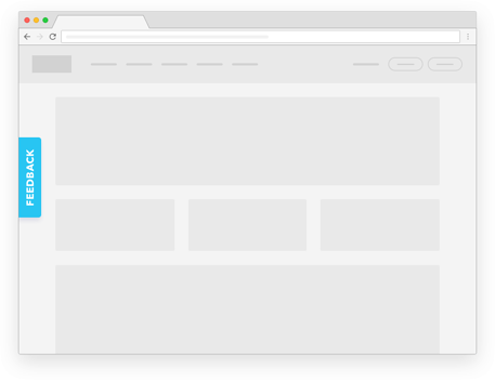
Fixed Feedback Button: Typically located at the center or on the margins of your website as a side tab. When clicked, the fixed feedback button opens a tab that displays the website feedback form on the screen and prompts users to provide feedback.
-
Feedback Banner: A feedback banner is a feedback widget embedded at the top of your website to look like a banner. It works like a fixed feedback button; clicking it opens a popup with a form for users to share feedback right on their current screen.
-
Floating Feedback Button: A floating feedback button often resembles a chat icon usually seen on websites. It remains visible to your site users, regardless of their scrolling or the webpage they're on, ensuring easy access.
Website Feedback Button Examples & Use Cases
Feedback buttons can be implemented in a variety of ways and can be placed based on the website's goals, user interface, and the type of feedback they aim to collect. Let us look at some common examples of feedback buttons that you can use on your website:
-
Net Promoter Score (NPS): Leverage NPS surveys in the feedback button by asking users to rate on a scale of 0-10 how likely they are to recommend the website to others based on their website experience.
-
Report a Problem Button: Add this feedback button on your survey apps or community websites to let users report issues, spam, or inappropriate content.
-
Smiley Rating or Emoji Feedback: Utilize a row of emojis (e.g., happy, neutral, sad) or smiley face surveys to get quick visual feedback on the website's content or service.
-
Thumbs Up/Thumbs Down: Similar to the smiley rating, you can offer a simplified feedback collection option with thumbs-up and thumbs-down icons for measuring customer satisfaction.
-
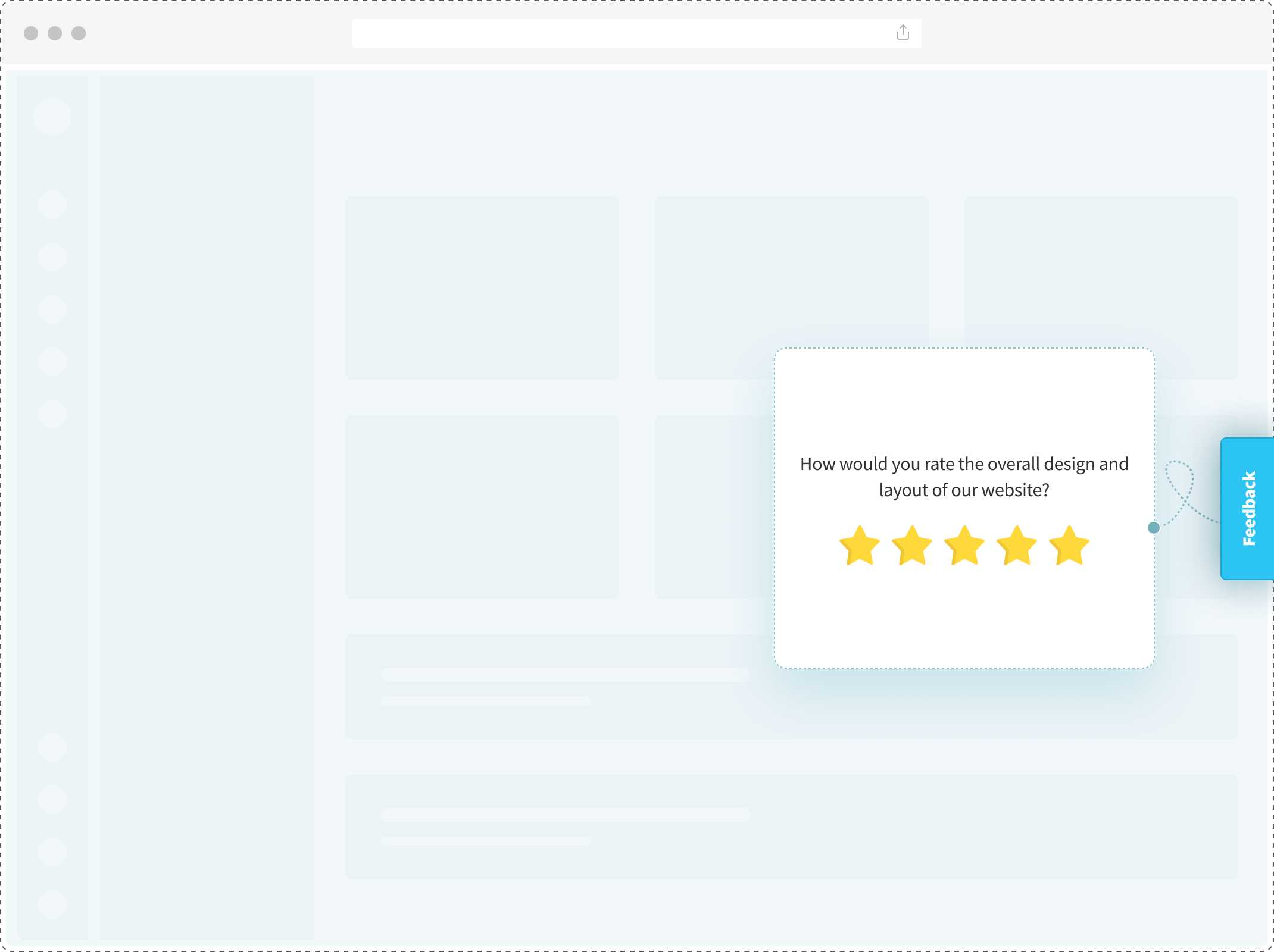
Star Rating: Implement a star rating system in the feedback button where users can choose a rating from 1 to 5 stars to indicate their satisfaction or dissatisfaction.
Top Website Feedback Button Tools to Collect Feedback
There are many feedback button tools that offer website feedback widgets to help brands collect valuable feedback and better understand their website users. Let us look at the top tools that offer feedback button website surveys.
1. Zonka Feedback
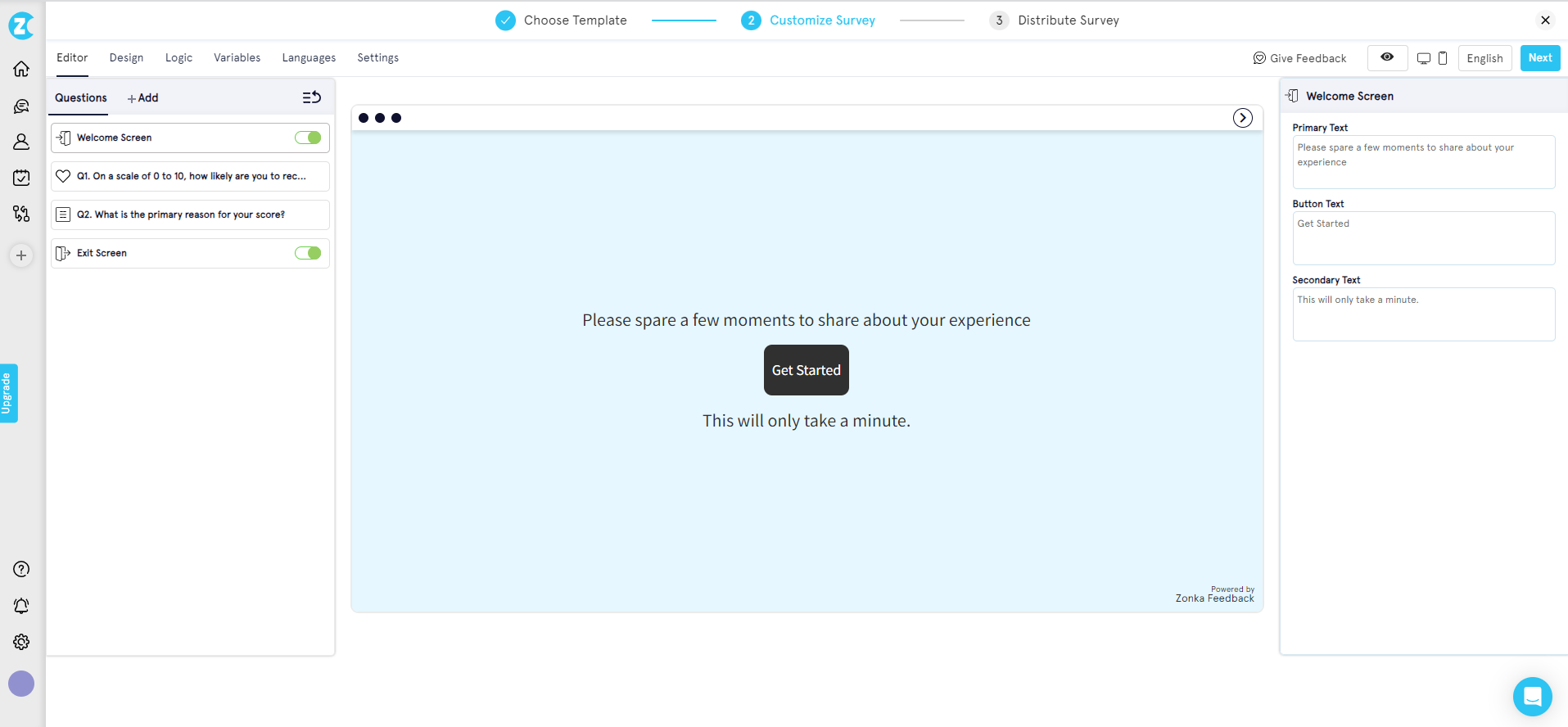
Zonka Feedback is a popular website feedback tool for adding website feedback buttons across multiple web pages without any plugins or coding. You can easily create feedback forms using templates, AI or by building them from scratch using the survey builder. Once your forms are ready, simply copy the widget code and embed the feedback button directly onto your site.
The feedback button in this survey software offers advanced triggering options, allowing it to appear based on user behaviors like time spent on a page, exit intent, or scroll percentage. This ensures feedback requests reach users at the most relevant moments, like when they're about to leave. It is also fully customizable, enabling you to adjust its design to match your website’s branding for a seamless experience.
Additionally, it supports various feedback types, including star ratings, NPS, CSAT, and even emoji feedback, providing valuable insights into user experiences and preferences.
Key Features:
- Anonymous feedback collection for candid user responses
- Mobile-friendly design ensures seamless feedback on any device
- Advanced targeting to display feedback button to specific user segments
- Customizable post-feedback actions like tailored thank-you messages or page redirects
- Multilingual surveys supported in over 30 languages
- Multiple feedback widgets, including website popup surveys, slide-ups, bottom bars, and microsurveys
- Easy integration with tools like Slack, Salesforce, Zendesk, and HubSpot
- AI features like sentiment analysis, response tagging, AI sentiment CX workflows. etc.
- Downloadable reports with filters for detailed analysis and comparison
Rating: 4.8/5
Free Plan: Free trial available
Pricing: Starts at $49/month
2. Qualtrics
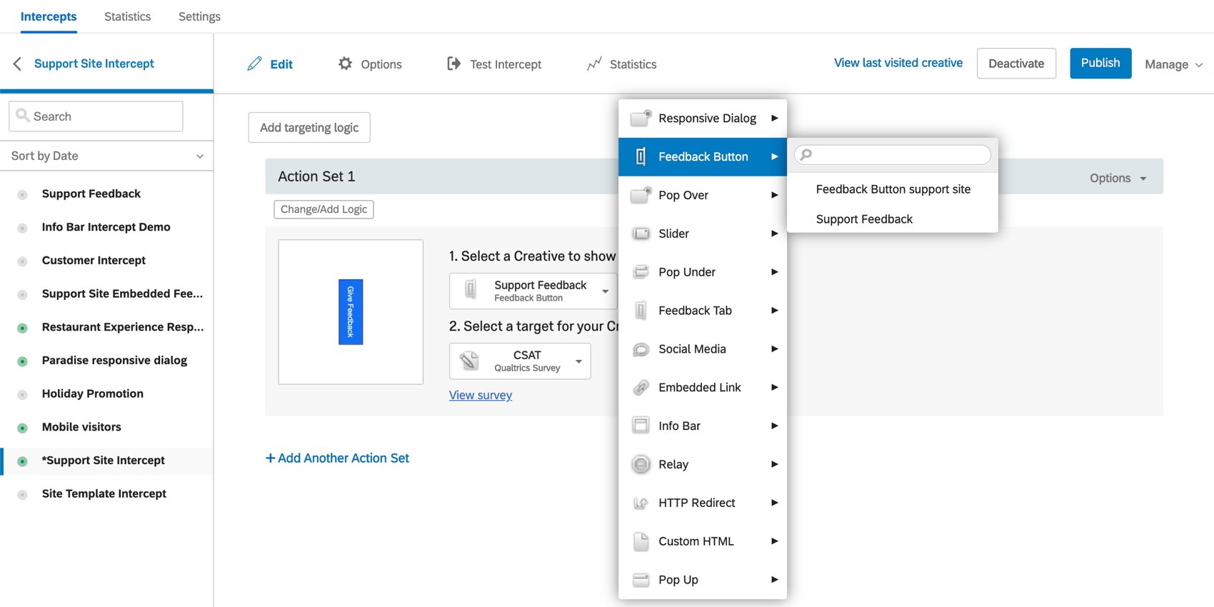
Qualtrics is an easy-to-use website survey tool that allows capturing instant feedback through interactive feedback forms across the customer journey. Its intelligent reporting and analytics are designed to create a powerful business impact.
Key Features:
-
50+ survey templates
-
In-app optimization with simple user clicks
-
Predictive intelligence and analytics
-
Actionable customer insights
-
Drag and drop functionalities for easy survey creation
Rating: 4.8/5
Free Plan: Available
Pricing: Not mentioned on the website. Other sources have suggested that it starts at $1500/year
Qualtrics isn't the only website feedback button tool out there. Check out the top Qualtrics alternatives to find more cost-effective and simpler plans to capture actionable feedback.
3. SurveyMonkey
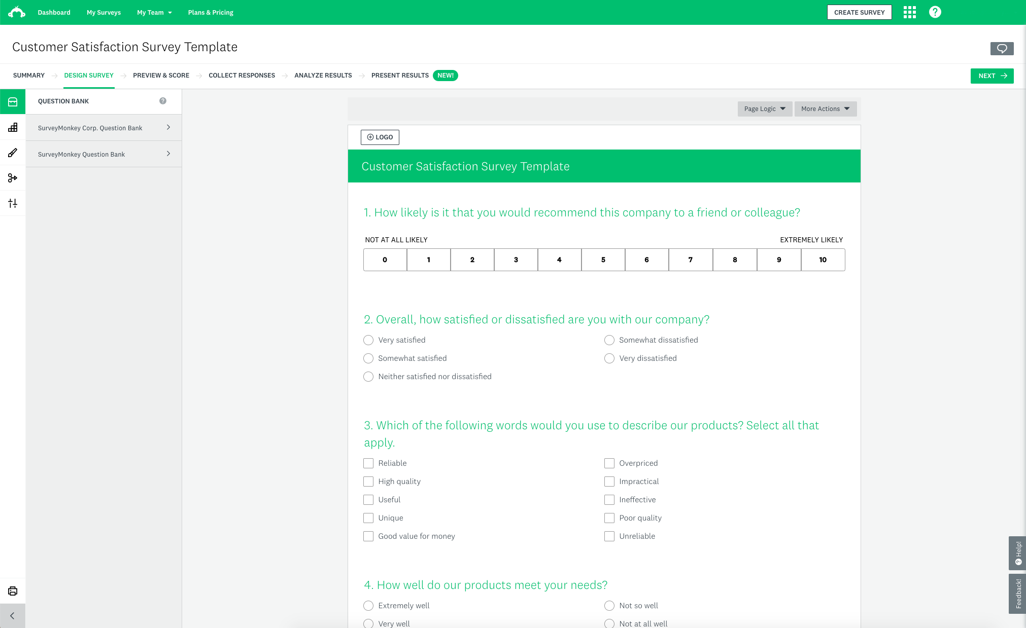
SurveyMonkey is a popular survey tool known for its intelligent data management and insightful reports. It offers the website feedback widget feature and embedding surveys directly into the website.
You can also use readymade form templates for different industries and build questionnaires effortlessly.
Key Features:
-
Website feedback button, popup surveys, and embedded surveys
-
Multilingual surveys
-
Ready-to-use templates
-
Intelligent reports with filters
-
Business tool integration
Rating: 4.6/5
Free Plan: Basic plan available
Pricing: Starts at $25/month/user
Not sure if SurveyMonkey is the perfect solution for you? Check out SurveyMonkey alternatives and competitors.
4. Medallia
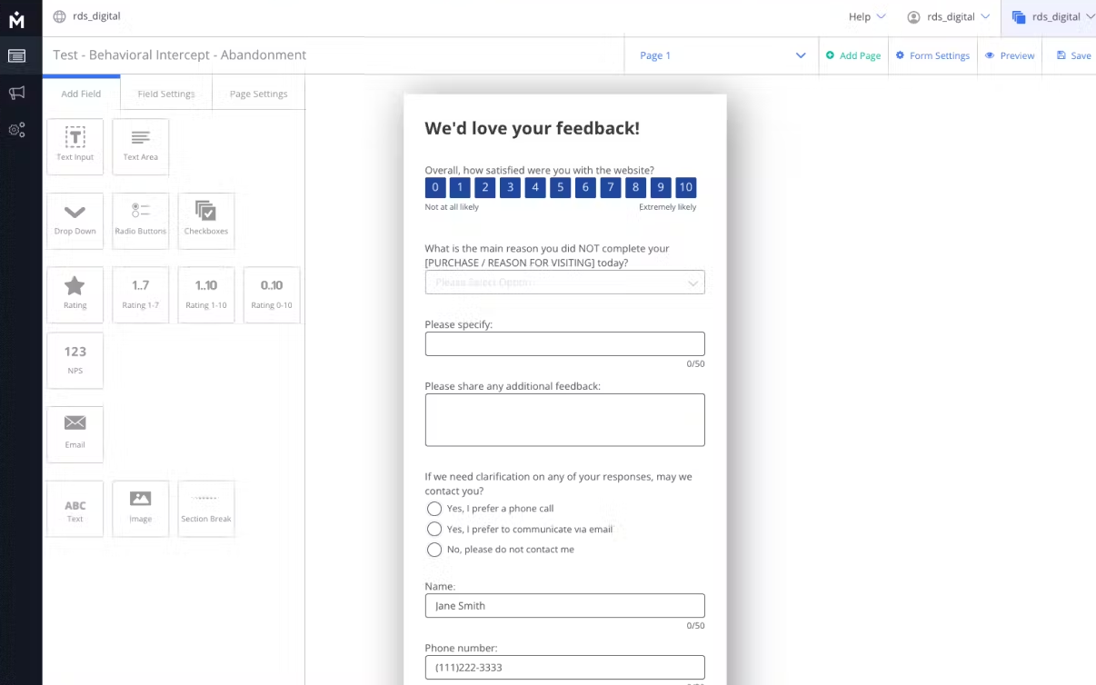
Medallia is a popular website feedback tool as it lets you create the best feedback buttons and branded feedback forms that can be seamlessly integrated into your website, apps, emails, and SMS communication channels. This interactive feedback button can be strategically triggered to specific user segmentations, for example, to those who are about to exit your website.
The platform is an enterprise feedback management software that offers a comprehensive suite of features that extend beyond feedback collection and is most suited for large enterprises.
Key Features:
-
Website feedback button, popup form, and embedded surveys
-
Multilingual surveys
-
Ready-to-use templates
-
Intelligent reports with filters
-
Business tool integration
Rating: 4.6/5
Free Plan: Not available
Pricing: Contact their team to get pricing information
Wondering if Medallia would suit your needs? Why not check out Medallia alternatives and competitors?
5. AskNicely
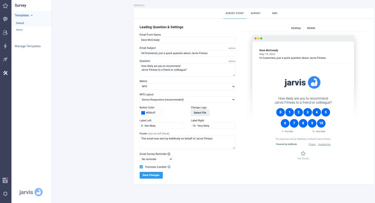
AskNicely has feedback buttons that can easily trigger a NPS survey on your website, email, or inside your app. You can configure your feedback form, share surveys, and understand customer sentiment through actionable data gathered by its useful analytics.
Key Features:
-
Gather customer feedback, assess NPS, and utilize workflow automation
-
Real-time feedback collection from customers
-
Share out-of-the-box reports to the CEO
-
Integrate feedback data into the CRM and business intelligence tools
-
Close the feedback loop with customers
Rating: 4.6/5
Free Plan: Not available
Pricing: Contact their team to get pricing information
Website Feedback Button Questions to Collect Customer Feedback
Use these questions in the feedback button to collect Net Promoter Score, Customer Satisfaction (CSAT), Customer Effort Score (CES), or simply a general feedback.
-
How would you rate your experience on the website?
Why ask this: To understand how happy your website visitors and customers are with their overall experience of navigating your website.
Where to add this: Homepage or any webpage of your website
-
How did you hear about us?
Why ask this: To know how your website visitors discovered your business and which marketing channels are working well for you
Where to add this: Website's landing pages
-
Did you find the information you were looking for on the website?
Why ask this: To understand the effectiveness of your site's navigation and content organization
Where to add this: Landing page, product pages
-
How satisfied are you with your recent transaction?
Why ask this: To know how smooth and user-friendly is the buying process for the visitor
Where to add this: Post-transaction screen
-
Was this article helpful?
Why ask this: To capture article and content feedback and deliver authentic content
Where to add this: Content pages like blogs and help articles
-
How would you rate the overall design and aesthetics of the website?
Why ask this: To identify improvements in a website's design flaws
Where to add this: Homepage
-
Please describe the issue here.
Why ask this: For capturing bug reporting insights
Where to add this: Thank You page
-
How satisfied are you with the speed and performance of the website?
Why ask this: To identify areas that need improvement and to ensure optimal customer experience.
Where to add this: After the customer completes a specific action, lands on a particular webpage, loads a product feature, or opens heavy content on the website like a video or image
-
How satisfied are you with the recent interaction with our customer service team?
Why ask this: To measure agent performance and collect help center feedback
Where to add this: In post-interaction surveys shared just after a user had an interaction with the service or support team.
-
Is there anything that you feel is missing on this website?
Why ask this: To give users the option to give suggestions for improvement with open-ended questions
Where to add this: In exit-intent feedback when the website user is exiting the website
-
How likely are you to revisit our website in the future?
Why ask this: To assess the overall UX and identify areas that require improvement
Where to add this: When the website user is leaving the website.
-
How likely are you to recommend our website to your friends and known ones on a scale of 0 to 10?
Why ask this: To measure overall customer satisfaction and loyalty
Where to add this: At key visitor touchpoints such as post-purchase, subscription, feature addition, customer service interaction, after a few minutes on a content page (article or blog), or during website exit
-
Would you like to subscribe to our newsletter?
Why ask this: To drive user engagement
Where to add this: Content pages like blogs, articles, and newsletters
-
What made you exit?
Why ask this: To know the reason for the users' intent to leave your site
Where to add this: In the exit intent form that appears when the customers choose to leave your website
Benefits of Website Feedback Button
There are many benefits of using a feedback button on website. These include:
- Reducing Support Tickets: A well placed feedback button allows users to report issues directly, reducing the need for support tickets and freeing up your support team for complex cases. It helps address minor problems like broken links or payment issues quickly.
- Collecting Feedback without Disrupting User Flow: The feedback button is unobtrusive, letting users share their thoughts without interrupting their browsing. It gathers valuable insights without affecting website performance or user engagement.
- Unsolicited Feedback: A feedback button enables users to spontaneously share their thoughts without prompting which drives customer engagement. Unsolicited feedback is valuable as it provides genuine insights even when you aren't expecting it which could be in terms of design, navigation, and user experience.
- Survey without Contact Details: A website feedback button helps you collect feedback from all visitors without requiring contact details, enabling instant feedback on challenges. For example, if a user faces payment issues, they can report it by clicking the button, allowing prompt resolution of otherwise unnoticed problems.
- Reporting of Usability Issues: Visitors often leave without reporting usability issues that hinder their purchase experience. A feedback button encourages them to share bugs and design flaws, showing you value their feedback. This can boost their likelihood of returning and making a purchase.
- In-App Feedback: You can add a feedback button directly to your web app or even mobile app to gather feedback on various aspects which increases the chances of customers sharing feedback as opposed to other channels like email, SMS, etc.
How to Add a Feedback Button to a Website?
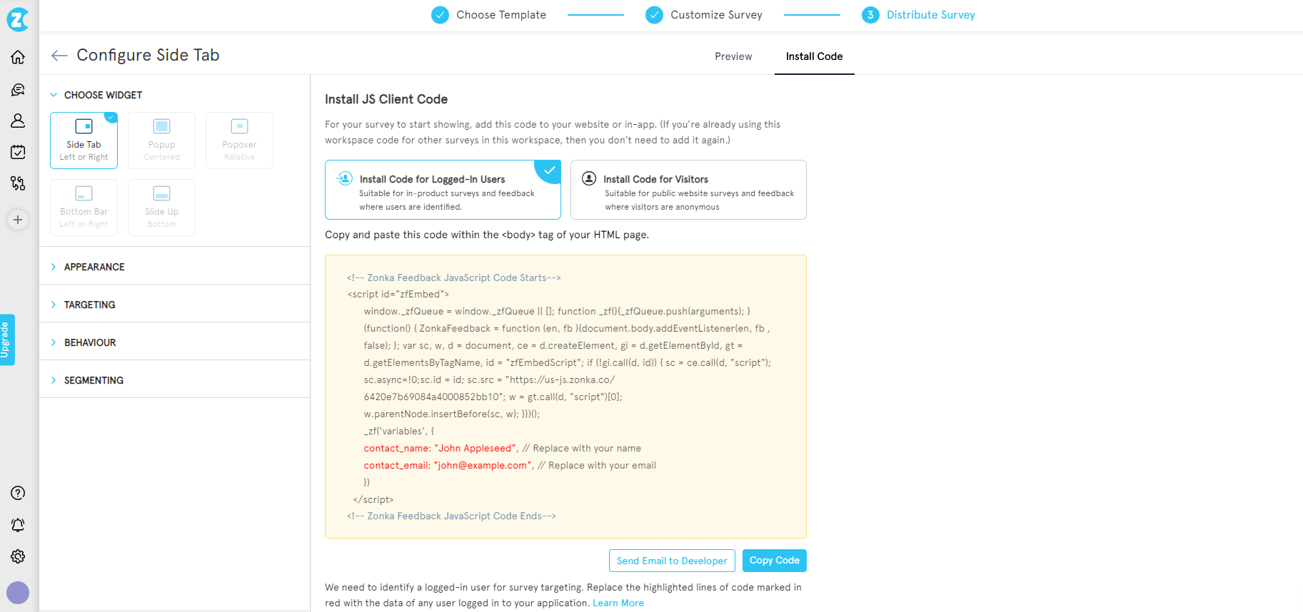
We explain below how you can add a feedback button to your website using Zonka Feedback with just a few simple steps:
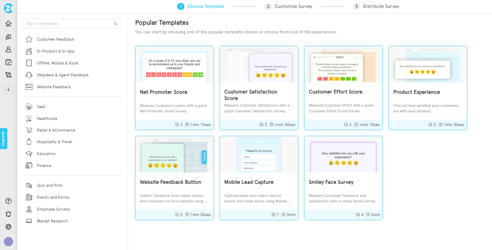
Step 1: Create a Survey
Go to the survey dashboard and click on 'Add Survey'. Select the template of your choice.
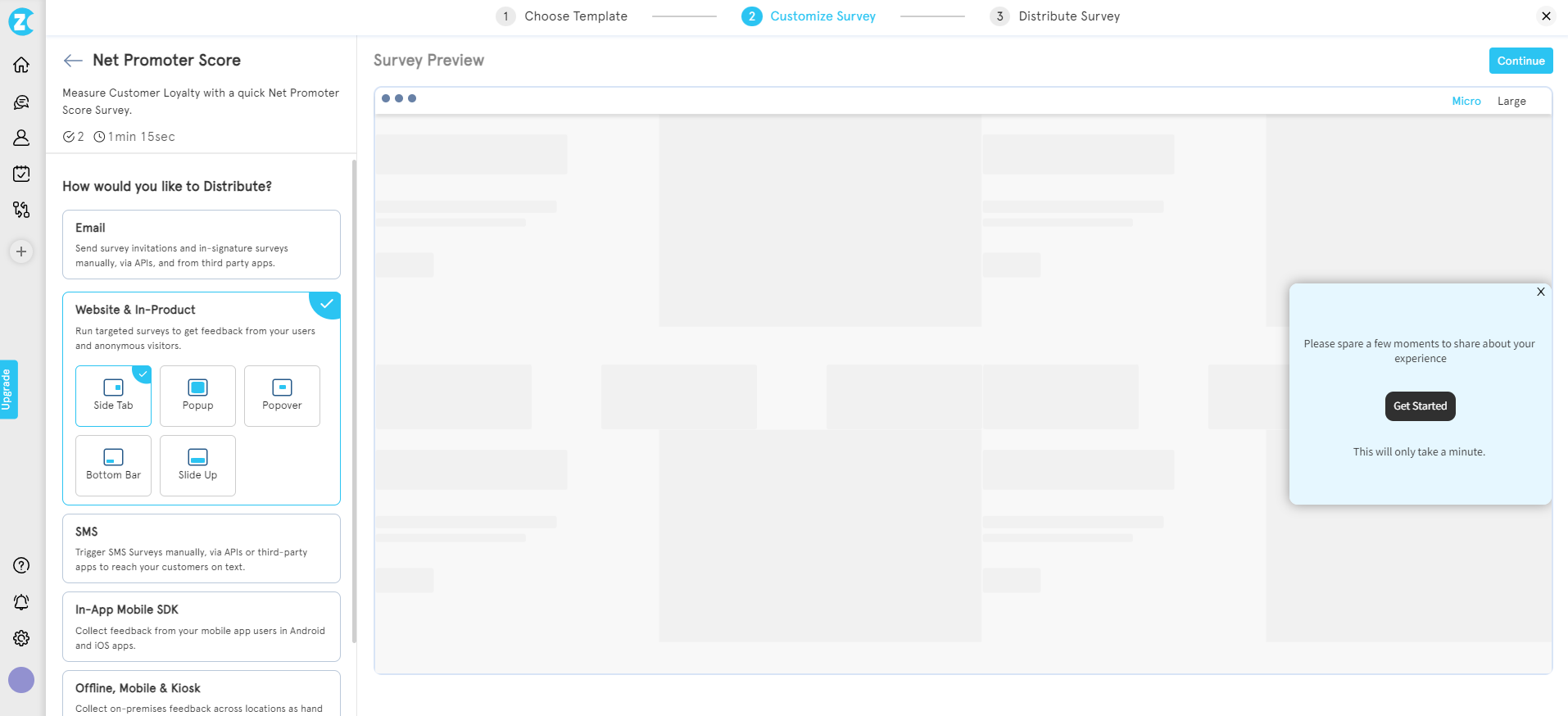
Step 2: Select the Feedback Widget
Select the distribution option as 'Web widget' and then select the type as 'side tab' or feedback button.
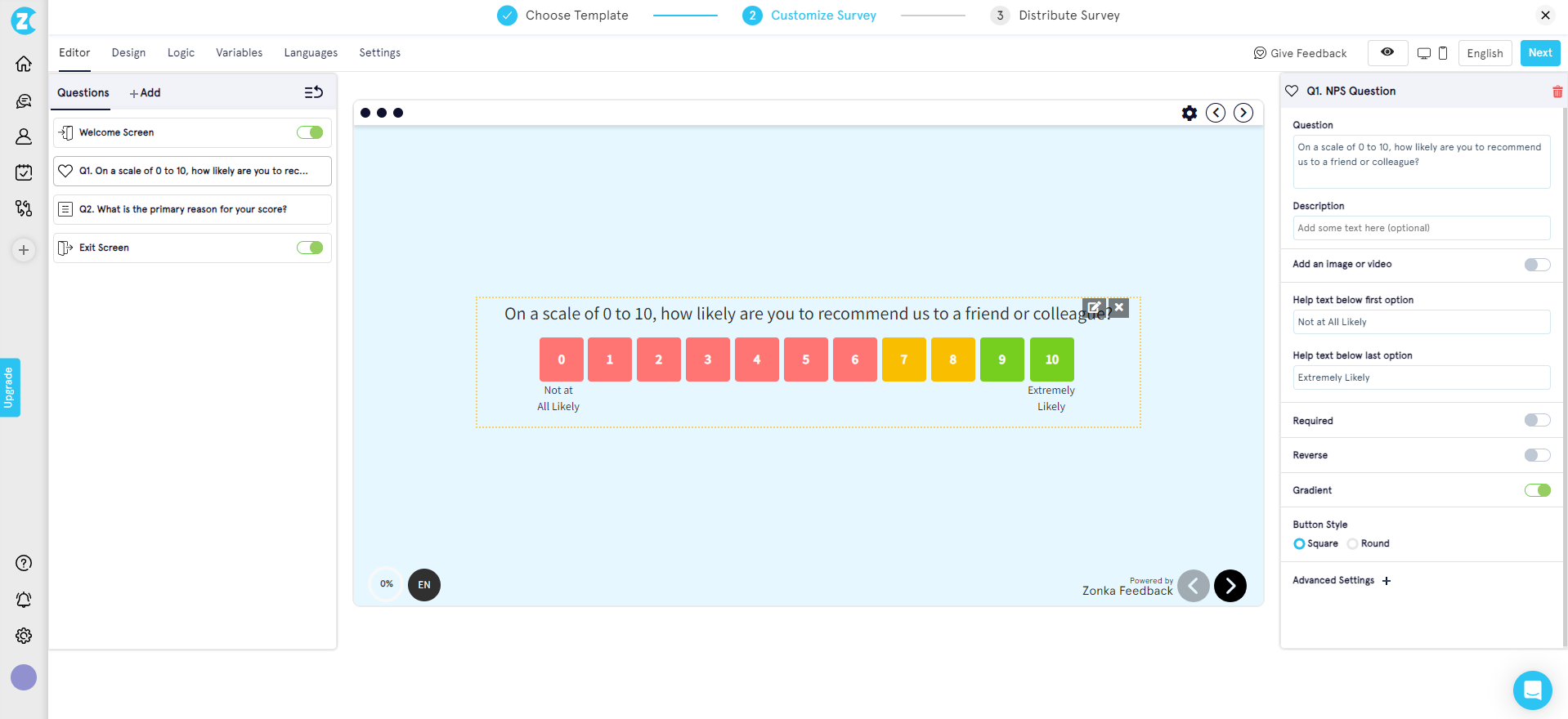
Step 3: Customize your Feedback Form
Edit the survey questions and explore other functionalities like survey logic, design, variables, etc.
Step 4: Embed Ready-to-use Code into your Website
Once you click on next, you will see a readymade code that you can simply copy and insert the snippet in your website script. You can also perform feedback button customizations from the options available like appearance, targeting, behavior, etc.
Conclusion
A website feedback button isn't just an add-on; it's a strategic tool for increasing customer satisfaction. It communicates to your audience that you are listening and valuing their opinion. This fosters a stronger bond between your brand and customers and boosts loyalty, conversions, and advocacy.
Sign up for 14 day free trial with Zonka Feedback to create impactful surveys using the feedback button and collect user insights that will empower you to refine your website, product, and service and drive continuous improvement.
Frequently Asked Questions
1. What is a website feedback button and how does it work?
A website feedback button is a discreet element placed on your website that allows visitors to share feedback instantly without leaving the page. When users click on the feedback button, a pop-up or overlay form appears, enabling them to provide input on their experience, report bugs, or suggest improvements.
2. Where should I place a feedback button on website for maximum engagement?
For optimal results, place your feedback button on high-traffic pages like the homepage, product pages, or post-purchase screens. Many websites find success by positioning the feedback button at the bottom right corner, ensuring it is visible without being intrusive. This strategic placement increases the chances of visitors interacting with the feedback button.
3. What types of feedback can I collect with a feedback button?
A feedback button can be used to collect various types of feedback, including Net Promoter Score (NPS), Customer Satisfaction (CSAT), feature requests, bug reports, and website usability feedback. You can also use it for specific feedback button examples like emoji ratings, star ratings, or thumbs-up/down options, allowing users to express their opinions quickly.
4. How can I add a feedback button on website without coding?
Many feedback tools, like Zonka Feedback, make it easy to add a feedback button without any coding skills. Simply create a survey, customize it to match your brand, and generate an embed code. Then, copy and paste the code into your website’s HTML, and your feedback button is ready to collect valuable insights.
5. What are the benefits of using a website feedback button?
Using a feedback button on your website offers several benefits, including the ability to gather real-time user insights, improve user experience, identify usability issues, and address customer pain points quickly. It also provides a private channel for feedback, reducing the chances of users venting frustrations on public platforms like social media.

 MS Teams